-
Share with us... Your Best & Worst Collections of Haute Couture F/W 2025.26
-
Xenforo is upgrading us to version 2.3.7 on Thursday Aug 14, 2025 at 01:00 AM BST. This upgrade includes several security fixes among other improvements. Expect a temporary downtime during this process. More info here
You are using an out of date browser. It may not display this or other websites correctly.
You should upgrade or use an alternative browser.
You should upgrade or use an alternative browser.
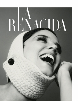
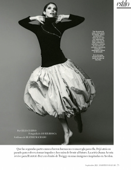
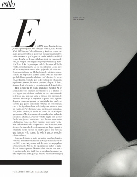
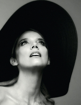
Harper’s Bazaar España September 2021 : Shalom Harlow by David Roemer
- Thread starter vogue28
- Start date
SH's face has definitely changed during the past decade. Her jawline has become more squarish and sometimes she looks puffy. The first cover shot is just terrible--that hair. She looks like Dayle Haddon in the second cover shot.
Bertrando3
Well-Known Member
- Joined
- Mar 22, 2010
- Messages
- 5,526
- Reaction score
- 2,217
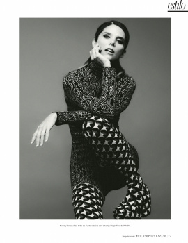
I love Shalom's editorial but it feels so disjointed like I can't see what their vision was. She looks pretty in all of the shots and she's giving energy and face but yeah it feels very all over the place for me.
versustito
Well-Known Member
- Joined
- Apr 19, 2006
- Messages
- 11,090
- Reaction score
- 897
I love the cover´s and editorial´s !!!
Lola701
Well-Known Member
- Joined
- Oct 27, 2014
- Messages
- 13,147
- Reaction score
- 33,196
Shalom’s ed is like if the editor tried to combine Suzanne Koller, Joe McKenna and Emmanuelle Alt in one ed. And the photography is very I&V.
The black & white shots are great tho.
« Herederas del Mito » and Rossy de Palma’s ed are actually the most interesting eds here. Shalom’s ed could have been perfect if it followed the vision of the B&W shots.
The Fendi ed is tired and done.
It’s HB espana. The standards or the expectations are not so high. It’s a good issue…
- Joined
- Jan 9, 2008
- Messages
- 36,510
- Reaction score
- 23,545
Shalom’s ed is like if the editor tried to combine Suzanne Koller, Joe McKenna and Emmanuelle Alt in one ed. And the photography is very I&V.
100% agree, and I'm also getting Chris Colls from the photography!
Always love the sight of supermodels for September and while the outcome is far from groundbreaking or revolutionary, it would be wrong not to celebrate Shalom Harlow back on the covers of fashion magazines.
The second cover is a knockout because it's very much inspired by Peter Lindbergh's iconic images for American Vogue as @[B]tigerrouge[/B] eloquently pointed out. I'm doubtful I will ever get tired of this styling direction, in all honesty. A total win for Harper's Bazaar Spain (and us), if you ask me!
versustito
Well-Known Member
- Joined
- Apr 19, 2006
- Messages
- 11,090
- Reaction score
- 897
I love the cover s... and editorial
Rosi de Palma editorial is stunning
Rosi de Palma editorial is stunning
FashionMuseDior
Well-Known Member
- Joined
- Feb 27, 2012
- Messages
- 1,785
- Reaction score
- 725
For a brief second I thought that Lucia girl was Marija Vujovic! It's always a delight to see Rossy in editorials.
Similar Threads
- Replies
- 7
- Views
- 3K
- Replies
- 16
- Views
- 5K
- Replies
- 13
- Views
- 3K
- Replies
- 24
- Views
- 6K
- Replies
- 5
- Views
- 3K
Users who are viewing this thread
Total: 1 (members: 0, guests: 1)
New Posts
-
-
Christian Dior 'Miss Dior Essence' Fragrance 2025 : Natalie Portman by Lachlan Bailey (5 Viewers)
- Latest: Kite
-
-
Chanel 'Bleu De Chanel L'Exclusif' Fragrance 2025 : Timothée Chalamet by Mario Sorrenti (5 Viewers)
- Latest: TomBlanksFullFatMiuMiu
-



 , it's such a shame that this issue is a waaay better than a vast majority of this year's Vogue September issues!


