You are using an out of date browser. It may not display this or other websites correctly.
You should upgrade or use an alternative browser.
You should upgrade or use an alternative browser.
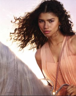
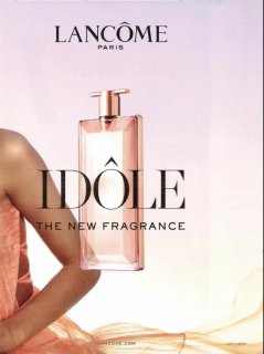
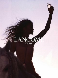
Lancôme 'Idôle' Fragrance 2019 : Zendaya by Alexi Lubomirski
- Thread starter TZ001
- Start date
Wintergreen
Well-Known Member
- Joined
- Jan 13, 2015
- Messages
- 787
- Reaction score
- 247
Terrible, she looks like Serena Williams.
Bertrando3
Well-Known Member
- Joined
- Mar 22, 2010
- Messages
- 5,462
- Reaction score
- 2,129
LOOOOOVE this 


FashionMuseDior
Well-Known Member
- Joined
- Feb 27, 2012
- Messages
- 1,782
- Reaction score
- 705
She looks absolutely stunning
Similar Threads
- Replies
- 2
- Views
- 2K
D
- Replies
- 37
- Views
- 9K
- Replies
- 25
- Views
- 4K
- Replies
- 15
- Views
- 5K
Users who are viewing this thread
Total: 2 (members: 0, guests: 2)
New Posts
-
Dolce & Gabbana Holiday 2024 : Awar, Felice, Lulu, Kit & Mathieu by Gordon von Steiner (7 Viewers)
- Latest: MModa
-
-
-
-


