Ralph Lauren F/W 2017.18 : Faretta by David Sims | the Fashion Spot

Ralph Lauren F/W 2017.18 : Faretta by David Sims

Oh hell no! so tired of Faretta already.
 
Ok, there she is again. :lol: 
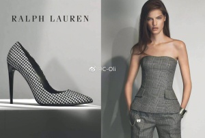
She's the ''Vitto'' of this season.
I hate when they overexpose a girl for a season. Especially cuz we know that 99% of the times it doesnt last.
But good for her that Meisel is stanning. Milk that moment, cuz he might drop her next season, just like he did with Caitie Greene.

Anyway, can't deny that she is gorgeous, but this is not doing it for me. It's beautiful, but boring.
 
Love her but she is being way to overexposed, it is killing her appeal
 
She is gorgeous in those shots, but the overall result is boring. But it's Ralph Lauren, so I guess that's fine.
 
When I open Ad Campaigns thread I get a feeling a see only Mariacarla and Faretta names in threads titles:rolleyes:
 
Wow that shot of the houndstooth stilleto heel is so stale it's almost hard to believe SM shot it and to top it off does not contrast beautifully against the talented Farretta and her clothing...
 
After that beautiful campaign he did last season, i though that RL was ready to change in terms of direction...
Here we are again with their usual kinda dated whole operation.

Meisel's photography is great but the styling, the total-look effect and the layout is problematic.
 
Ralph Lauren has a certain formula, but this seems to be missing the ingredients that typically elevate the campaign.
 
Ralph Lauren has a certain formula, but this seems to be missing the ingredients that typically elevate the campaign.

I would say that I'm generally quite taken with their formula. Outdoors or in some posh house, girls exuding glamour and energy. This for me is too catalogue. And I don't recall Meisel using such a light grey backdrop ever. A miss, I'm afraid.
 
She looks gorgeous. It's very simple but i don't know why it's still pretty good.
 
Those images above are featured inside the September issue of British Vogue, I didn't even know the campaign was photographed by Steven Meisel - and I was in love. I wouldn't say the aesthetic is distinctively Meisel, but come to think of it, I'm reminded of his campaigns for Max Mara back in 90s.
 
So boring. Truly dated and Meisel should be ashamed.

Faretta looks good but very different, because of the photoshop probably.
 
I think the problem isn't Faretta, the problem is that most of her work looks exactly the same because of the art direction: her standing in front of a grey background (this, Zara, Lanvin, a bit Valentino too) so it gets tiring to see the same thing all over but it's not her fault, I think she's giving her best and doing a great job.
 
I knew this wasn't Meisel. It's dull and lifeless. Meisel would never!
 

Users who are viewing this thread

New Posts

Forum Statistics

Threads
214,426
Messages
15,261,380
Members
88,420
Latest member
fartnoise
Back
Top