-
Live Streaming... The S/S 2026 Fashion Shows
London Fashion Week S/S 2026 Show Schedule -
MODERATOR'S NOTE: Please can all of theFashionSpot's forum members remind themselves of the Forum Rules. Thank you.
You are using an out of date browser. It may not display this or other websites correctly.
You should upgrade or use an alternative browser.
You should upgrade or use an alternative browser.
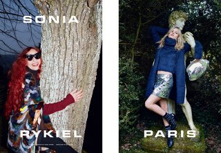
Sonia Rykiel F/W 2015.16 : Elizabeth & Georgia May Jagger by Juergen Teller
- Thread starter gossiping
- Start date
VogueGirl8910
Well-Known Member
- Joined
- Apr 14, 2008
- Messages
- 48,037
- Reaction score
- 8,751
Is same concept, but the previous season was muc better than this.
TREVOFASHIONISTO
Active Member
- Joined
- Jun 2, 2008
- Messages
- 15,357
- Reaction score
- 66
its looking very Vivienne Westwood
D
Deleted member 1957
Guest
I love it,beautiful colours
Similar Threads
- Replies
- 14
- Views
- 4K
- Replies
- 19
- Views
- 5K
- Replies
- 13
- Views
- 2K
- Replies
- 0
- Views
- 1K
Users who are viewing this thread
Total: 1 (members: 0, guests: 1)


