-
Live Streaming... The F/W 2025.26 Fashion Shows
New York Fashion Week F/W 2025.26 Show Schedule
You are using an out of date browser. It may not display this or other websites correctly.
You should upgrade or use an alternative browser.
You should upgrade or use an alternative browser.
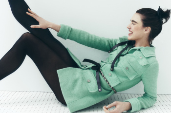
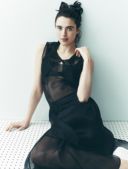
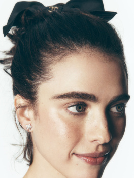
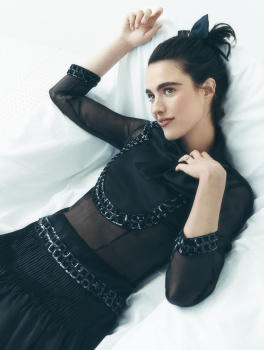
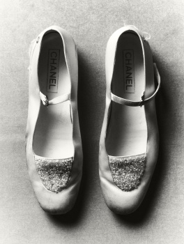
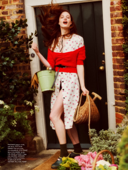
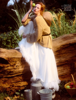
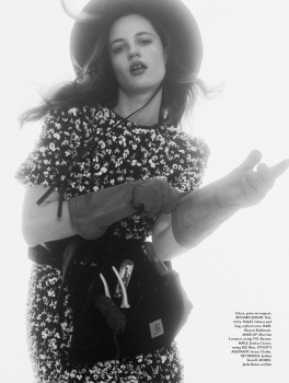
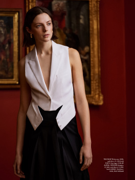
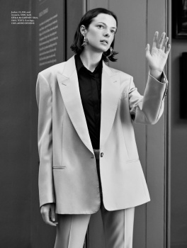
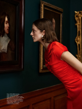
UK Elle April 2024 : Margaret Qualley by Tom Schirmacher
- Thread starter vogue28
- Start date
tigerrouge
Well-Known Member
- Joined
- Feb 25, 2005
- Messages
- 18,430
- Reaction score
- 8,422
Margaret Qualley's more recent magazine shoots seem to be selling a casual 'I didn't even brush my hair for this' image.
Not a fan of "not giving a f*ck" covers - when things are low-effort, why should I care?
I'd say French Elle does it better, except her French Elle cover was just the same.
Not a fan of "not giving a f*ck" covers - when things are low-effort, why should I care?
I'd say French Elle does it better, except her French Elle cover was just the same.
gunsnroses
Well-Known Member
- Joined
- Jul 31, 2017
- Messages
- 439
- Reaction score
- 412
She’s always styled the same in the most boring Chanel piecesMargaret Qualley's more recent magazine shoots seem to be selling a casual 'I didn't even brush my hair for this' image.
Not a fan of "not giving a f*ck" covers - when things are low-effort, why should I care?
I'd say French Elle does it better, except her French Elle cover was just the same.
- Joined
- Jan 9, 2008
- Messages
- 35,743
- Reaction score
- 21,516
Much prefer this over last month's Lashana Lynch cover! This feels more quintessential Elle and perhaps because this reminds me of something Elle France is capable of, is the reason I'm so into this. All of this works for me - the fact its Margaret Qualley, the Chanel, the layout, the use of the pale green. Might be tempted to get this.
caioherrero
Well-Known Member
- Joined
- Sep 2, 2017
- Messages
- 2,968
- Reaction score
- 1,509
Last month was naomiMuch prefer this over last month's Lashana Lynch cover! This feels more quintessential Elle and perhaps because this reminds me of something Elle France is capable of, is the reason I'm so into this. All of this works for me - the fact its Margaret Qualley, the Chanel, the layout, the use of the pale green. Might be tempted to get this.
- Joined
- Jan 9, 2008
- Messages
- 35,743
- Reaction score
- 21,516
Last month was naomi
Shows how much of an impression Noami's cover left on me... completely forgot about it!
Kenya Hunt posted the following cover and described it as a subscribers cover. Are they back?
MulletProof
Well-Known Member
- Joined
- Apr 18, 2004
- Messages
- 28,645
- Reaction score
- 7,035
And it’s annoying because she’s beautiful, really good as an actress with the ability of convey so much emotion and a professional dancer.. you’d think these creative teams would know what to do with such a nice cocktail that you usually cannot get from your regular model (zero notion of performing arts) or even an actress (limited looks) and exploit it but it’s more like ‘let’s undo and stay safe’. If looks was all she’s selling, these ‘here’s my face’ shots would work but there’s more to her that they’re just wasting and it shows in these shoots.Margaret Qualley's more recent magazine shoots seem to be selling a casual 'I didn't even brush my hair for this' image.
- Joined
- Jan 9, 2008
- Messages
- 35,743
- Reaction score
- 21,516
Coming back to the thread to rave about good this looks sat on the shelves - even more so when placed alongside the eyesore that is FKA Twigs on British Vogue! It's bright, bold, clean, eye-catching and really sings alongside its competitors.
Srdjan
Well-Known Member
- Joined
- Jan 11, 2012
- Messages
- 5,026
- Reaction score
- 1,530
I love how fresh and simple the cover is. I'll always prefer a magazine cover with the cover subject just being there and looking good and pretty, instead of an over-emphasized art direction that tries to send a message or tell some story.
Similar Threads
- Replies
- 25
- Views
- 7K
- Replies
- 27
- Views
- 4K
- Replies
- 5
- Views
- 3K
- Replies
- 22
- Views
- 3K
Users who are viewing this thread
Total: 1 (members: 0, guests: 1)

