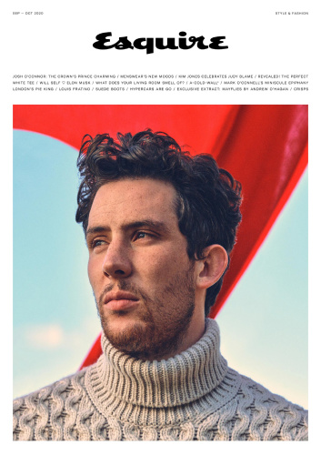
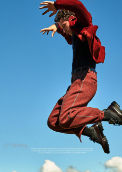
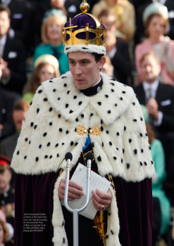
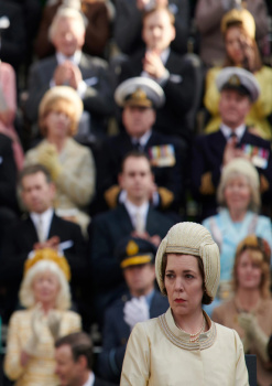
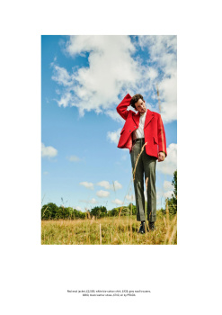
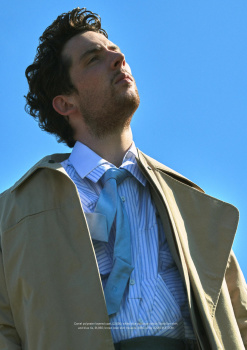
UK Esquire September/October 2020 : Josh O'Connor by Simon Emmett

Benn98

Well-Known Member
Joined
Aug 6, 2014
Messages
42,531
Reaction score
20,511
UK Esquire September/October 2020


The Man Who Would Be King


Photographer: Simon Emmett
Stylist: Catherine Hayward
Cast: Josh O'Connor


UK Esquire Digital Edition
 
Is this some kind of parody? this cant be real
 
I sort of like the cover? It looks so British, and the red is striking. It's not the most flattering shot of Josh, though. The way it's angled, it looks as though the quarantine 15 went straight to his chins.

Editorial is useless. It's a shame, I guess I should just keep rewatching "God's Own Country" for better shots of Josh frolicking in the fields.
 
combine issue for big month but don't have proper fashion editorial? ewww
 
combine issue for big month but don't have proper fashion editorial? ewww

It's sad to go through this issue, 164 pages btw. The main fashion editorial for the season is an 18-page collage with cut-outs from runway shows and brand lookbooks, so nobody except the stylist and collage creator worked on it. Talk about doing something on the cheap!
And yet they must've pulled a decent sum of money from advertisers such as Dior Men (4 pages of ads, 8 pages for a puff piece), Armani (4 pages), Prada (back cover), and Vuitton/Hermes/D&G (2 pages each), topped up by ads for Bottega, Ferragamo, wristwatches, supercars. This is twice the amount of ads you'd find in March/Sept US GQ, who, quality aside, still publish 2-3 original edits per issue. Josh may be the face of Loewe and the opening look of his editorial is all Loewe but they don't have any ads in this issue unlike all of the other credits in that edit, and the jumper on the cover is from Canali.
 
I love Josh, SO MUCH, and it's beyond amazing to see him, that being said, something about this cover and the edit is just off, that red object in the background is giving me Soviet Union propaganda posters vibes.
 
I love Josh but this is not his best angle. Not sure if it is that or the beard.

I also love that the last heading under the title is just "crisps". Like, what about crisps?! is there a new flavour? are we eating them wrong? have they evolved into a new form?
 
This issue arrived in Canada and while the page count is disappointing, I am more disappointed in the quality of the paper. In the past, they have used a mix of glossy and matte paper for each different section and it was refreshing to feel the difference physically as you switch from long form articles to editorials. Now, they use a rough, cheaper feeling paper throughout and it's just not the same experience.

I hope this is an off case due to the pandemic.
 
I imagine its a cost cutting exercise.
 
I also love that the last heading under the title is just "crisps". Like, what about crisps?! is there a new flavour? are we eating them wrong? have they evolved into a new form?

So now you understand what the story was with crisps, right? LOL. It's part of their shopping feature that appears in every issue. Basically, they photograph their selected picks of a specific item, and crisps just so happen to be one if it.
 
So now you understand what the story was with crisps, right? LOL. It's part of their shopping feature that appears in every issue. Basically, they photograph their selected picks of a specific item, and crisps just so happen to be one if it.


oh yes :lol: it was quite interesting seeing crisps photographed like that. It instantly made me crave some!
 

Users who are viewing this thread

New Posts

Forum Statistics

Threads
210,702
Messages
15,124,301
Members
84,410
Latest member
nise
Back
Top
monitoring_string = "058526dd2635cb6818386bfd373b82a4"
<-- Admiral -->