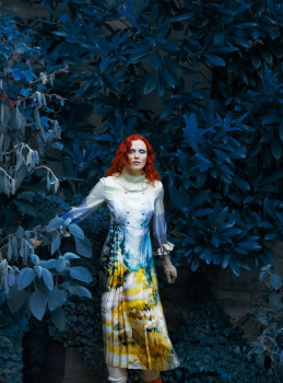
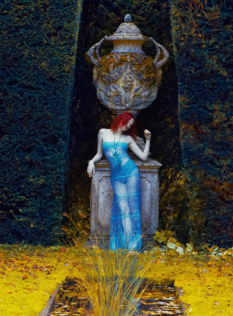
Your argument is impeccable, and I can hardly argue with such irrefutable proof, but I'm sticking with Homer. It's all about the five-o'clock-shadow area.
I really like Karen and Erik Madigan Heck & Leith Clark managed to produce some pretty good content in the past (UK Harper's Bazaar July 2016, for example), but this cover doesn't work for me ONLY because of the cyan-ish skin undertone (I colour-corrrected it on the face, but nonetheless her arms still give me some creepy corpse vibe! ) and this clownish make-up Andrew Gallimore did on her (lower part of the face, especially), which is really shameful, considering that he is the one of the very best MUA in the industry!
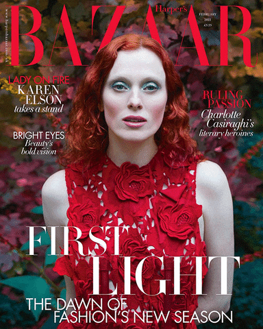
There is DEFINITELY something (seriously!) wrong when it come to the post-production of these images. Look carefully at her skin (undertone, because as we all know Karen has that signature pale/porcelain skin) on the 1st and 2nd images, and THEN look (carefully!) at these CYAN-ish arms on the 3rd (more prominent ) and 4th (less prominent) images! Besides that, this infamous 3rd image defies all laws of light known to me, because Karen's arms should be much warmer (because of the hedge's reflection), and legs should be a way more cooler (compared to the arms) because of that (artificially cyan) sward!
Seriously, I'm still trying to wrap my head around the fact that *YOU* are literally the best thing happened to this community since Jul 14th, 2017 when my beloved @aracic decided to join us. Moreover, I'm thinking of collecting all your INGENIOUS posts from here and publish it someday, which would be a bestseller with no doubt!
fees like Alice went down the wrong hole. I usually love Karen but with such bad photography, styling and make up one can’t do miracles.
everything could’ve worked marvellously but it didn’t.
Damn, I was really hoping for a Karen Elson x Meisel cover for UK Vogue this year! It's always great to see Karen, but the cover isn't great - mostly because of the make-up. Some nice shots in the story, but a couple of them look like attempts at that Leibovitz look, and it doesn't quite work unfortunately.
I'm very fond of Erik Madigan Heck's manipulation of colour, especially with his landscape/garden shots - I don't really want realism, I want to see something I can't easily get elsewhere.
But I've seen much better work of his in Bazaar, and because Karen Elson is involved, I imagined much better from the entire editorial.
This site uses cookies to help personalise content, tailor your experience and to keep you logged in if you register.
By continuing to use this site, you are consenting to our use of cookies.