You are using an out of date browser. It may not display this or other websites correctly.
You should upgrade or use an alternative browser.
You should upgrade or use an alternative browser.
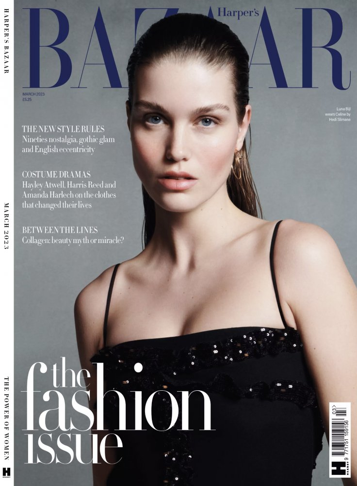
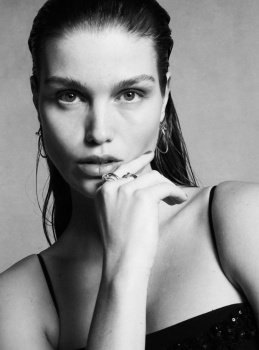
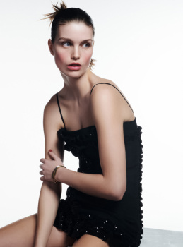
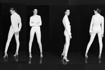
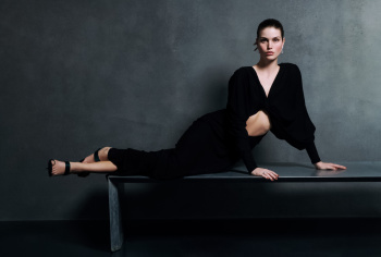
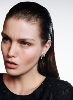
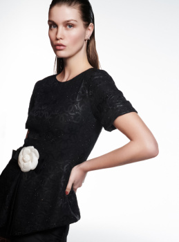
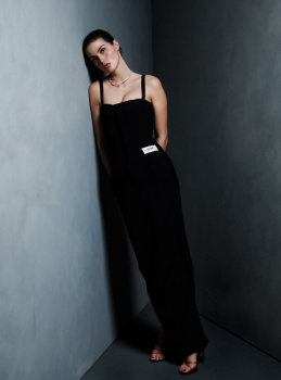
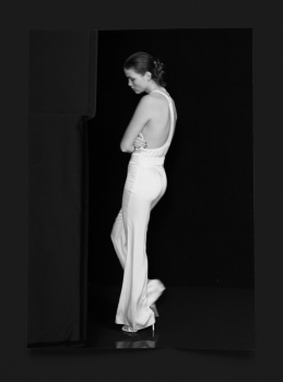
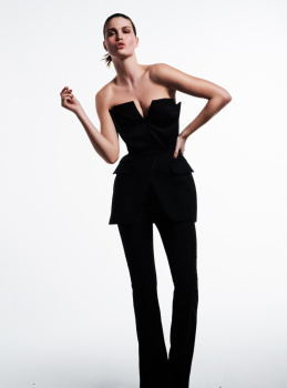
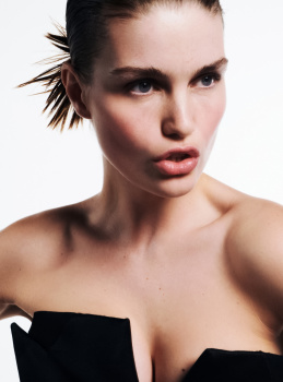
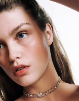
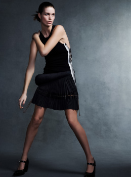
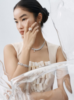
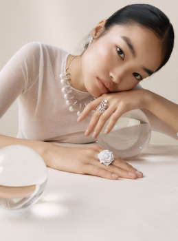
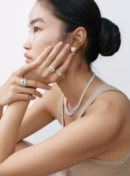
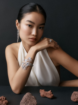
UK Harper’s Bazaar March 2023 : Luna Bijl by Betina du Toit
- Thread starter ChicSaks
- Start date
D
Deleted member 1957
Guest
Nice to see a model on the fashion issue but with one of the best print models at the moment I expected them to have some fun with the shoot. Hope she has a major editorial.
penny609
Well-Known Member
- Joined
- Apr 21, 2007
- Messages
- 5,746
- Reaction score
- 748
I share your feeling, they have Luna and we get a simple portrait (may it be beautiful) with a grey background. Still keep high hopes for the editorial, she usually delivers whatever the theme is.Nice to see a model on the fashion issue but with one of the best print models at the moment I expected them to have some fun with the shoot. Hope she has a major editorial.
Benn98
Well-Known Member
- Joined
- Aug 6, 2014
- Messages
- 42,530
- Reaction score
- 20,571
It actually looks a bit festive. Nice, but very inoffensive and too understated for an issue that signals a new season. And the hairstyle is not doing her face shape any favours.
There will likely be a long editorial featuring Luna.
There will likely be a long editorial featuring Luna.
penny609
Well-Known Member
- Joined
- Apr 21, 2007
- Messages
- 5,746
- Reaction score
- 748
There will likely be a long editorial featuring Luna.
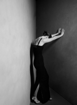
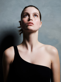
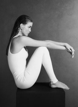
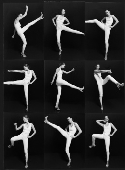
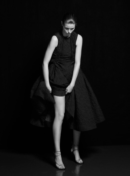
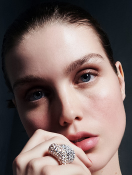
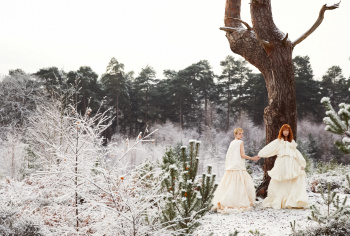
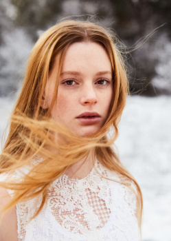
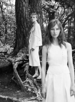
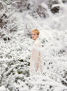
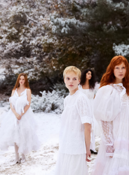
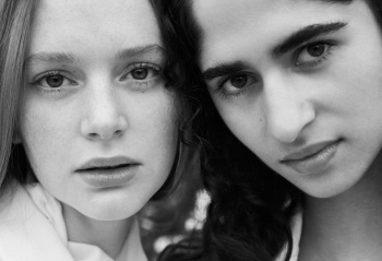
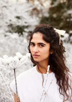
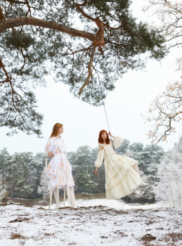
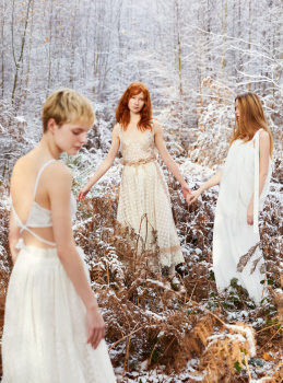
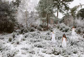
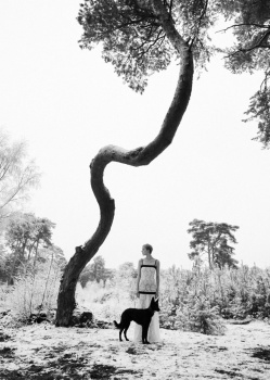
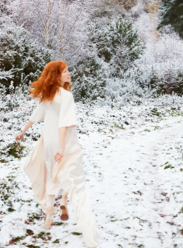
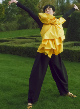
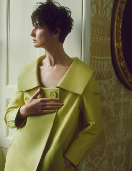
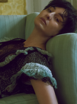
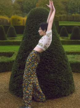
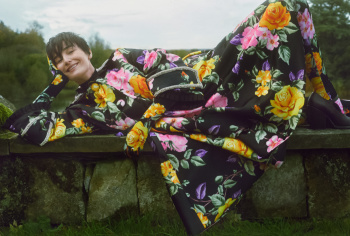
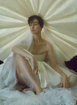
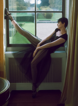
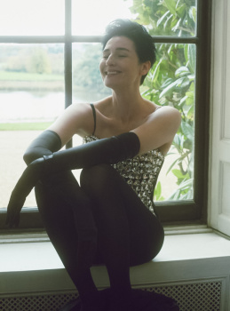
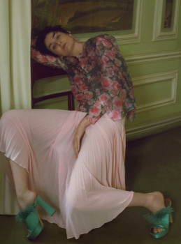
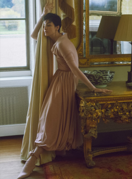
Some images from the editorial (perhaps even the whole story) are posted on Luna's thread. Sorry, don't have time enough to repost them here but in case you want to see... It's in the same mood as the cover even if on some pages her expression and energy are stronger.
- Joined
- Jan 9, 2008
- Messages
- 35,316
- Reaction score
- 20,315
I’m afraid to start sounding like an absolute grouch of tFS lately, but what on Earth is this… for March! Far more suited to a month like November. Are British Bazaar now afraid of colour? Two covers in a row which has been completely devoid of a sense of life and energy.
On the flip side... I adore Luna Bijl, and will always approve of models scoring the covers of British fashion magazines. The cover as a whole is rather classic, timeless, easy on the eye and certainly reads like a fashion magazine cover should.
On the flip side... I adore Luna Bijl, and will always approve of models scoring the covers of British fashion magazines. The cover as a whole is rather classic, timeless, easy on the eye and certainly reads like a fashion magazine cover should.
WAVES
Well-Known Member
- Joined
- Aug 29, 2020
- Messages
- 3,012
- Reaction score
- 3,120
it’s amazing to have a model on the cover of Harpers Bazaar however feels a little too generic and tamed. and quite of a fandom choice too since she hasn’t scored a campaign in a while… I’m sure the editorial will be good.
Zorka
Well-Known Member
- Joined
- Jan 29, 2014
- Messages
- 16,486
- Reaction score
- 14,427
caioherrero
Well-Known Member
- Joined
- Sep 2, 2017
- Messages
- 2,937
- Reaction score
- 1,491
Doesn’t look like a spring issue
liberty33r1b
Well-Known Member
- Joined
- Nov 9, 2003
- Messages
- 24,304
- Reaction score
- 691
what a beautiful cover, love it
tigerrouge
don't look down
- Joined
- Feb 25, 2005
- Messages
- 18,289
- Reaction score
- 8,091
Flicking through this ahead of seeing my print copy... 246 pgs. Lots of new season ads (I see Chanel is back on The Staircase). Only one cover shot seems to have been created, no subscribers one.
Some of the art direction in the main editorial section really leans heavily into 90s US Bazaar, in terms of font choice and positioning, even more so than recent months, when things have been heading that way.
You know, Vogue has big name recognition, but there's something about this issue of Bazaar that blows it out of the water in terms of how things have been selected, researched and presented to be relevant to the people who read UK Bazaar. There isn't the sense that the magazine is a vehicle for the editor's ego, with the audience coming second, or that it's a performative vision of people.
D
Deleted member 1957
Guest
Luna saved the ed but it would have been better. Love Erins though
Similar Threads
- Replies
- 26
- Views
- 5K
- Replies
- 8
- Views
- 1K
- Replies
- 7
- Views
- 3K
- Replies
- 17
- Views
- 5K
D
Users who are viewing this thread
Total: 2 (members: 0, guests: 2)


