tigerrouge
Well-Known Member
- Joined
- Feb 25, 2005
- Messages
- 18,869
- Reaction score
- 9,662
I had a quick flick through the digital copy before my print one arrives. A positive thing I could say is that the mood throughout the magazine is consistent - the energy and even the overall colours of the content are all on the same level.
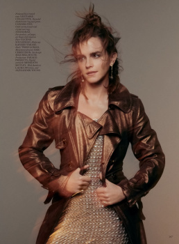
Emma Watson, not a fan, will not be happy if her cover is inflicted on me, I don't want to read about how she's left acting behind - it's more likely that acting has left her behind - there appears to be no mention of feminism in her feature, she must have abandoned that like a bad job, but of course, she's all about sustainability now, and always has been. I can't be too harsh, she's a person who had a role that's provided her with f*ck-off money for life, and being in that position might turn the best of us into being an inconsistent bullshitter, just because we can.
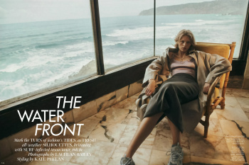
Amber's editorial wouldn't be out of place in UK Bazaar. I'm very taken with one image in the Water Front, where the wave is breaking in the background as she sits at the table in front of the window. There's more of a sense of narrative in that shoot.

