She has the kind of facial bone structure that helpfully resembles actual models (Freja) but I give it to her, she's good in front of the fashion still camera in her own right. Good choice, good execution - well done, Elle.
They somehow took the charm right out of her and we are left with hollow, awkward portraits. The cover is not good. I adore Jenna but I am so disappointed with what the magazine has done with her.
Stunning cover though I never really likes that top. She photographs really well but the editorial made her look a little too young for the more serious editorial. I wish they had kept it fun and youthful maybe on location because she can deliver.
I'm surprised with the result of the cover story, it's amazing & Jenna gives a vibe of Jean Shrimpton on every photo with a pretty tribute to the 60's aesthetic.
Great cover, really great! I'm able to appreciate the minimal beauty styling, how it allows the fashion to standout and how the impactful Loewe creation still doesn't steal the spotlight from Jenna Ortega. This is all just so sympathetically executed - perfectly!
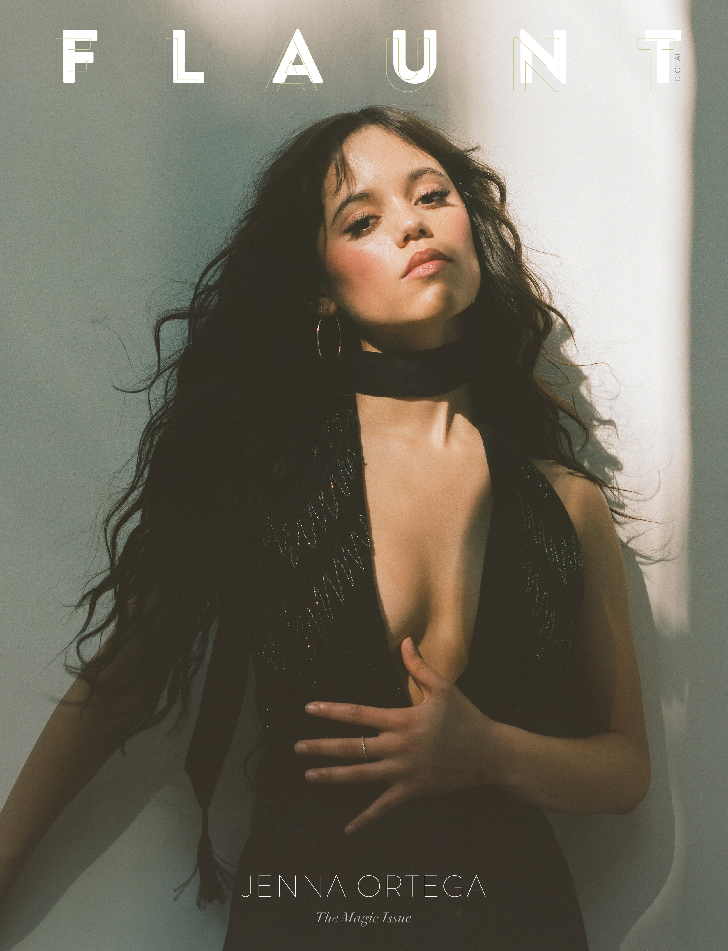
The photograph of Jenna wearing the black sequined Alaia is gorgeous. You can understand why @[B]crmsnsnwflks[/B] selected the image for their entry in this week's Cover Challenge round, given the fact the shot works incredibly well as a cover.
I find myself liking most of Bryce Anderson's work on instagram but unfortunately it's always underwhelming when presented anywhere else. Same issue with Szilveszter Mako.
This site uses cookies to help personalise content, tailor your experience and to keep you logged in if you register.
By continuing to use this site, you are consenting to our use of cookies.