You are using an out of date browser. It may not display this or other websites correctly.
You should upgrade or use an alternative browser.
You should upgrade or use an alternative browser.
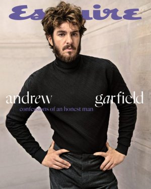
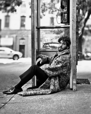
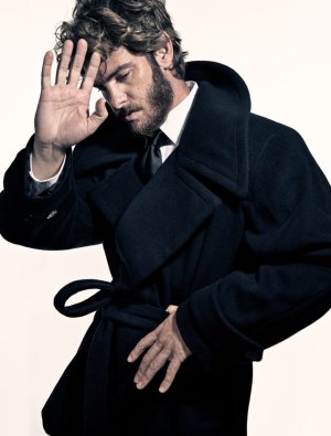
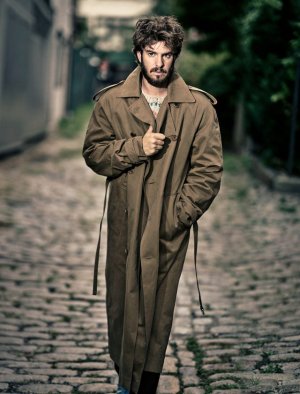
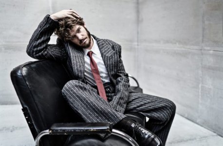
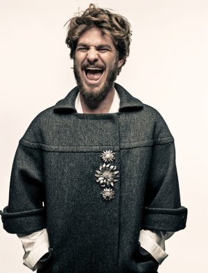
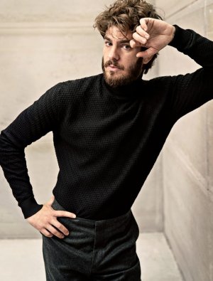
US Esquire October/November 2024 : Andrew Garfield by Mark Seliger
- Thread starter Kenny
- Start date
phungnam96
Well-Known Member
- Joined
- Jul 7, 2011
- Messages
- 1,133
- Reaction score
- 764
Hobo core is the new black?
honeycombchild
Well-Known Member
- Joined
- Jan 22, 2009
- Messages
- 8,841
- Reaction score
- 727
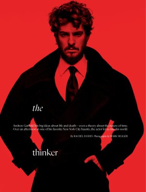
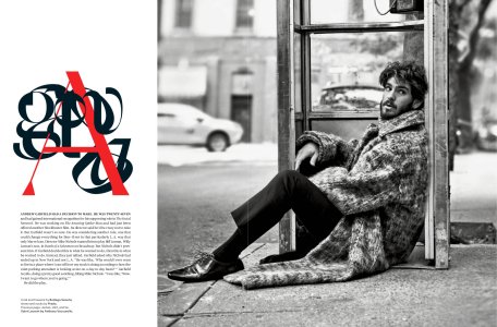
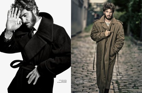
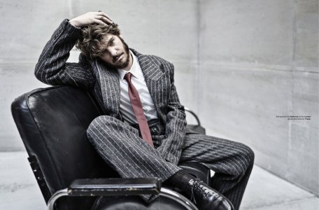
These are not good photos at all and not at all a great representation of a very handsome subject. He looks tired and so dishevelled. Maybe it was for a role, but even so, big pass for me.
D
Deleted member 1957
Guest
The hair doesnt work for him makes him look like a Karen.
Kenny
Well-Known Member
- Joined
- Jul 27, 2021
- Messages
- 189
- Reaction score
- 528
Phuel
Well-Known Member
- Joined
- Feb 18, 2010
- Messages
- 5,726
- Reaction score
- 8,725
^^^ That version of the cover is the only tolerable image in the entire issue.
Whenever Norman Jean Roy isn’t helming the coverstory, this Esquire instantly plummets into a dusty, dull, dated aesthetic. Mark Seliger is intolerably dated and obnoxiously cliched. These celebs need to slap any photographer that suggests a screaming pose; That sensibility he’s deployed in the mid-2000s for John Varvatos and featuring some annoying person like Perry Farrell needs to be forever left behind in 2004, like Juicy Couture. (...Perry Farrell also gets a 2-page feature in this issue, looking like Caitlyn Jenner’s elderly sis with his brand new squeaky, shiny, tightly-pulled facelift.)
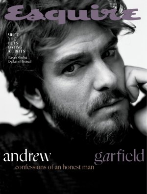
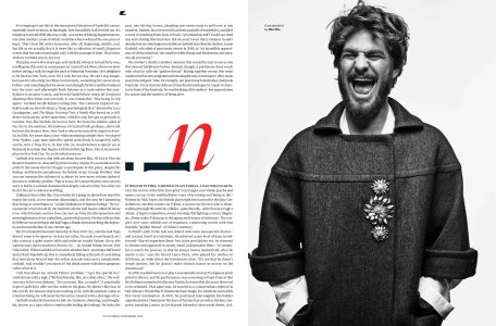
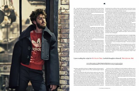
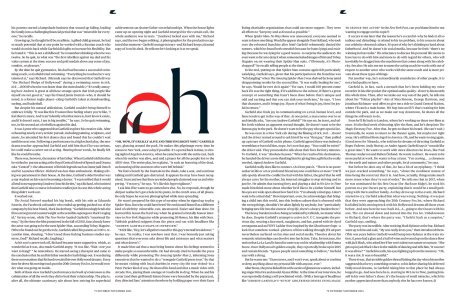
Esquire USA October/November 2024
Whenever Norman Jean Roy isn’t helming the coverstory, this Esquire instantly plummets into a dusty, dull, dated aesthetic. Mark Seliger is intolerably dated and obnoxiously cliched. These celebs need to slap any photographer that suggests a screaming pose; That sensibility he’s deployed in the mid-2000s for John Varvatos and featuring some annoying person like Perry Farrell needs to be forever left behind in 2004, like Juicy Couture. (...Perry Farrell also gets a 2-page feature in this issue, looking like Caitlyn Jenner’s elderly sis with his brand new squeaky, shiny, tightly-pulled facelift.)


Esquire USA October/November 2024
MModa
Well-Known Member
- Joined
- Oct 19, 2023
- Messages
- 908
- Reaction score
- 805
The b&w close-up cover appears on the newsstands and the color cover is sent to subscribers. I prefer the newsstand cover. The entire shoot does not look special in any shape or form. However, I prefer the photography and styling inside featuring comedian Hasan Minhaj. It is shot by Guy Aroch and styled by Nick Sullivan.
jeremydante
Well-Known Member
- Joined
- Jul 15, 2009
- Messages
- 3,099
- Reaction score
- 572
Is her method acting and growing out all his hair on his head (yes, the whole head including his face) for a role?
Similar Threads
- Replies
- 20
- Views
- 2K
D
- Replies
- 1
- Views
- 453
- Replies
- 11
- Views
- 2K
Users who are viewing this thread
Total: 2 (members: 0, guests: 2)
New Posts
-
-
Gucci by Gucci Fragrance 2006 : Freja, Raquel & Natasha by Inez & Vinoodh (11 Viewers)
- Latest: audace
-
-
-


