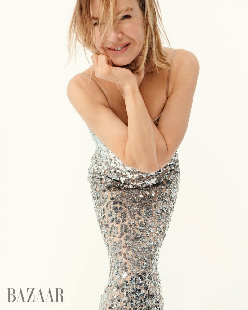
US Harper’s Bazaar April 2022 : Renée Zellweger by Mel Bles | Page 2 | the Fashion Spot

US Harper’s Bazaar April 2022 : Renée Zellweger by Mel Bles

True, there were those fashion editorials from Carine that got reprinted. I remember thinking most of them were pretty bad - Bruce Springsteen on a September cover!
No, there were others. Some from bazaar China. Look at the last issues from her.
 
Yes, especially if Bazaar's signature use of typography was brought into play, working with the white space and the shape she's making.
 
Not only does this magazine produce dire content, that content is now getting increasingly reprinted across other editions, as if the American one represents some sort of flagship publication, and all the others must follow in its wake.

An interesting twist would be if content from other Bazaars around the world could be reprinted in this one.

That's because it is.
It's the OG, just like American Vogue is the OG.
 
The first cover is awkward, but not that bad.
The second one is unforgivable. Renee should sue.
 
What they put up on the website is atrocious.
That styling?!
 
The Glenda years were awful and nothing has improved since her departure. What a shame.
 
I'll say it out loud, I miss Glenda. Give me "FABULOUS AT EVERY AGE" and "BEST BAGS & SHOES" with that plain generic background... over this mess.

Oh my god. I have to agree, which is making me cringe at myself. :rofl:

What's really bothering me about this cover (aside from the image) is the layout of the text. It's just... off.
 
My thoughts on Samira Nasr at the helm of Harper's Bazaar remain unchanged, with the unveiling of yet another series of dire covers. Another missed opportunity and another occasion in which I feel this magazine with such a rich history slipping away. A crying shame!
 
That's because it is.
It's the OG, just like American Vogue is the OG.

My point is, despite its history and its resouces, it's not acting like it. It's generally producing forgettable editorials that make people feel the opposite of inspired, and written content that strives to imitate the tone of Radhika's Vanity Fair. Rather than leading the Bazaar brand worldwide, it's a pale imitation of its former self, and seemingly happy to trail in the wake of what other magazines are doing.

I'm about to flick through this issue online, let's see if I can eat my words... it's 160 pages, the theme is reinvention, as exemplified by Renée Zellweger, according to the editor's letter. Because we're moving into spring-summer fashion, there's a lot more colour throughout the pages, which helps lift the mood of the magazine and provide a little more energy.

The Renée cover story... it is what it is. It's followed by MODERN LOVE, a 10 pg editorial, by Camille Vivier, with Zinnia Kumar and Sade van der Hoeven, which is a hybrid of studio and location shots, the location being Canal Saint-Martin in Paris. Then there's a 8 pg jewellery section, INNER VISIONS, and a piece on the artistic director of Hermès, ending with an 8 pg studio edit, A CUT ABOVE, by Deirdre Lewis, with Abby Champion.

There's nothing here that I would look twice at, and still-life jewellery edits are a dime a dozen in UK Bazaar and Tatler, who have them down to a fine art, month after month.

If I had to pick one word: anaemic. This magazine feels anaemic, lacking energy and drive. But one positive is that it's not childish - the magazine maintains a consistent approach in regarding its audience as having a degree of maturity, and it tries to produce content at that level, which is something I probably don't give it enough credit for doing.
 
I just flipped through my copy as well (in print it's 146 pages) and it's instantly forgettable.
 
God, the covers from US Bazaar it's getting worse on every issue.
 

Users who are viewing this thread

New Posts

Forum Statistics

Threads
214,442
Messages
15,262,006
Members
88,454
Latest member
scribblesofthegods
Back
Top