You are using an out of date browser. It may not display this or other websites correctly.
You should upgrade or use an alternative browser.
You should upgrade or use an alternative browser.
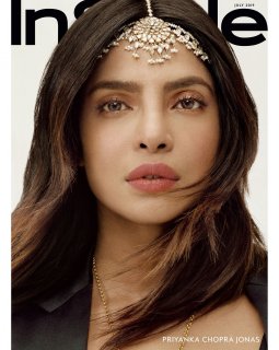
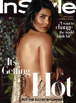
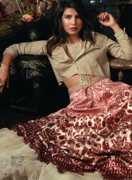
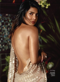
US InStyle July 2019 : Priyanka Chopra by Robbie Fimmano
- Thread starter vogue28
- Start date
caioherrero
Well-Known Member
- Joined
- Sep 2, 2017
- Messages
- 2,938
- Reaction score
- 1,492
OMG. This is too bad Laura. Why u did this?
dodencebt
Well-Known Member
- Joined
- Sep 11, 2010
- Messages
- 5,227
- Reaction score
- 2,919
I'm having the same issue with it as with Kate Moss' VP cover by Mikael - it's shot from a waist perspective and it gives the person's back too much space to dominate the image. It's all I can see when I look at it; I don't even look at Priyanka's face. And there's no neck!
Benn98
Well-Known Member
- Joined
- Aug 6, 2014
- Messages
- 42,530
- Reaction score
- 20,571
I think it's not bad
So do I. From the neck up is questionable (head looks too big for her frame, and the absence of her neck), but I'm quite taken with the sensuality here. The stylist really did a shoddy job. She's hardly wearing that dress.
Benn98
Well-Known Member
- Joined
- Aug 6, 2014
- Messages
- 42,530
- Reaction score
- 20,571
God, what's with magazine retouchers going overboard? It's so odd.
You don't need much with Priyanka. And to still lay on that kitschy jewels make the entire thing look so cheap. Like it's something lifted from Vogue India.
You don't need much with Priyanka. And to still lay on that kitschy jewels make the entire thing look so cheap. Like it's something lifted from Vogue India.
- Joined
- Jan 9, 2008
- Messages
- 35,351
- Reaction score
- 20,425
I'm having the same issue with it as with Kate Moss' VP cover by Mikael - it's shot from a waist perspective and it gives the person's back too much space to dominate the image. It's all I can see when I look at it; I don't even look at Priyanka's face. And there's no neck!
Quite a hard pose to pull off! I also wasn't a great admirer of the Kate Moss cover, and off the top of my head, cannot recall even a well-established model pulling off such a pose. Maybe Gisele on the cover of Harper's Bazaar back in 2003 and 2009?
Similar Threads
- Replies
- 17
- Views
- 4K
- Replies
- 28
- Views
- 7K
- Replies
- 4
- Views
- 1K
D
Users who are viewing this thread
Total: 2 (members: 0, guests: 2)


