You are using an out of date browser. It may not display this or other websites correctly.
You should upgrade or use an alternative browser.
You should upgrade or use an alternative browser.
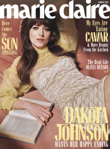
US Marie Claire Summer 2020 : Dakota Johnson by Steven Pan
- Thread starter vogue28
- Start date
Benn98
Well-Known Member
- Joined
- Aug 6, 2014
- Messages
- 42,530
- Reaction score
- 20,571
I like the concept and the cropping of the image because it's not something we normally see on covers. Someone lounging, reading a book. Everything else is really quite offensive. The cheap-looking wig, the 'styling', and that new aggressive font.
caioherrero
Well-Known Member
- Joined
- Sep 2, 2017
- Messages
- 2,938
- Reaction score
- 1,492
I hate the new EIC
ThickGlossies
Active Member
- Joined
- Mar 1, 2013
- Messages
- 156
- Reaction score
- 65
Im getting Playboy vibes from this LMAO
Annie Hall
Member
- Joined
- May 11, 2020
- Messages
- 27
- Reaction score
- 55
I actually don't hate the font or colour scheme, but whose face is that? I thought fashion (not social media, obviously) had evolved past the point of photoshopping beyond recognition. It's a pass from me.
Also LOL at the caviar headline
Also LOL at the caviar headline
Handbag Queen
Well-Known Member
- Joined
- Apr 5, 2006
- Messages
- 1,719
- Reaction score
- 204
I love this!
D
Deleted member 1957
Guest
This really aged her, looks like a bad editorial from a vintage mag
- Joined
- Jan 9, 2008
- Messages
- 35,329
- Reaction score
- 20,364
Always been partial to Dakota Johnson and certainly don’t think this is the worst magazine cover I’ve seen her on. The colours are nice for a summer cover and I’m quite fond of the styling and whole setup, which I find even more fitting considering most of us are at home right now.
Yet I cannot help but envision a gorgeous and simplistic portrait of Dakota from Thomas Whiteside, had we still had Anne Fulenwider at the helm. Aya Kanai appears to have a thing for all things retro.
Yet I cannot help but envision a gorgeous and simplistic portrait of Dakota from Thomas Whiteside, had we still had Anne Fulenwider at the helm. Aya Kanai appears to have a thing for all things retro.
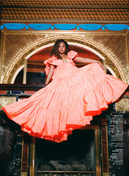
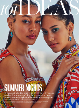
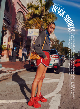
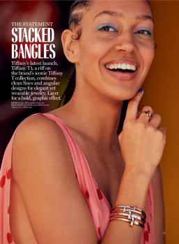
Got this in the mail today. 92 pages.
Review:
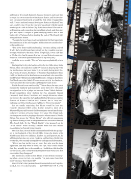
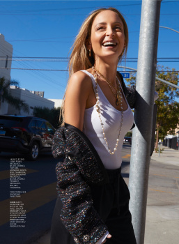
"Nicole Unscripted"
P:Nicole Nodland
S: Yashua Simmons
Nicole Richie
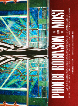
"Phoebe Robinson Is Doing the Most"
P:Tyler Joe
S: Ryan Young
Articles about female surfers and the Olympics, rideshares "from hell," and Jessica Elbaum
Review:
"Nicole Unscripted"
P:Nicole Nodland
S: Yashua Simmons
Nicole Richie
"Phoebe Robinson Is Doing the Most"
P:Tyler Joe
S: Ryan Young
Articles about female surfers and the Olympics, rideshares "from hell," and Jessica Elbaum
Benn98
Well-Known Member
- Joined
- Aug 6, 2014
- Messages
- 42,530
- Reaction score
- 20,571
Benn98
Well-Known Member
- Joined
- Aug 6, 2014
- Messages
- 42,530
- Reaction score
- 20,571
Benn98
Well-Known Member
- Joined
- Aug 6, 2014
- Messages
- 42,530
- Reaction score
- 20,571
Srdjan
Well-Known Member
- Joined
- Jan 11, 2012
- Messages
- 4,994
- Reaction score
- 1,491
What? Not even 100 pages for a triple-month issue? That sounds really bad.92 pages.

Similar Threads
- Replies
- 11
- Views
- 4K
- Replies
- 32
- Views
- 9K
- Replies
- 3
- Views
- 1K
- Replies
- 24
- Views
- 6K
- Replies
- 0
- Views
- 780
Users who are viewing this thread
Total: 2 (members: 0, guests: 2)
New Posts
-
Matthieu Blazy - Designer, Creative Director of Bottega Veneta (4 Viewers)
- Latest: thegentlemanboyfriend
-
-
-
-


