You are using an out of date browser. It may not display this or other websites correctly.
You should upgrade or use an alternative browser.
You should upgrade or use an alternative browser.
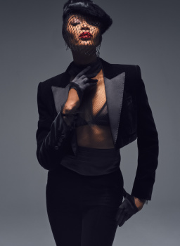
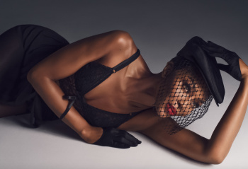
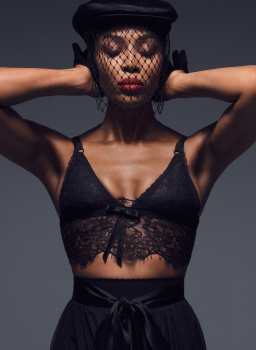
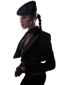
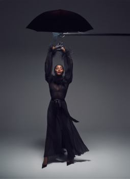
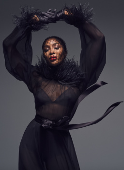
V Magazine #151 Winter 2024 : Naomi Campbell by Solve Sundsbo
- Thread starter jeje10
- Start date
- Joined
- Jul 14, 2017
- Messages
- 14,873
- Reaction score
- 22,092
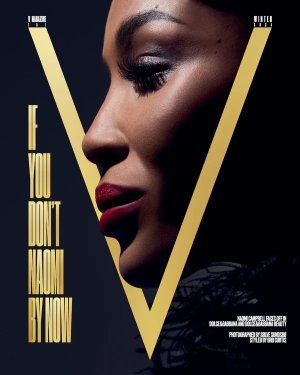
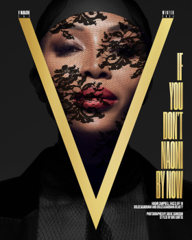
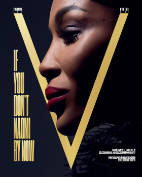
They really sabotaged the newsstand buyer with this... horrid. But an interesting choice to have her on the cover amid all the controversy regarding her charity - and in Dolce & Gabbana, of all brands. Gotta love her persistence lmao
I do like the special cover tho
I do like the special cover tho
Royal-Galliano
völlig losgelöst
- Joined
- Nov 25, 2005
- Messages
- 16,080
- Reaction score
- 749
the profile cover looks stunning but no. it's interesting that there have been so many people in the industry cancelled over the years, but naomi is still standing. does she know something the others wouldn't? lol
ReneSanchez
Well-Known Member
- Joined
- Aug 20, 2020
- Messages
- 157
- Reaction score
- 536
I used to love V Magazine, but this is a hard pass, it has been ages since they had a worthy issue. Gigi's celebration issue felt such a non-event and while I find this couture concept and hardcover interesting, Naomi as a subject in this time just feels irrelevant.
D
Deleted member 1957
Guest
Love both but prefer the second cover. The little smirk is selling the cover!
- Joined
- Jan 9, 2008
- Messages
- 36,861
- Reaction score
- 24,631
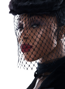
The cover with the Dolce & Gabbana lace veil is definitely the strongest cover out of the two. I'm not hating on this. I am genuinely sat here feeling like this is the best Naomi Campbell has looked in what feels like AGES! She suits those Dolce & Gabbana pieces perfectly, and I love how chic, sharp, and sexy this all is.
jeremydante
Well-Known Member
- Joined
- Jul 15, 2009
- Messages
- 3,597
- Reaction score
- 1,237
At this point, Naomi has done everything- five times over.
So nothing feels fresh, nothing feels new or exciting. It really begs the question- why still be all over the place? Respect to her tenure in the game, for sure. But, at what point is enough enough or time to go into something bigger or a retirement?
Especially with the Fashion for Relief scandal, wouldn't it have been more wise to kind of chill for the moment? Or at least for the remainder of this year? V has kind of lost it, as far as generating exciting content as they did in the past.
Zorka
Well-Known Member
- Joined
- Jan 29, 2014
- Messages
- 18,668
- Reaction score
- 20,985
MModa
Well-Known Member
- Joined
- Oct 19, 2023
- Messages
- 2,047
- Reaction score
- 2,566
The V covers with Naomi are not my cup of tea. However, I do think that this is the best Naomi editorial in what seems like forever. She actually looks attractive and the photographs are very polished and beautiful. I do completely agree with your comments regarding her work in the last few years.At this point, Naomi has done everything- five times over.
So nothing feels fresh, nothing feels new or exciting. It really begs the question- why still be all over the place? Respect to her tenure in the game, for sure. But, at what point is enough enough or time to go into something bigger or a retirement?
Especially with the Fashion for Relief scandal, wouldn't it have been more wise to kind of chill for the moment? Or at least for the remainder of this year? V has kind of lost it, as far as generating exciting content as they did in the past.
alwaysademo
Well-Known Member
- Joined
- May 25, 2024
- Messages
- 599
- Reaction score
- 1,112
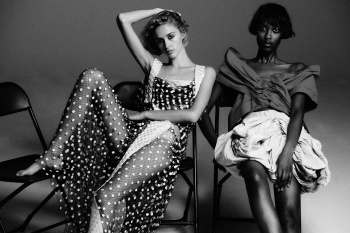
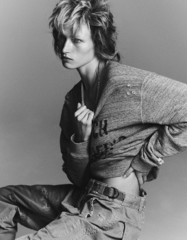
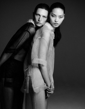
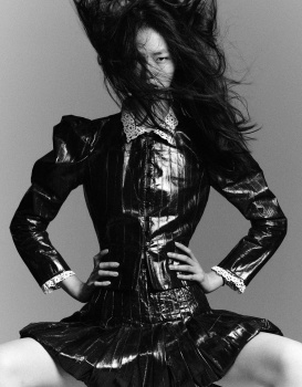
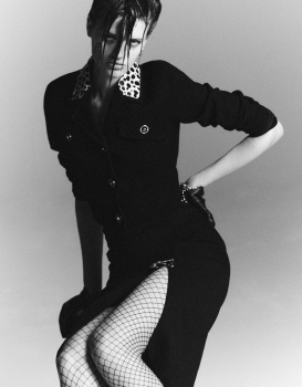
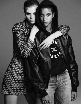
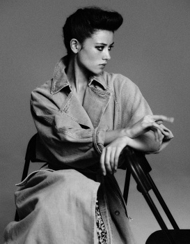
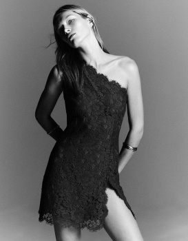
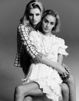
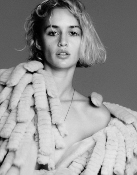
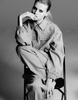
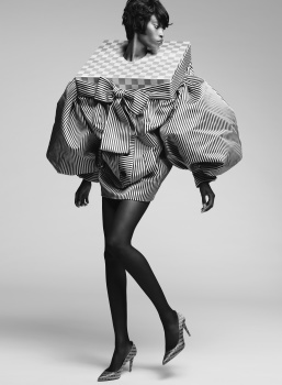
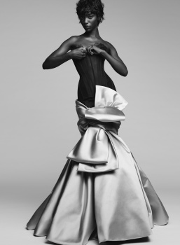
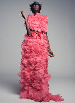
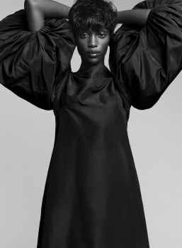
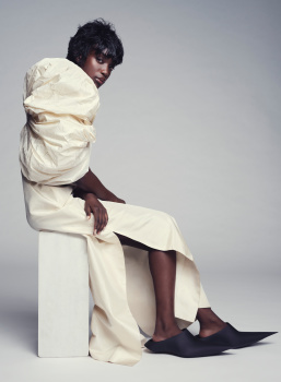
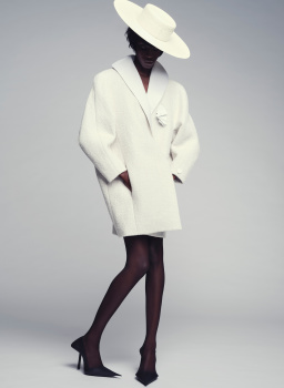
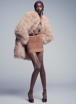
Maty Fall is so dreamy. I really like the shot with the puffy sleeves.
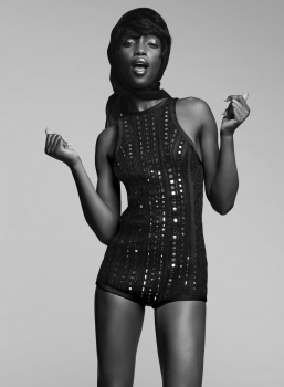
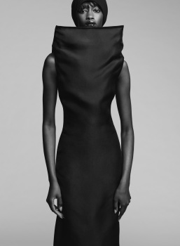
Jiahui is too. My eyes go straight to her in last pic.
Jiahui is too. My eyes go straight to her in last pic.
penny609
Well-Known Member
- Joined
- Apr 21, 2007
- Messages
- 6,004
- Reaction score
- 1,164
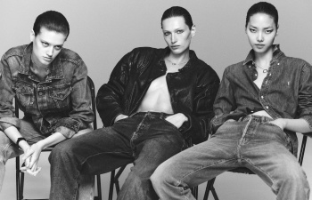
Haha, this issue sort of is, for sure. No comment on Naomi's performance, not worth.This magazine needs to stop. What an old fashioned bag of boredom.
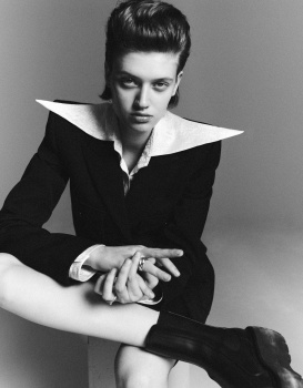
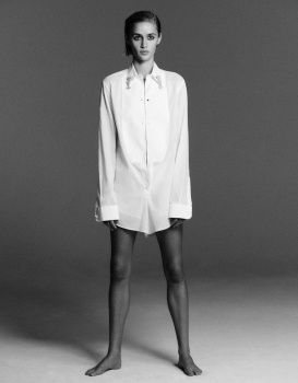
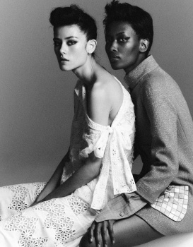
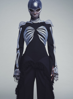
Second story is slightly better, I do like some of the pictures posted here but all in all, it's just the same of recipe Krisprolls, sorry I meant Chris Colls, gives us for about a decade or more. Special mention to Quinn Mora, though, too rare in magazines and definitely the one catching my attention in that series.
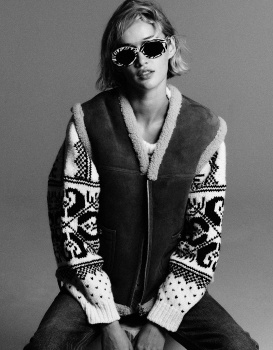
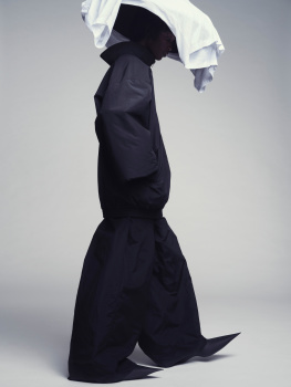
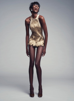
Last one by Nathaniel Goldberg is not bad either, but nothing beyond exciting. Simple studio shots put together can work well every now and then, but there are legions of them everywhere and there have been some for already too long.
So, yes, if all they can offer is a 3-story-issue with nothing standing out, they might consider stopping it...
jeje10
Well-Known Member
- Joined
- Apr 30, 2024
- Messages
- 282
- Reaction score
- 586
I found it on Instagram, in case you haven't seen it yet 🙂Does anybody have photos of the Aubrey Plaza editorial in this issue? I just saw makeup artist Kathy Jeung posted about it. The photos look great.
Similar Threads
- Replies
- 14
- Views
- 3K
- Replies
- 9
- Views
- 3K
- Replies
- 5
- Views
- 3K
Users who are viewing this thread
Total: 1 (members: 0, guests: 1)

