Vanity Fair October 2021 : Regina King by Jackie Nickerson

I like her but don’t like this photo as a cover. Zero energy.
 
What a terrible cover.
Bad styling, color scheme, and pose.
She looks like a deluxe bottle of pepto bismal.

She's interesting, and usually photographs beautifully, but nothing works here.
 
^ Ha! Never thought Balenciaga and House of Deréon would be in the same conversation but that's just where we are in 2021 I suppose.

I can hear Myrtle Snow somewhere screaming, "BALENCIAGA!" in despair.
 
  • Like
Reactions: KoV
This magazine is so lost, while Air Mail is thriving! Hilarious really.
Who would run a cover with this composition, colour, photography everything?

Was the dress designed by Beyonce's mom?

:lol::lol::lol:
After that diamond rant, I'd say she's better off turning curtains into dresses than 'clapping back'
 
That dress could’ve served as a fabulous Divine homage, but the shot is d e a d. What a waste of Regina who has so much beauty and presence on camera.
 
THE POWER! THE GLORY!!!!! JAW ON FLOOR! DED!!!! QUEEN!!!!! STYLE ICON TO END THEM ALL!!!! DIVINE GODDESS! REGAL EMPRESS! I WORSHIP!!!!!!! PURE MAGIC!

Frankly - I'm so tired of this kind of treatment of celebrities, tbh. Can celebs be fabulous? Beautiful? Stylish? Yes. But POWER AND GLORY? Kiss her butt harder. I know it's kind of not entirely serious, but it also sort of it.
 
What a shame she doesn't have much energy in the shot because the set-up is very striking - the pink and red combination really works for me. A more dramatic pose would have been great, or even just a shot of her laughing; it would have really elevated everything.
 
Vanity Fair October 2021


Regina King In Her Element

Photography: Jackie Nickerson
Styling: Nicole Chapoteau
Hair: Larry Sims
Makeup: Porsche Cooper
Cast: Regina King


Vanity Fair Digital Eiditon
 
THE POWER! THE GLORY!!!!! JAW ON FLOOR! DED!!!! QUEEN!!!!! STYLE ICON TO END THEM ALL!!!! DIVINE GODDESS! REGAL EMPRESS! I WORSHIP!!!!!!! PURE MAGIC!

Frankly - I'm so tired of this kind of treatment of celebrities, tbh. Can celebs be fabulous? Beautiful? Stylish? Yes. But POWER AND GLORY? Kiss her butt harder. I know it's kind of not entirely serious, but it also sort of it.


I admit I found your post rather hilarious, but I think the “power and glory” is just a playful nod to her surname, King, and her first name is “Queen” in Latin.
 
Vanity Fair October 2021

After Hours

Photography: Tom Craig
Styling: Nathan Klein
Hair: Neil Moodie
Makeup: Jenny Coombs
Cast: Claire Foy, Sheila Atim, Rebecca Ferguson, Fala Chen, Camille Cottin, Phoebe Dynevor, Sandra Oh


Vanity Fair Digital Edition
 
Must admit that this immediately grabbed my attention on the shelves at the newsstand! The combination of the pink backdrop, red Vanity Fair masthead and the overall composition of the cover was very eye-catching. Perhaps a smile wouldn't have gone amiss, I agree @[B]LastNight[/B].
 
In print, the cover doesn't look as radioactive as the scan suggests, it's bright but it doesn't scald your eyeballs.

But what magazines like Vanity Fair seem to be doing, is using coloured backdrops - big slabs of colour - as compensation for the lack of energy in their cover shots.

I'm a fan of all-red covers, but I've never seen as many produced before as I have during 2020-21.
 
  • Like
Reactions: KoV
I received my copy a week or two ago and I haven't even flipped through it yet. Just a couple of years ago I read many issues cover-to-cover and at least a couple pieces from every issue. Now? Can't remember the last time I read even a single article all the way through.
 
It used to take me an entire month to get through an issue of Vanity Fair, because I had to find the time to sit down and properly read through a feature, which would mention events and people which I would have to find out more about.

Now it takes me a month to start looking at the issue, and then only because it's sitting in the pile of things 'one step away from the recycling bin' and the pile is getting tall, so I need to read them and move them on.

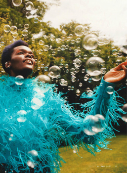
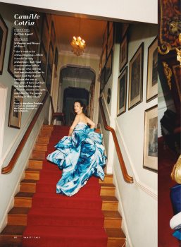
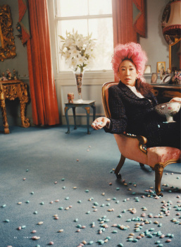
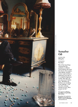
Vanity Fair might always have fawned over its Hollywood cover stars, but at least the accompanying photography attempted a sort of grandeur or a sense of expensive glamour. Now it's just people standing in front of a sheet or a photoshopped block of colour.

As for the serious articles - in all the PR about their global restructuring, do we ever hear Conde Nast boasting about its commitment to quality journalism? They have decided the universe revolves around what people look at online, which means everything gets tailored to short attention spans. Any semblance of depth - in either the photography or the writing - has been deemed unnecessary.

Never mind the idea of writing something that carries an understanding of history and context, as long as you say what's 'right' according to the way the wind blows on the internet, as if the hot air of people's opinions represents a form of distilled wisdom, rather than just the chatter of a billion monkey brains.
 

Users who are viewing this thread

New Posts

Forum Statistics

Threads
212,032
Messages
15,170,263
Members
85,847
Latest member
AntonHansen100
Back
Top
monitoring_string = "058526dd2635cb6818386bfd373b82a4"
<-- Admiral -->