You are using an out of date browser. It may not display this or other websites correctly.
You should upgrade or use an alternative browser.
You should upgrade or use an alternative browser.
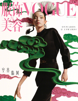
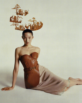
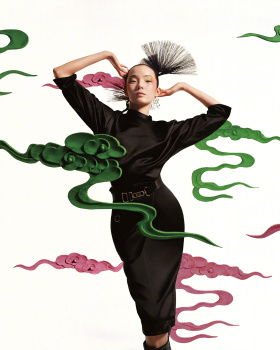
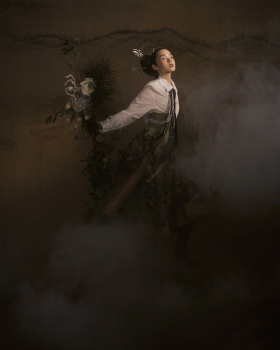
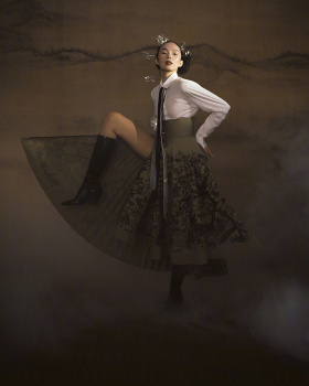
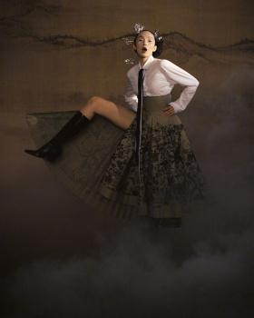
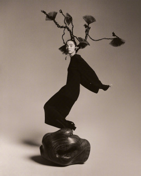
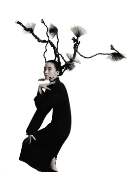
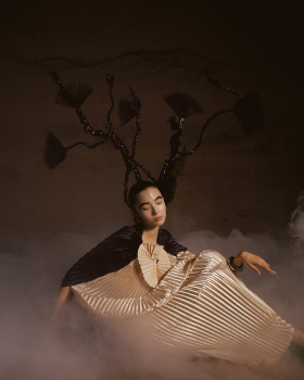
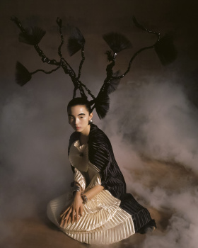
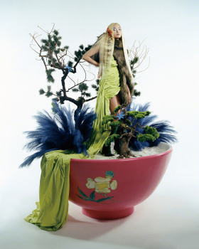
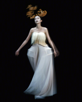
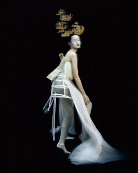
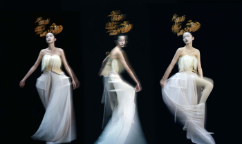
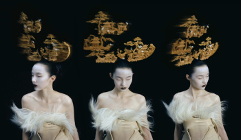
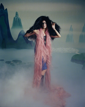
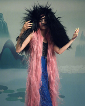
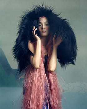
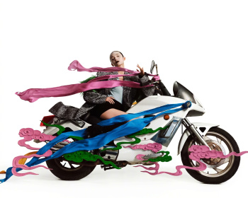
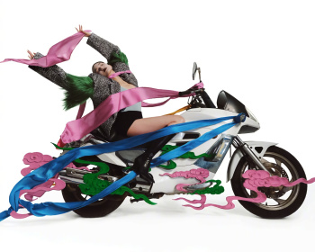
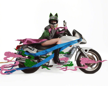
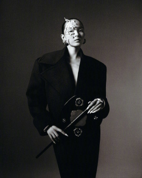
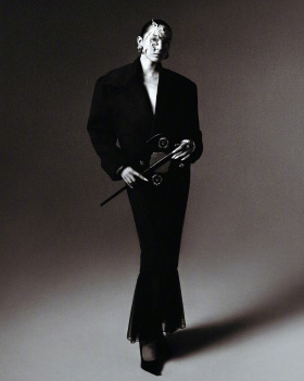
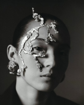
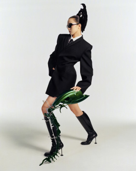
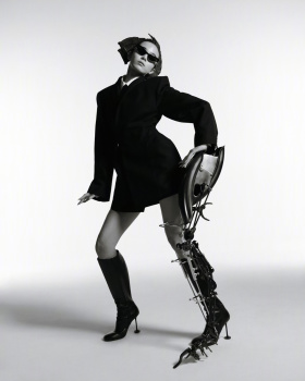
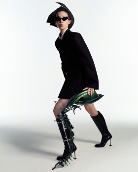
Vogue China August 2022 : Xiao Wen Ju by Leslie Zhang
- Thread starter MDNA
- Start date
luchang732
Active Member
- Joined
- Feb 19, 2018
- Messages
- 45
- Reaction score
- 36
I genuinely LOVE it actually.
Desperate all that "Chinese Ancient Art" marketing, It's quiet a interesting cover.
The baby pink font against green clouds in embossment, really gives this cover life
Desperate all that "Chinese Ancient Art" marketing, It's quiet a interesting cover.
The baby pink font against green clouds in embossment, really gives this cover life
JoCaderone
Well-Known Member
- Joined
- May 19, 2013
- Messages
- 484
- Reaction score
- 123
Ju always delivers
Hafyiez wafa
Well-Known Member
- Joined
- Jul 19, 2018
- Messages
- 916
- Reaction score
- 1,088
The Editorial inside is sooo good tho very "Tim Walker"
Someone please post.. xd
Someone please post.. xd
Zorka
Well-Known Member
- Joined
- Jan 29, 2014
- Messages
- 16,486
- Reaction score
- 14,432
The Editorial inside is sooo good tho very "Tim Walker"
Someone please post.. xd

caioherrero
Well-Known Member
- Joined
- Sep 2, 2017
- Messages
- 2,937
- Reaction score
- 1,491
This is so good
Bertrando3
Well-Known Member
- Joined
- Mar 22, 2010
- Messages
- 5,462
- Reaction score
- 2,129
Very nice !!! Love the cover and story !
Paul Lintag
Well-Known Member
- Joined
- Mar 8, 2021
- Messages
- 673
- Reaction score
- 4,209
D
Deleted member 1957
Guest
Love everything! High fashion seems to be alive in East Asia.
VogueGirl8910
Well-Known Member
- Joined
- Apr 14, 2008
- Messages
- 50,076
- Reaction score
- 8,413
The cover story is amazing & Xiao looked great on every photo. The edit reminds me to the Tim Walker's photography.
Similar Threads
- Replies
- 13
- Views
- 3K
- Replies
- 42
- Views
- 10K
- Replies
- 41
- Views
- 13K
- Replies
- 10
- Views
- 2K
- Replies
- 3
- Views
- 3K
Users who are viewing this thread
Total: 2 (members: 0, guests: 2)
New Posts
-
-
D la Repubblica ‘DStyle’ Autumn/Winter 2024 : Raquel Zimmermann by Mark Kean (13 Viewers)
- Latest: Lola701
-
Louis Vuitton Cruise 2025 : Mona Tougaard, Larissa Moraes & Cara Schadel by Jamie Hawkesworth (8 Viewers)
- Latest: chrisand489
-
-


