Vogue Germany May 2012 : Guinevere van Seenus Claudia Knoepfel and Stefan Indlekofer

i dont like the cover the eds are n ice tho. The cover makes her look shorter
 
Guinevere's editorial looks like it was intended for Kate Moss, who had to pull out at the last minute.
 
Lindsey by Terry is getting really annoying now. Other eds are pretty but nothing note worthy.
 
seems like another lackluster issue without anything too exciting. lindsey's ed looks like something straight out of harpers bazaar, and Ohne Worte is just completely boring. I'll pass....
 
the girl in the 1st, 4th and 7th picture of klassenbeste should be german newcomer franziska mueller, right?
 
i love what ben hassett did in lindsey's editorial, that one and guinevere's are so good! the rest..like terry richardson..so bad
 
stilübung
model: lindsey wixson
photographer: terry richardson
stylist: julia van boehm
hair: duffy
make-up: frank b

Looks like something out of Bazaar.

Even the entire team is the same.

From the Bazaar US March 2012 thread:

chic in the heat
model: lindsey wixson
photographer: terry richardson
stylist: julia von boehm
hair: duffy
make-up: frank b
 
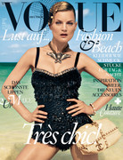
After seeing Guinevere's editorial in the print, the shoot and cover becomes understandable. Because the colours and styling on the cover feels commercial. As opposed to the soft, muted tones of the edit. Perhaps the opening shot of Guinevere wearing Céline would have made a more coherent cover.
 
It reminds me a lot of Britt's Cover from the April 2011 Issue.
Don't like it at all.

vogue.de
 

Users who are viewing this thread

New Posts

Forum Statistics

Threads
210,767
Messages
15,127,282
Members
84,495
Latest member
fashionhill
Back
Top
monitoring_string = "058526dd2635cb6818386bfd373b82a4"
<-- Admiral -->