-
MODERATOR'S NOTE: Please can all of theFashionSpot's forum members remind themselves of the Forum Rules. Thank you.
You are using an out of date browser. It may not display this or other websites correctly.
You should upgrade or use an alternative browser.
You should upgrade or use an alternative browser.
Vogue Greece July/August 2020 : Esther Mastroyianni & Ros Georgiou
- Thread starter amby
- Start date
Srdjan
Well-Known Member
- Joined
- Jan 11, 2012
- Messages
- 5,029
- Reaction score
- 1,541
Interesting how both covers resemble the two covers of VP summer issue from 2018 with Edie Campbell.
BTW, I remember that at the relaunch, they've said a Greek celebrity was supposed to appear on the cover that year. Did I miss it or that never happened?
BTW, I remember that at the relaunch, they've said a Greek celebrity was supposed to appear on the cover that year. Did I miss it or that never happened?
RMDV
Well-Known Member
- Joined
- Oct 31, 2017
- Messages
- 664
- Reaction score
- 513
I hate these. First cover you can't even tell who that is , the floating arm is distracting and the masthead color is depressing.
The second is just awkward. the pose, the fashion.. nothing works here.
By no means do either of these images scream cover.
The second is just awkward. the pose, the fashion.. nothing works here.
By no means do either of these images scream cover.
Miss Dalloway
Well-Known Member
- Joined
- Mar 3, 2006
- Messages
- 25,698
- Reaction score
- 1,003
Once again, gorgeous covers from VG, i actually look forwrd to their threads now.
D
Deleted member 141309
Guest
This looks like shots that would be submitted to some amateur Greek Fashion Photography Competition 2020 Finalists or some similar event.
lauralynn025
le monde est à moi
- Joined
- Jun 6, 2020
- Messages
- 316
- Reaction score
- 335
Oh wow! These are gorgeous. These are definitely in my top favorites for July 2020 so far.
JPineapple
Well-Known Member
- Joined
- Jul 1, 2018
- Messages
- 2,850
- Reaction score
- 3,998
These covers are gorgeous! Very refreshing
Valentine27
Well-Known Member
- Joined
- Jan 4, 2010
- Messages
- 12,826
- Reaction score
- 1,703
These are beautiful covers. The first one reminds me of Anja Rubik for VP April 2018 by Lachlan Bailey (one of my favorite ever), and I agree the second one has a similar vibe to Edie's 2018 VP summer cover. Good to see Ros Georgiou!
subway 123
Well-Known Member
- Joined
- Mar 23, 2009
- Messages
- 41,097
- Reaction score
- 4,914
subway 123
Well-Known Member
- Joined
- Mar 23, 2009
- Messages
- 41,097
- Reaction score
- 4,914
Aggeliki Tsionou by George Katsanakis

Elli Tsitsipa by Dionisis Andrianopoulos

Nadia Serlidou by Panos Davios

Esther Mastroyianni by Dionisis Andrianopoulos

Rosanna Georgiou by Thanassis Krikis

instagram/aumorfia
instagram/ellitsitsipa
instagram/antoniakarra
instagram/rominakaramanea
instagram/dimitriossordoulidis

Elli Tsitsipa by Dionisis Andrianopoulos

Nadia Serlidou by Panos Davios

Esther Mastroyianni by Dionisis Andrianopoulos

Rosanna Georgiou by Thanassis Krikis

instagram/aumorfia
instagram/ellitsitsipa
instagram/antoniakarra
instagram/rominakaramanea
instagram/dimitriossordoulidis
Benn98
Well-Known Member
- Joined
- Aug 6, 2014
- Messages
- 42,532
- Reaction score
- 20,631
I hate these. First cover you can't even tell who that is , the floating arm is distracting and the masthead color is depressing.
The second is just awkward. the pose, the fashion.. nothing works here.
By no means do either of these images scream cover.
Cosign! They've had a winner last month, and now this.
Poor girl must have the strongest neck (and core!) on the second cover.
I do wonder how well all these artistic covers are faring. It's interesting because I imagine this is what tFSers wanted years ago and yet the concept has so very quickly lost its novelty.
Also, what exactly makes these covers Vogue Greece? It could be Vogue Portugal, Vogue Ukraine, Vogue Poland, Vogue Czechoslovakia, Vogue Brazil, and now......Vogue Turkey. That's how interchangeable all of them are.
RMDV
Well-Known Member
- Joined
- Oct 31, 2017
- Messages
- 664
- Reaction score
- 513
Cosign! They've had a winner last month, and now this.
Poor girl must have the strongest neck (and core!) on the second cover.
I do wonder how well all these artistic covers are faring. It's interesting because I imagine this is what tFSers wanted years ago and yet the concept has so very quickly lost its novelty.
Also, what exactly makes these covers Vogue Greece? It could be Vogue Portugal, Vogue Ukraine, Vogue Poland, Vogue Czechoslovakia, Vogue Brazil, and now......Vogue Turkey. That's how interchangeable all of them are.
Exactly - they all started blending together and I can't even tell which is which now tbh. This looks most like Czechoslovakia because their covers have been really terrible, I'm not sure what sales they're even driving.
Greece started out great... the bella shoot was albeit boring but at least pretty and had a strong-ish concept... but this.... this is just a waste of paper, ink and everyone's time who worked on anything related to these shoots.
subway 123
Well-Known Member
- Joined
- Mar 23, 2009
- Messages
- 41,097
- Reaction score
- 4,914
subway 123
Well-Known Member
- Joined
- Mar 23, 2009
- Messages
- 41,097
- Reaction score
- 4,914
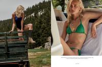
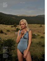
ROAD TRIP
Panos Davios, Photographer
Fashion Editor George Karapetis
Hair by Daniel Babek
Model Nadia Serlidou




10artistmanagement
Panos Davios, Photographer
Fashion Editor George Karapetis
Hair by Daniel Babek
Model Nadia Serlidou


10artistmanagement
subway 123
Well-Known Member
- Joined
- Mar 23, 2009
- Messages
- 41,097
- Reaction score
- 4,914
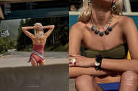
ΘΕΡΙΝΟ ΗΛΙΟΣΤΑΣΙΟ
Photography by Dionisis Andrianopoulos
Marilena Karagianni, Fashion Stylist
Make up by Athina Karakitsou
Model Esther Mastroyianni


10artistmanagement
Photography by Dionisis Andrianopoulos
Marilena Karagianni, Fashion Stylist
Make up by Athina Karakitsou
Model Esther Mastroyianni


10artistmanagement
subway 123
Well-Known Member
- Joined
- Mar 23, 2009
- Messages
- 41,097
- Reaction score
- 4,914
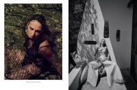
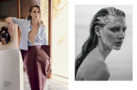
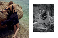
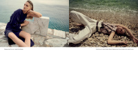
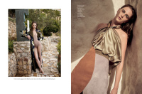
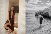
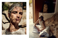
SHAPE OF SUMMER
Thanassis Krikis, Photographer
Fashion Director Nicholas Georgiou
Make up by Hara Papanicolaou
Hair by Christos Vourlis
Model Ros Georgiou


10artistmanagement
Thanassis Krikis, Photographer
Fashion Director Nicholas Georgiou
Make up by Hara Papanicolaou
Hair by Christos Vourlis
Model Ros Georgiou


10artistmanagement
Similar Threads
- Replies
- 12
- Views
- 2K
- Replies
- 3
- Views
- 1K
- Replies
- 30
- Views
- 7K
- Replies
- 5
- Views
- 1K
Users who are viewing this thread
Total: 1 (members: 0, guests: 1)


