You are using an out of date browser. It may not display this or other websites correctly.
You should upgrade or use an alternative browser.
You should upgrade or use an alternative browser.
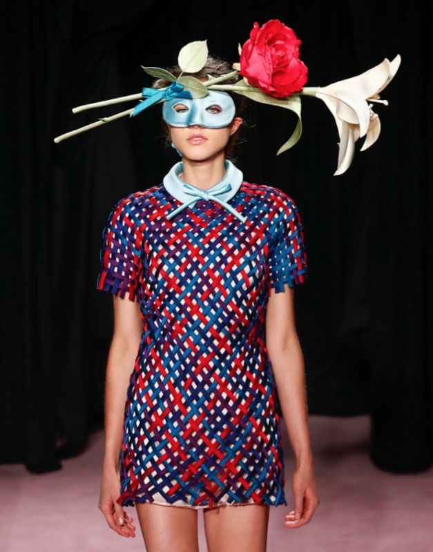
Vogue Netherlands June 2018 : Annely Bouma by Paul Bellaart
- Thread starter amby
- Start date
mistress_f
Hell on Heels
- Joined
- May 27, 2007
- Messages
- 7,239
- Reaction score
- 374
Benn98
Well-Known Member
- Joined
- Aug 6, 2014
- Messages
- 42,582
- Reaction score
- 20,774
^ well they simply kept the entire runway look, it's not photoshopped.
Ah, thanks! Really happy for Annely.
I like the quirkiness about it. I hope they explore that side more. It would be interesting what else they can do with it, judging by this cover. Also for once, the tagline is convincing. It feels warm, it feels like summer. I hope the content won't be a let down.
Les_Sucettes
Well-Known Member
- Joined
- Dec 4, 2007
- Messages
- 3,128
- Reaction score
- 278
Not really my cup of tea but it makes sense to tie in
with the massive V&R exhibition at the Kunsthal in Rotterdam starting this month.
with the massive V&R exhibition at the Kunsthal in Rotterdam starting this month.
Les_Sucettes
Well-Known Member
- Joined
- Dec 4, 2007
- Messages
- 3,128
- Reaction score
- 278
same post.
Deleted member 116957
New/Inactive Member
- Joined
- Apr 4, 2009
- Messages
- 13,746
- Reaction score
- 15,820
Why is this magazine so aggressively ugly?
caioherrero
Well-Known Member
- Joined
- Sep 2, 2017
- Messages
- 3,044
- Reaction score
- 1,602
I really don’t understand why this magazine is so ugly and boring.
versustito
Well-Known Member
- Joined
- Apr 19, 2006
- Messages
- 11,105
- Reaction score
- 920
I love the cover ! very VOGUE 

D
Deleted member 130879
Guest
LOVE the look, love how Dutch it feels (having returned from the Netherlands quite recently really makes this ressonate with me). BUT, there's something way off here as the cover doesn't look great. I think it's a problem with the logo + roses creating a stuffed top VS the empty bottom.
I think this is the case of bad design.
I think this is the case of bad design.
Similar Threads
- Replies
- 31
- Views
- 7K
- Replies
- 49
- Views
- 14K
- Replies
- 12
- Views
- 6K
Users who are viewing this thread
Total: 1 (members: 0, guests: 1)
New Posts
-
-
-
US Harper's Bazaar Winter 2025 : Meghan, Duchess of Sussex by Malick Bodian (7 Viewers)
- Latest: phungnam96
-
-


