Vogue Netherlands Man F/W 2015.16 : Bram Valbracht by Paul Bellaert
- Thread starter Mr-Dale
- Start date
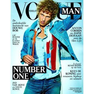

 The cover is meh.
Similar Threads
Users who are viewing this thread
New Posts
-
 Chanel 'Gabrielle L'Eau' Fragrance 2024 : Rianne van Rompaey by Solve Sundsbo (7 Viewers)
- Latest: fashionlov
-

-
-
-
Dolce & Gabbana F/W 2025.26 : Vittoria Ceretti & Mona Tougaard by Steven Meisel (5 Viewers)
- Latest: fashionsavvvvvy