-
The Red Carpet Highlights of... The 82nd Annual Venice Film Festival 2025!
You are using an out of date browser. It may not display this or other websites correctly.
You should upgrade or use an alternative browser.
You should upgrade or use an alternative browser.
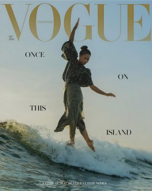
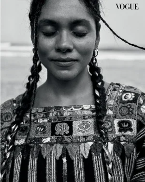
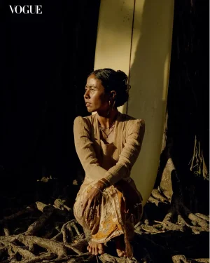
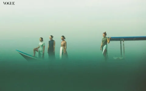
Vogue Philippines September 2025: Ikit Agudo by Archie Geotina & Yerg
- Thread starter crmsn
- Start date
lanvinray
Well-Known Member
- Joined
- Mar 10, 2009
- Messages
- 20,356
- Reaction score
- 528
Too bleak & mundane for a September issue 😴
I was expecting a model or a fashion icon but instead they opted for this abomination 🥱
Vogue Ph cannot escape it's woke & nat geo/time facade They desperately need new direction
I was expecting a model or a fashion icon but instead they opted for this abomination 🥱
Vogue Ph cannot escape it's woke & nat geo/time facade
 They desperately need new direction
crmsn
Well-Known Member
- Joined
- Jun 6, 2018
- Messages
- 2,881
- Reaction score
- 9,132
The quality feels too raw for my taste, but it’s undeniably a striking image, one that captures Filipino identity through Filipino fashion.
I’m curious to see what’s inside this issue. I heard they’ve revamped the layout a little bit with hip and modern fonts, and with 422 pages to mark their third anniversary, it sounds like a major editorial push.
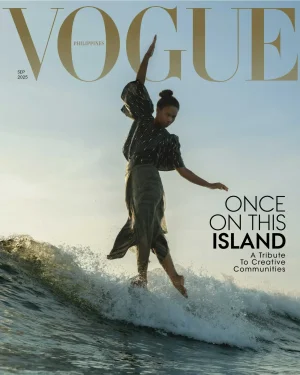
PS: Here’s my take on the cover with a different design. I adjusted the layout to reflect how I wanted it since the original blurb felt too weighted on the right side.
BalkaniStaCouture
Well-Known Member
- Joined
- Mar 6, 2024
- Messages
- 4,582
- Reaction score
- 5,895
Bertrando3
Well-Known Member
- Joined
- Mar 22, 2010
- Messages
- 5,573
- Reaction score
- 2,285
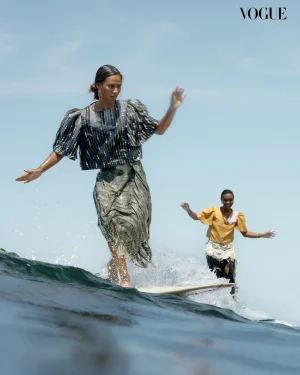
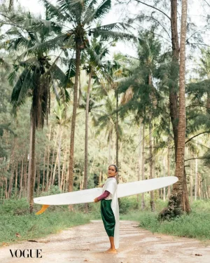
Oh I'm liking this: it feels fresh, you can almost hear the sound of the waves, love the colors, the lighting, the images feel soft and calm. The cover is striking too  happy with this.
 happy with this.
AristoCrazy
Member
- Joined
- Nov 1, 2020
- Messages
- 16
- Reaction score
- 42
This is such a random september cover. I'll give its a good picture even if i dont like it. But does it say september cover? i dont think so.
and its the freaking rainy season here in the Philippines right now. This should have been an april or may cover.
Amaccana Bea!!!
and its the freaking rainy season here in the Philippines right now. This should have been an april or may cover.
Amaccana Bea!!!
crmsn
Well-Known Member
- Joined
- Jun 6, 2018
- Messages
- 2,881
- Reaction score
- 9,132
At 422 pages, I'm wondering if this is the biggest September Vogue this year. (American Vogue I believe was 365 pages).
Nope. but it's a close second. I'll post the page counts of this year's September Vogues soon on the other thread.
Similar Threads
- Replies
- 5
- Views
- 4K
- Replies
- 11
- Views
- 1K
- Replies
- 13
- Views
- 1K
- Replies
- 7
- Views
- 1K
- Replies
- 27
- Views
- 3K

