Gorgeous images, though I wish the issue’s tagline wasn’t splitting the first cover across the middle. I think that third cover strikes the right balance between that naturalistic and contemporary yet still fashionable style a lot of editors try to achieve ; it’s almost like an oil painting.
Vogue Portugal always has very interesting covers but the taglines are always very literal which makes it seem more like a novel than a magazine cover. I wish they would use less obvious titles like the covers in the 90s and 2000s. I also wish the last cover had adults instead of kids, the fact that the girl has on makeup gives it a strange vibe. Or am I mistaken and they are not kids?
picclick uk
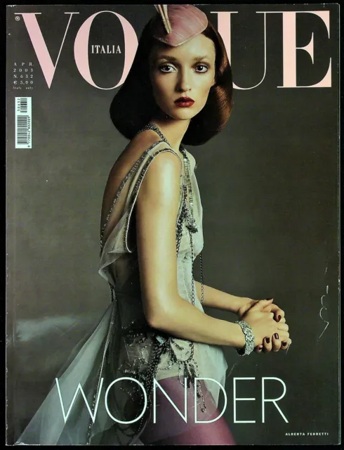
If this were Vogue Portugal, it would be the wonder issue. I wish their magazine just had 'memories' in a less intrusive font.
This site uses cookies to help personalise content, tailor your experience and to keep you logged in if you register.
By continuing to use this site, you are consenting to our use of cookies.