You are using an out of date browser. It may not display this or other websites correctly.
You should upgrade or use an alternative browser.
You should upgrade or use an alternative browser.
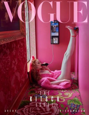
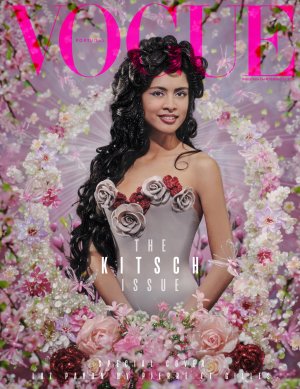
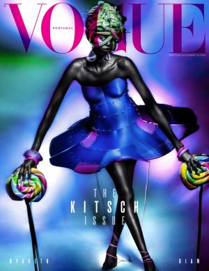
Vogue Portugal February 2024 : The Kitsch Issue
- Thread starter crmsn
- Start date
thenewclassic
Well-Known Member
- Joined
- Mar 6, 2013
- Messages
- 839
- Reaction score
- 923
I kinda like the first one
nonfatgoddess
Well-Known Member
- Joined
- Dec 3, 2023
- Messages
- 109
- Reaction score
- 203
They could've just went with only the first cover. It's beautiful. Also, I'm always a little bit bothered with Vogue Portugal's cover lines. I feel like they should adjust the text tracking/spacing
Deleted member 116957
New/Inactive Member
- Joined
- Apr 4, 2009
- Messages
- 13,746
- Reaction score
- 15,824
This magazine is so smug.
kokobombon
Well-Known Member
- Joined
- Oct 7, 2007
- Messages
- 18,851
- Reaction score
- 2,411
I was expecting to hate the result with that concept but I actually LOVE the 1st one.
Benn98
Well-Known Member
- Joined
- Aug 6, 2014
- Messages
- 42,582
- Reaction score
- 20,780
First one is the best. If you're going to make a name for yourself copying Meisel-era VI you may as go the whole nine yards. I'm a bit over multi covers personally, so don't see the need for the other two. Their not very kitschy either.
Toni Ahlgren
Well-Known Member
- Joined
- Aug 29, 2020
- Messages
- 1,649
- Reaction score
- 4,924
If you're gonna do Pierre & Gilles, let Pierre & Gilles do it.
JPineapple
Well-Known Member
- Joined
- Jul 1, 2018
- Messages
- 2,920
- Reaction score
- 4,088
They photographed Luz cover.If you're gonna do Pierre & Gilles, let Pierre & Gilles do it.
TerraVera
Well-Known Member
- Joined
- Dec 23, 2023
- Messages
- 205
- Reaction score
- 334
i really want them to change the font, but i also like covers 1 and 3
just wish there was more continuity between their covers. for such a strong, fun theme, they all seem so disparate - vogue portugal has a bad habit of trying to cover the whole spectrum of a theme instead of zeroing in on one or a few aspects and executing them well. they overextend themselves trying to be 'aRtSy' and different. it's unnecessary; they don't have to keep proving themselves - which is how it comes off to me.
in addition to vogue china, they have and have shown the potential to put out good work, but they try to do so much with not enough of it hitting the mark. edit, edit, edit yourself.
Toni Ahlgren
Well-Known Member
- Joined
- Aug 29, 2020
- Messages
- 1,649
- Reaction score
- 4,924
Ouch, my bad.They photographed Luz cover.
Cocteau Stone
Well-Known Member
- Joined
- Feb 12, 2022
- Messages
- 2,023
- Reaction score
- 5,083
Everytime "kitsch" is involved in fashion, why is it always using pink? Can we go a little above and beyond that please. Not really amused by any of this, and I don't think any of these really translate as kitsch at all.
The Model Gene
Member
- Joined
- Apr 27, 2022
- Messages
- 20
- Reaction score
- 17
My question with The Kitsch Issue is why now? The Avery Richardson cover is so Alessandro Michele coded, and Kitsch is no longer driving the fashion narrative.
penny609
Well-Known Member
- Joined
- Apr 21, 2007
- Messages
- 6,010
- Reaction score
- 1,171
Kitsch is outdated per se (as good-taste-gurus usually think), somehow, so it doesn't really matter if they do it now, yesterday, yesteryear... Tomorrow or the day after. There'll always be some nutty eyes (like mines) craving for their dose of kitschy stuff. Bright bold colors seemingly randomly put together, timeless old-fashioned twists (like on the first cover, my obvious favorite) and even the bunch of bad taste of nonsenses involved will always appeal to my... eyes.My question with The Kitsch Issue is why now? The Avery Richardson cover is so Alessandro Michele coded, and Kitsch is no longer driving the fashion narrative.
Similar Threads
- Replies
- 15
- Views
- 5K
- Replies
- 17
- Views
- 5K
- Replies
- 16
- Views
- 5K
Users who are viewing this thread
Total: 1 (members: 0, guests: 1)
New Posts
-
-
-
-
The Music From Christian Dior Shows (PLEASE READ POST #1 FOR FULL SOUNDTRACK LISTS) (6 Viewers)
- Latest: evaislegit
-


