You are using an out of date browser. It may not display this or other websites correctly.
You should upgrade or use an alternative browser.
You should upgrade or use an alternative browser.
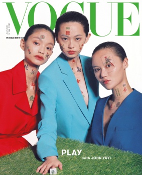
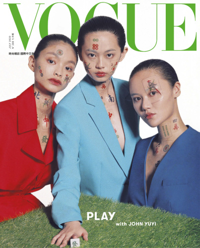
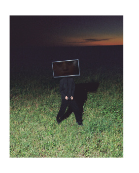
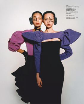
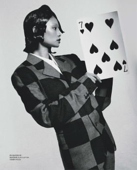
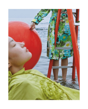
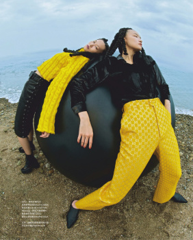
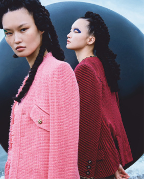
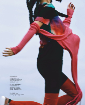
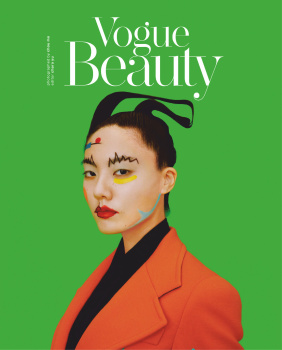
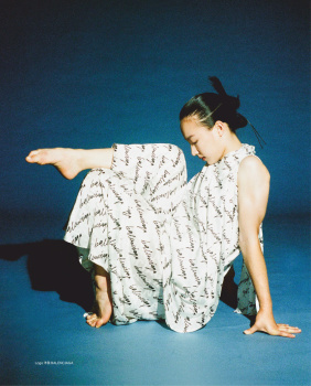
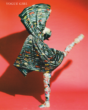
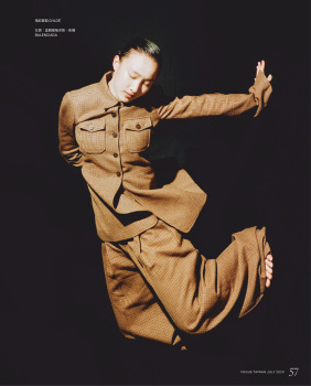
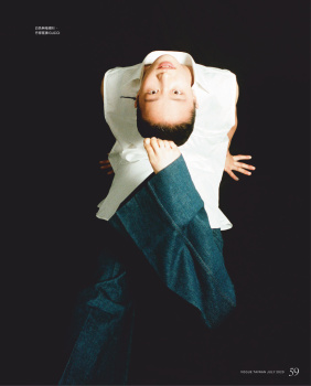
Vogue Taiwan July 2020 : Giwa Huang, Rouyi Fang & John Yuyi by John Yuyi
- Thread starter MDNA
- Start date
Benn98
Well-Known Member
- Joined
- Aug 6, 2014
- Messages
- 42,582
- Reaction score
- 20,744
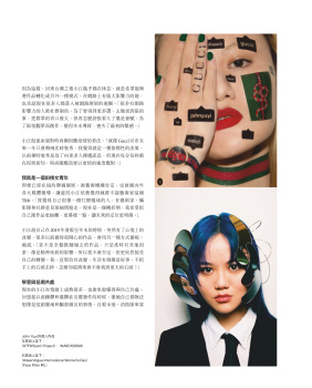
Good grief, what on earth is this??? Their worst cover in years. I'd even take those cheesy Taiwanese celebrity covers over this.
The tattoos, the styling, that cheap set, it's all really quite awful. Also, why did the artist chose to insert herself on the cover?
And of course you're living for this, MDNA. LOL!
The tattoos, the styling, that cheap set, it's all really quite awful. Also, why did the artist chose to insert herself on the cover?
And of course you're living for this, MDNA. LOL!
crmsn
Well-Known Member
- Joined
- Jun 6, 2018
- Messages
- 2,921
- Reaction score
- 9,203
On a positive note, that looks like a NYLON Japan cover.
On a negative note, are they portrayed as mah jong tiles? If yes, then why?
"Play" could be a great concept for a magazine issue, but they executed it poorly.
This has to be their worst cover this year, but at least we got "real" people
on the cover and not some illustrations from kids, a burnt-like painting of Carol,
or an overly-saturated landscape artwork.
MON
Well-Known Member
- Joined
- Jun 20, 2009
- Messages
- 12,635
- Reaction score
- 5,188
It could have been executed better???
The coats should have looked sharper.
The mahjong tattoos removed. I mean the concept is "play", but they could have lined up the mahjong pieces and made the middle model look as if she were lifting her piece with a death glare.
Heavier makeup.
Different masthead color.
The coats should have looked sharper.
The mahjong tattoos removed. I mean the concept is "play", but they could have lined up the mahjong pieces and made the middle model look as if she were lifting her piece with a death glare.
Heavier makeup.
Different masthead color.
Piet Retief
Well-Known Member
- Joined
- Jan 7, 2016
- Messages
- 703
- Reaction score
- 352
THIS! Also get rid of the artificial turf...Different masthead color.
- Joined
- Jan 9, 2008
- Messages
- 36,839
- Reaction score
- 24,555
I have secondhand embarrassment from looking at this. What on Earth? This is simply all sorts of awful, from the amateur photography to the colours and the fact it resembles something out of 2000 in the worst possible way. Ew.
Fiercification
Well-Known Member
- Joined
- Apr 17, 2008
- Messages
- 6,284
- Reaction score
- 1,476
The card/sticker (?) over the third girl on the right's eye is bloody freaking me out. Like if you were to peel it back you'd either tear her skin completely or find out it's metal because she's secretly a robot  .
.
Fashion these days...
 .
.Fashion these days...
magsaddict
Well-Known Member
- Joined
- Oct 25, 2016
- Messages
- 964
- Reaction score
- 291
it looks like something they would have come up with in the late 90s early 2000s.
Benn98
Well-Known Member
- Joined
- Aug 6, 2014
- Messages
- 42,582
- Reaction score
- 20,744
Like if you were to peel it back you'd either tear her skin completely or find out it's metal because she's secretly a robot.
God, stop!


phungnam96
Well-Known Member
- Joined
- Jul 7, 2011
- Messages
- 1,237
- Reaction score
- 923
I’m not surprised... Oh at all.
Benn98
Well-Known Member
- Joined
- Aug 6, 2014
- Messages
- 42,582
- Reaction score
- 20,744
Similar Threads
- Replies
- 4
- Views
- 3K
Users who are viewing this thread
Total: 1 (members: 0, guests: 1)
New Posts
-
-
US Vogue November 2025 : Nicole Kidman by Carlijn Jacobs, Greta Lee & Ayo Edebiri by Tyler Mitchell (6 Viewers)
- Latest: Rigida
-
-
-

