Vogue Ukraine July 2018 : Marte Mei van Haaster by Alexander Saladrigas | the Fashion Spot

Vogue Ukraine July 2018 : Marte Mei van Haaster by Alexander Saladrigas

Source @vogue_ukraine Instagram

35284966_10155762209718031_7879978177303412736_o.jpg
 
Finally something from VU that doesn't feel forced.
 
Isn't it disrespectful to wear shoes on tatami floor?
 
These two covers remind me of Vogue Italia way too much ! They did the same in the 90s with Meisel !
 
I think this is a reference to the work of Araki (the Japanese background and watermelons). I'll be interested to see what the editorial looks like and if they further reference him.
 
Other than a nice color-palette, so insufferable with their 1st year art school student concepts.

Just embarrassing.
 
ed preview


Beauty supplement: Anna de Rijk by Lukasz Pukowiec


vogue.ua
 
First cover left me cold. Saw it, and instantly exited the thread. It's too rehearsed and affected, not even in a traditional Japanese way. I must say their novelty is slowly beginning to wear off since you can basically get the same elsewhere.
The second looks way better. There's more play, fashion, colours.
 
I LOVE Marte Mei Van Haaster so i'm just here to say i'm happy to see her stunningness on a Vogue cover that's all...A Queen...A Truly Amazing person. ....:)
 
I think this is a reference to the work of Araki (the Japanese background and watermelons). I'll be interested to see what the editorial looks like and if they further reference him.

Definitely going that way from the preview.

Although I hate on them a lot, and although I still think this looks odd, I can give it a "pass" on my book if I look at it from a "travel issue" point of view.

I think they did the vintage references in a more classy way this time. This doesn't look as edgy-try-hard as their previews covers, although it doesn't feel groundbreaking either.

It's ok. It's an ok cover. I prefer the second cover, though.
 
I prefer the second cover, but I don't think it would've worked as well without the first (if that makes sense).
 
I prefer the second cover, but I don't think it would've worked as well without the first (if that makes sense).

Agreed! You needed the first with set a tone (and context?), I suppose in that sense what we're effectively saying is that the second cover isn't 'telling' enough?
 
The second is too "beauty" not enough character but the first one is far too stiff and has this second rate Wes Anderson vibe about it I just detest.
 
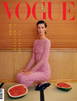
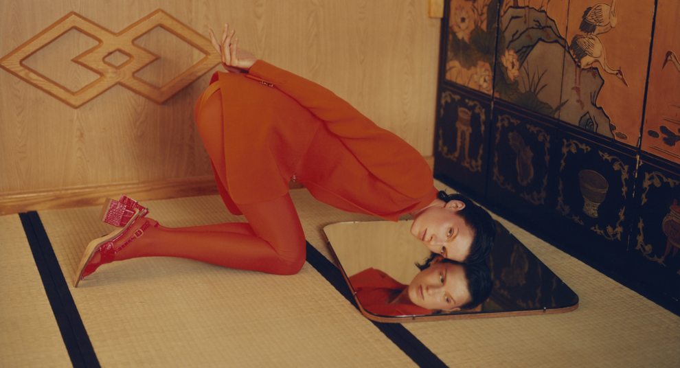
As tone-deaf as the covers are (particularly the first one with the Dolce & Gabbana dress--have we forgotten the fact that they once said they don't want a japanese designer to carry out their legacy?--and the audacity to wear shoes on a tatami), the images are actually striking. I get the magazine's attempt at subverting tradition, but given today's climate the whole thing comes off rather disrespectful despite the claim that this is an "East Meets West" issue. I wouldn't mind seeing the same setting for the first cover, but let's do it with a Japanese designer and without footwear on a tatami. It would also nice to see a Japanese model fronting the cover, but I'm not mad at all with their decision to go with Marte. Print-wise, she's such an underrated model.
 

Users who are viewing this thread

New Posts

Forum Statistics

Threads
214,476
Messages
15,263,183
Members
88,502
Latest member
giat352
Back
Top