You are using an out of date browser. It may not display this or other websites correctly.
You should upgrade or use an alternative browser.
You should upgrade or use an alternative browser.
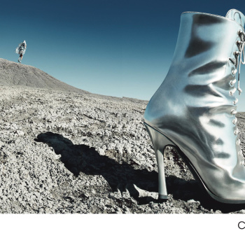
Calvin Klein 205W39NYC F/W 2018.19 by Willy Vanderperre
- Thread starter 9sete
- Start date
fashionlover2001
Active Member
- Joined
- Aug 4, 2008
- Messages
- 2,716
- Reaction score
- 6
Love the cast. Poor Julia...
dior_couture1245
Fat Karl
- Joined
- Jan 30, 2006
- Messages
- 9,225
- Reaction score
- 4,763
It's pretty compelling, tbh. Some great shots. Well produced, memorable. Could have done without the shot of the spaceship, though...that's too on the nose.
All that said, there's nothing here that feels Calvin Klein. I'm all for a creative director taking the house to new territory and opening it up for new interpretation...but there's ZERO sex appeal here...and I'm sorry, but Calvin Klein's DNA is sex appeal, period. There's no definable silhouette or collection from the brand, unlike say Dior or Chanel or Balenciaga...it's all about the attitude here at Calvin. "Sex appeal" can be a broad blanket, of course, in which many different things can be considered sexy, sensual, erotic, etc...but this collection and campaign? No.
All that said, there's nothing here that feels Calvin Klein. I'm all for a creative director taking the house to new territory and opening it up for new interpretation...but there's ZERO sex appeal here...and I'm sorry, but Calvin Klein's DNA is sex appeal, period. There's no definable silhouette or collection from the brand, unlike say Dior or Chanel or Balenciaga...it's all about the attitude here at Calvin. "Sex appeal" can be a broad blanket, of course, in which many different things can be considered sexy, sensual, erotic, etc...but this collection and campaign? No.
YohjiAddict
Well-Known Member
- Joined
- May 26, 2016
- Messages
- 3,655
- Reaction score
- 5,186
I'm just here for Luca Lemaire...
D
Deleted member 141523
Guest
this screams Meisel! Vogue Italia JULY 2001
zacatecas570
Well-Known Member
- Joined
- Sep 27, 2008
- Messages
- 7,203
- Reaction score
- 1,083
I actually LOVE this, wonderful cast and love the location. That Julia eyewear shot is very weird tho.
mepps
Well-Known Member
- Joined
- Mar 31, 2014
- Messages
- 1,784
- Reaction score
- 2,044
When you shamelessly rip off Avedon, but fail to live up to his genius.
Willy tried, but this is just as cold and sterile as everything he's ever done.
Raf Simons is the worst thing that could have ever happened to Calvin Klein.
He has ZERO sense of the sex and sensuality of this brand.
His ideas of "Americana" are so superficial, cliche, and tiresome.
It's like people who consume American movies and tv shows, and somehow believe they understand America and Americans.
They don't.
Royal-Galliano
völlig losgelöst
- Joined
- Nov 25, 2005
- Messages
- 16,094
- Reaction score
- 768
memorable! everything about this is cool except for those hideous balaclavas.
It should've been just OG Liya, but overall, I really love this campaign. The whole sense of solitude it brings is so languidly beautiful. Wow, who would've thought that Willy the cold, sterile, and clinical was able to conjure up a magic like this?
phungnam96
Well-Known Member
- Joined
- Jul 7, 2011
- Messages
- 1,238
- Reaction score
- 923
The eyewears shot is ironically hideous. But looking at this campaign, I cannot stop thinking about Verushka iconic editorial for Vogue decades ago or just even closer, Karolina by Steven Meisel for Vogue Italia.
D
Deleted member 141523
Guest
The inspiration is dark and sad: Safe (1995), by Todd Hynes. There's a character named Lester and he wears these clothes while he walks in a creepy way on the field. The character has a terminal illness and he covers his entire body to protect himself. It's too dark, didn't knew at the time.
D
Deleted member 1957
Guest
Love it!
Similar Threads
- Replies
- 7
- Views
- 4K
- Replies
- 67
- Views
- 21K
Users who are viewing this thread
Total: 1 (members: 0, guests: 1)
New Posts
-
-
-
-
-
Vogue Thailand November 2025: Jarinporn Joonkiat by Wasan Puengprasert (5 Viewers)
- Latest: phungnam96


