You are using an out of date browser. It may not display this or other websites correctly.
You should upgrade or use an alternative browser.
You should upgrade or use an alternative browser.
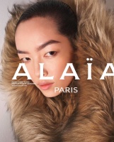
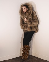
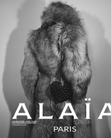
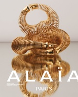
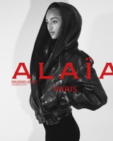
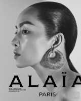
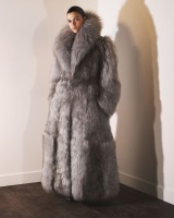
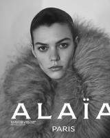
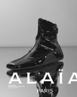
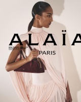
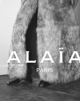
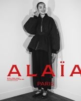
Alaïa W/S 2024.25 : Alix Bouthors, Mona Tougaard, & FeiFei Sun by David Sims
- Thread starter vogue28
- Start date
chrisand489
Well-Known Member
- Joined
- Oct 23, 2022
- Messages
- 583
- Reaction score
- 971
Melancholybaby
Well-Known Member
- Joined
- Aug 25, 2011
- Messages
- 14,118
- Reaction score
- 1,476
It's Winter 2024/Spring 2025 if I'm not mistaken.Spring? Baby, she's in a floor length fur.
ellearchivist
Member
- Joined
- Oct 31, 2024
- Messages
- 18
- Reaction score
- 17
I prefer this to what Tyron Lebon was doing. Feels more appropriate!
avonlea002
Well-Known Member
- Joined
- Feb 10, 2020
- Messages
- 2,458
- Reaction score
- 8,566
Why is it always the case these days that a more glamours or elegant collection has the be photographed in "raw" style for the campaign? I get the idea of juxtaposition but it's so tired at this point.
alwaysademo
Well-Known Member
- Joined
- May 25, 2024
- Messages
- 376
- Reaction score
- 635
I want to live in that fur coat. This campaign is selling it for me, great casting too.
alwaysademo
Well-Known Member
- Joined
- May 25, 2024
- Messages
- 376
- Reaction score
- 635
GivenchyAddict
Well-Known Member
- Joined
- Feb 5, 2012
- Messages
- 2,173
- Reaction score
- 5,131
Mona got the best shots imo.
I like it but it's a bit cold, no? I'm reminded of the fashion show that took place in Pieter Mulier's home. Not that it doesn't work, but I would like to see more personality and warmth. This lacks connection to the audience even if that fur is selling it.
Thefrenchy
Well-Known Member
- Joined
- Nov 13, 2006
- Messages
- 12,005
- Reaction score
- 1,242
It's a bit poor photography-wise but I always love their logo placement. Makes anything way stronger.
alwaysademo
Well-Known Member
- Joined
- May 25, 2024
- Messages
- 376
- Reaction score
- 635
exactly. I got Eza's book last month and kind of am amazed how his packaging lifts every brand he touches. Sometimes the image plays secondary role and that's fine if everything is tuned on the same level.
Mona has a sparkle here.
Mona has a sparkle here.
Similar Threads
- Replies
- 22
- Views
- 2K
- Replies
- 1
- Views
- 384
- Sticky
- Replies
- 65
- Views
- 11K
- Replies
- 3
- Views
- 954
D
- Replies
- 83
- Views
- 21K
Users who are viewing this thread
Total: 3 (members: 0, guests: 3)


