You are using an out of date browser. It may not display this or other websites correctly.
You should upgrade or use an alternative browser.
You should upgrade or use an alternative browser.
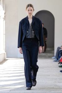
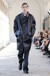
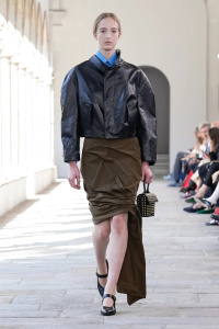
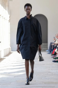
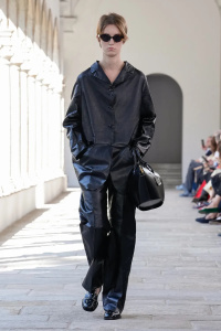
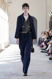
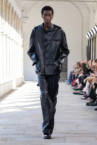
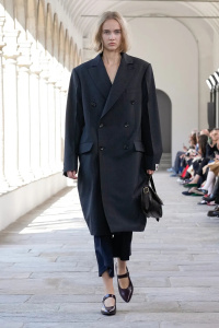
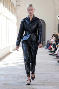
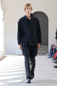
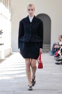
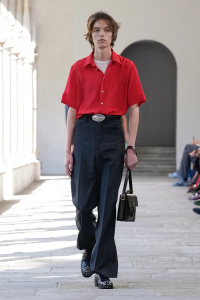
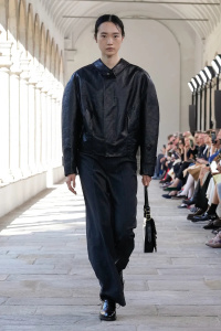
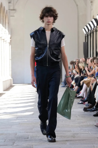
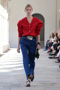
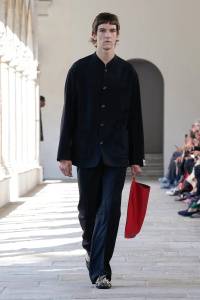
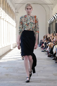
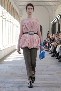
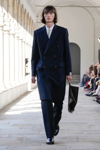
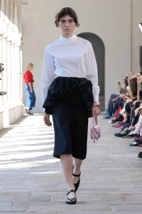
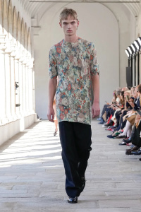
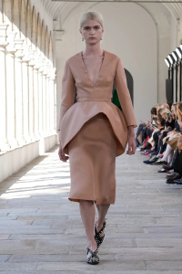
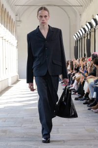
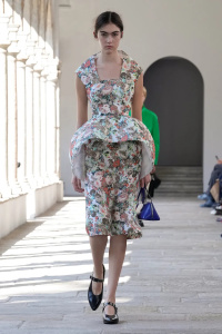
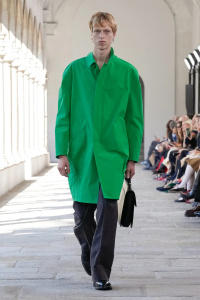
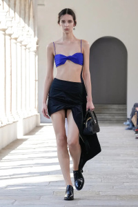
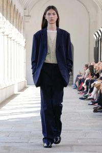
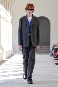
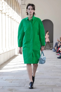
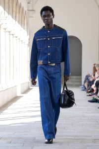
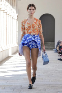
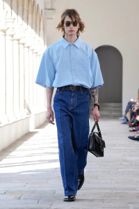
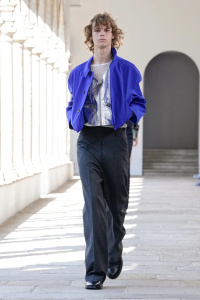
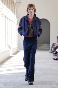
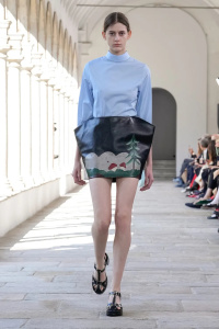
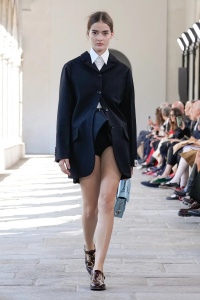
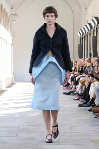
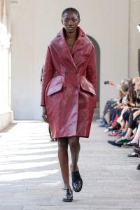
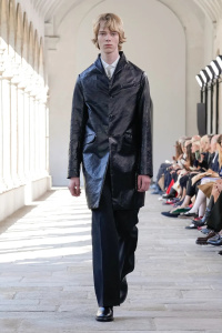
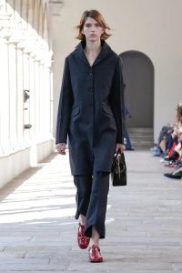
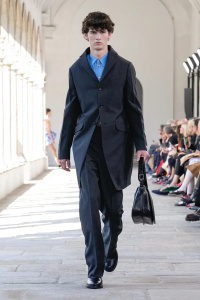
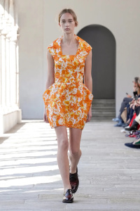
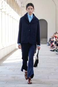
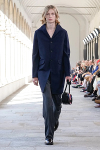
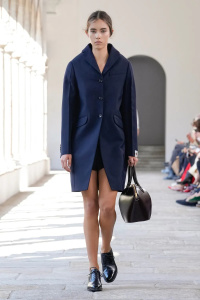
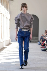
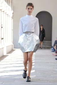
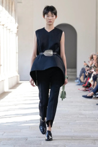
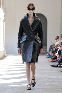
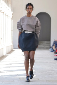
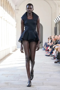
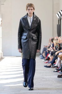
Bally S/S 2025 Milan
- Thread starter vogue28
- Start date
Deleted member 119799
New/Inactive Member
- Joined
- Jun 28, 2009
- Messages
- 1,157
- Reaction score
- 991
really enjoyed his first 2 shows, but this is too weird
philophile
Well-Known Member
- Joined
- Dec 23, 2023
- Messages
- 531
- Reaction score
- 882
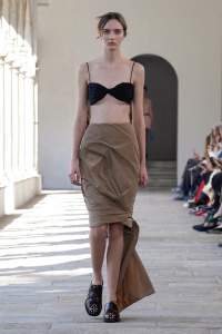
Loving the camel peplum look. Bally has always something good to offer. The leather always looks luxurious.
Thefrenchy
Well-Known Member
- Joined
- Nov 13, 2006
- Messages
- 12,356
- Reaction score
- 3,277
Probably one of my favorite shows of MFW. I for one am happy that he's not trying to make this brand another bore or philo-adjacent. At least he's trying to shake this brand up.
Love the casting and soundtrack was great.
Love the casting and soundtrack was great.
jeanclaude
Well-Known Member
- Joined
- Feb 12, 2012
- Messages
- 4,785
- Reaction score
- 14,175
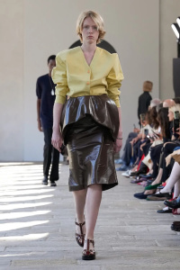
What is this?? Bally des Garçons?? Comme des Bally?? Hideous proportions and volumes, awful prints!
What was the inspiration here...Quasimodo?? The disconnection with the image of the brand (the shoes) is abysmal.
What was the inspiration here...Quasimodo?? The disconnection with the image of the brand (the shoes) is abysmal.
Cocteau Stone
Well-Known Member
- Joined
- Feb 12, 2022
- Messages
- 2,024
- Reaction score
- 5,086
I don't understand the point of many of these looks. All too weird for the sake of it and no real intention or translation to reality where it can work on the body.
Those bubble skirts are absolutely nightmarish.
Those bubble skirts are absolutely nightmarish.
jeremydante
Well-Known Member
- Joined
- Jul 15, 2009
- Messages
- 3,725
- Reaction score
- 1,413
Y'all crack me up; so critical, harsh and then dramatic on top of all that.
This collection was a good effort as the label comes away from Rhuigi's Tom Ford copycat sh*t. I liked the use of volume in this collection, the color palette and also the attention to details. Fashion has become more fixated on oddity today, as the industry continues to shy away from commercial forms of glamour and likes to touch on experimental forms of silhouette, taking the more sculptural approach. That is what was happening here. I am continuing to watch Bally, and have hopes it can be something great after the removal of Rhuigi. That was a good decision. Now, if they could just do something about that boxy font in the logo. Something about the "A" in Bally just annoys the hell out of me.
Show is also streaming on their website, for anyone who wants a replay or missed the live stream.
neogrotesque
Active Member
- Joined
- May 2, 2024
- Messages
- 49
- Reaction score
- 178
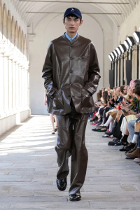
The hems on the bubble skirts are horrible and the raised necks only work on the super dramatic leather coats. He's trying too hard to push the brand into a Loewe/Demna Balenciaga direction while most people probably associate Bally with Tod's and old Ferragamo; I think something between CdG Girl meets Margaret Howell like his two previous collections would be better suited to this "heritage house but make it quirky" rebrand.
GivenchyHomme
Well-Known Member
- Joined
- Sep 3, 2009
- Messages
- 5,485
- Reaction score
- 5,391
The proportions and tailoring of those leather coats are killing me. They are so frumpy and unflattering.
yslforever
Well-Known Member
- Joined
- Nov 13, 2021
- Messages
- 2,359
- Reaction score
- 8,314
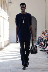
It lacks in production but I like the direction too. It's a nice departure from the rest of MFW.I really like this. It's probably an acquired taste, but I appreciate the change in direction. The menswear is particularly strong.
PDFSD
Well-Known Member
- Joined
- Mar 27, 2024
- Messages
- 3,041
- Reaction score
- 10,925
Goes both ways hun.... same can be said for your over optimistic dramatic love for how good it is :-)Y'all crack me up; so critical, harsh and then dramatic on top of all that.
This collection was a good effort as the label comes away from Rhuigi's Tom Ford copycat sh*t. I liked the use of volume in this collection, the color palette and also the attention to details. Fashion has become more fixated on oddity today, as the industry continues to shy away from commercial forms of glamour and likes to touch on experimental forms of silhouette, taking the more sculptural approach. That is what was happening here. I am continuing to watch Bally, and have hopes it can be something great after the removal of Rhuigi. That was a good decision. Now, if they could just do something about that boxy font in the logo. Something about the "A" in Bally just annoys the hell out of me.
Show is also streaming on their website, for anyone who wants a replay or missed the live stream.
the sculptural approach is a failure here and it's so many of it (when you don't master cut and shape one should build up slowly their know how and expertise with the pattern makers and factory), there´s a attempt in the men of some sort of reality & utility but all the woman look like cocktail princes its disjointed and unflattering.
blackcherrified
Well-Known Member
- Joined
- Aug 6, 2011
- Messages
- 317
- Reaction score
- 416
Some of the bubble skirts reminds me of Alessandra Facchinetti’s Valentino Fall 2008 HC collection but it’s soooo poorly executed I mean what are those creases?
Similar Threads
- Replies
- 4
- Views
- 10K
- Replies
- 7
- Views
- 3K
- Replies
- 30
- Views
- 8K
Users who are viewing this thread
Total: 1 (members: 0, guests: 1)

