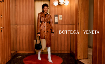
Bottega Veneta F/W 2023.24 by Maria & Louise Thornfeldt

Blazy’s work at BV is quite heavy design wise and can rebuke anyone outside fashion (and already does for some fashion insiders). So instead of scaring away potential customers and the loyal ones, I understand why they went for this ´basic’ approach.

It is commercial and luxe enough to have people gather at stores and then discover by themselves what the collection is about and all the ´tricks’ behind the ´basics’.
 
It takes me way too long to realize the brown paper bag at Maria Carla’s feet is actually a real leather suede one. And now I m obsessed.
I find so interesting how two designers who worked at Margiela have such different executions of his designs concepts.

For example, both Demna and Blazy use Margiela's "humble object in luxe materials" concept often in their collections. While, Demna's is based in conceptuality, commentary and virality, Blazy's is essentially craftsmanship as showmanship with a touch of humour.
 
uEOEovkU_t.jpg


US Vogue Digital Edition
 
Last edited by a moderator:
That last shot with Chu Wong is at least giving some energy and nice lighting.

Other than that this campaign is so incredibly lifeless and dull. Definitely not a world I would aspire to be a part of if I were to splurge on the advertised goods
 
that last shot reminds me of Armani ads.
Is that really the newest Bottega clientele the aspire to?
 
Why does the campaign have such 2 distinctive directions? is it all from the same collection?
 
Could it be that Liu´s images are for Fall campaign and the rest for Winter?

I love the video, it gives me The Shining vibes.
 
Could it be that Liu´s images are for Fall campaign and the rest for Winter?

I love the video, it gives me The Shining vibes.
Liu’s is the closing look from the show…

I really think that this is one time I wish the styling from the campaign was different from the one from the show…
 
While his collections are improving, the image surely isn't... Whoever is managing their image really is unable to translate what Blazy wants to say with his clothes. It's always so lifeless. And please, how many times are we going to have to endure the references to that book on the entryways of Milan... They are always so literal with everything. It's missing some freshness and an element of surprise. Everything is always very expected. Same photographers, same cast, same styling... Shake it up a bit! At least Daniel Lee had memorable campaigns.
 

Users who are viewing this thread

New Posts

Forum Statistics

Threads
212,457
Messages
15,185,315
Members
86,307
Latest member
decemberjonia
Back
Top
monitoring_string = "058526dd2635cb6818386bfd373b82a4"
<-- Admiral -->