You are using an out of date browser. It may not display this or other websites correctly.
You should upgrade or use an alternative browser.
You should upgrade or use an alternative browser.
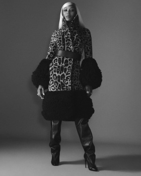
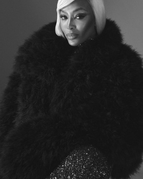
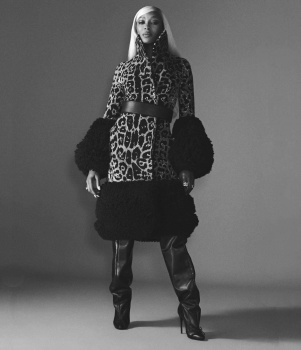
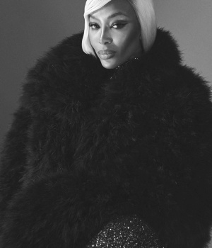
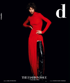
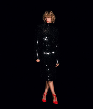
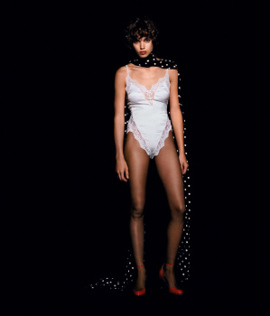
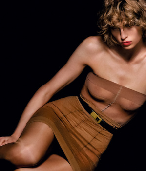
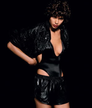
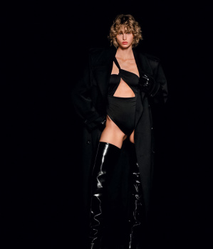
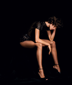
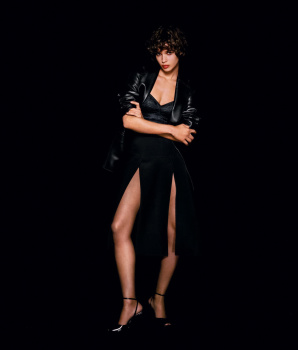
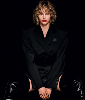
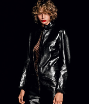
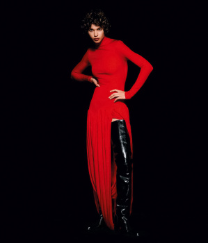
D la Repubblica ‘The Fashion Issue’ Volume #2 2024 : Naomi Campbell by Oliver Hadlee Pearch
- Thread starter vogue28
- Start date
Xone
Well-Known Member
- Joined
- Sep 1, 2004
- Messages
- 5,430
- Reaction score
- 5,059
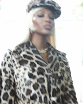
Pretentiousness?What is the purpose of putting a blurred Naomi on the cover?
Xone
Well-Known Member
- Joined
- Sep 1, 2004
- Messages
- 5,430
- Reaction score
- 5,059
A better stylist too....looks halfway there...hope cover 2 is better....Steven Meisel would've elevated this sort of story a few years ago... It just doesn't work for me.
tigerrouge
Well-Known Member
- Joined
- Feb 25, 2005
- Messages
- 18,965
- Reaction score
- 9,938
Blurring images doesn't add the sense of energy that's missing from Naomi's modern-day modelling.
Xone
Well-Known Member
- Joined
- Sep 1, 2004
- Messages
- 5,430
- Reaction score
- 5,059
explain that to the team please...lol..Blurring images doesn't add the sense of energy that's missing from Naomi's modern-day modelling.
"let's put Naomi a bolnde wig, she will be amaaaaazing" and then you don't ask just the bare minimum....then we got this editorial lol...
fashionlov
Well-Known Member
- Joined
- Jul 16, 2024
- Messages
- 765
- Reaction score
- 1,232
I guess they used this wig to give a different image of Naomi. Not very successful.
badgalcrush
Well-Known Member
- Joined
- Mar 2, 2017
- Messages
- 752
- Reaction score
- 426
Vogue Brasil May 2013 did it better , It had so much potential sad , Another photographer would have nailed it
Alquimista
Well-Known Member
- Joined
- Oct 1, 2023
- Messages
- 1,089
- Reaction score
- 3,163
Another Cyborg Naomi editorial but with a blonde wig
D
Deleted member 1957
Guest
She's actually rocking that blonde I wish the editorial was more gripping. The location and concept was good.
MaraPiovani
Well-Known Member
- Joined
- Jul 19, 2018
- Messages
- 178
- Reaction score
- 274
she is looking very karen huger from potomac
What is the purpose of putting a blurred Naomi on the cover?
Saves time and money on photoshop.
Deleted member 116957
New/Inactive Member
- Joined
- Apr 4, 2009
- Messages
- 13,746
- Reaction score
- 15,820
No one's thinking about a Vogue Brazil cover from 11 years ago, come on.Vogue Brasil May 2013 did it better , It had so much potential sad , Another photographer would have nailed it

Similar Threads
- Replies
- 19
- Views
- 7K
- Replies
- 7
- Views
- 2K
- Replies
- 5
- Views
- 1K
Users who are viewing this thread
Total: 1 (members: 0, guests: 1)

