You are using an out of date browser. It may not display this or other websites correctly.
You should upgrade or use an alternative browser.
You should upgrade or use an alternative browser.
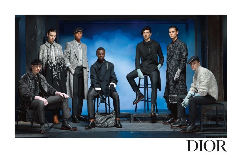
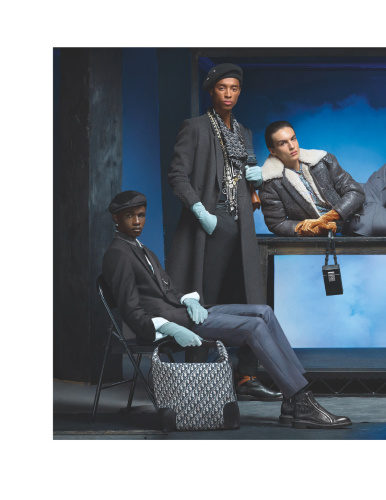
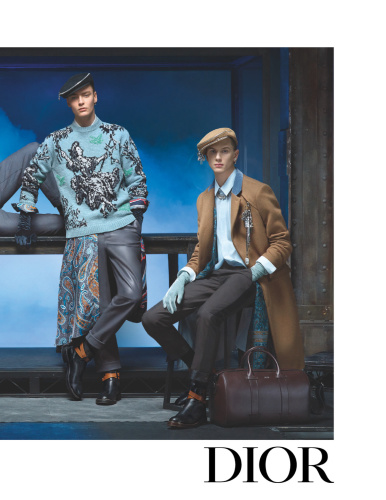
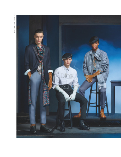
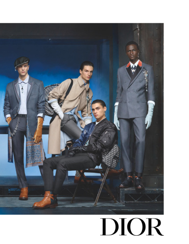
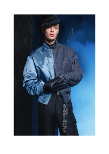
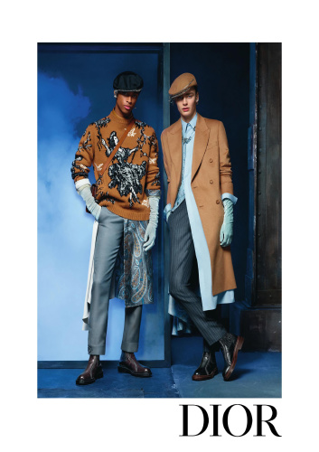
Dior Men F/W 2020.21 by Steven Meisel
- Thread starter Benn98
- Start date
YohjiAddict
Well-Known Member
- Joined
- May 26, 2016
- Messages
- 3,549
- Reaction score
- 4,801
Flatter than MGC campaigns and totally cheesy with that background. Happy that Melanie Ward is getting them big LVMH euros.
eugenius
Well-Known Member
- Joined
- Feb 2, 2005
- Messages
- 4,075
- Reaction score
- 1,950
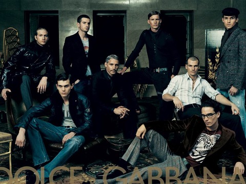
I know exactly what you mean, and I can see it. There was one season in particular (2004, I’m almost certain) that did look super-slick, and I wish Meisel would’ve tapped into that visual prowess to create this image. But alias, here we are: a photogenic collection with a flat-as-flick ad campaign.Looks like a dated D&G campaign circa mid 2000s
Lola701
Well-Known Member
- Joined
- Oct 27, 2014
- Messages
- 11,434
- Reaction score
- 24,461
All the Kim Jones campaigns with Meisel, even at Vuitton, have the same composition. While I get the sense of consistency, it’s not really inspiring or elevating.
The collection and the set had a very cinematic feel and this is very lookbook oriented.
It’s beautiful but not memorable.
The collection and the set had a very cinematic feel and this is very lookbook oriented.
It’s beautiful but not memorable.
Conbothsides
Well-Known Member
- Joined
- Apr 21, 2017
- Messages
- 288
- Reaction score
- 529
Jones' campaigns for Dior are always a turnoff for me. This one is so bland it makes me uncomfortable. And it's a far cry from the aforementioned D&G 2004 campaign I think...
blog.livedoor.jp/rememberemember/archives/27133840.html

blog.livedoor.jp/rememberemember/archives/27133840.html
Scotty
Well-Known Member
- Joined
- Apr 3, 2015
- Messages
- 5,902
- Reaction score
- 3,362
Jones' campaigns for Dior are always a turnoff for me. This one is so bland it makes me uncomfortable. And it's a far cry from the aforementioned D&G 2004 campaign I think...

blog.livedoor.jp/rememberemember/archives/27133840.html
There's something sexy about the D&G ones. This one's a flop.
RedSmokeRise
Well-Known Member
- Joined
- May 31, 2015
- Messages
- 1,730
- Reaction score
- 1,111
this looks like the front of a playbill for a broadway show lol terrible
crying at this read
D
Deleted member 1957
Guest
The blue and grey is a nice combo but the content is very flat. Most likely the mood of the shoot.
avonlea002
Well-Known Member
- Joined
- Feb 10, 2020
- Messages
- 2,439
- Reaction score
- 8,473
Every time I see a new Dior men campaign I wonder how much influence Meisel has on its final look. Maybe I'm wrong, but I get the impression that we blame Kim Jones too much. With all of Steven'a great works in mind I find it hard to believe that his role comes down to just standing behind the camera and clicking the button.
phungnam96
Well-Known Member
- Joined
- Jul 7, 2011
- Messages
- 1,125
- Reaction score
- 759
Call me Meisel stan but I love it! Much better than the mess of last season.
eugenius
Well-Known Member
- Joined
- Feb 2, 2005
- Messages
- 4,075
- Reaction score
- 1,950
Yep, that's exactly the one I had in mind. There was this image, plus another one w/ the models in more casual fare, and if I remember correctly, all of them in head-to-toe black suits.And it's a far cry from the aforementioned D&G 2004 campaign I think...
In those images from that season, my eyes really did have to travel. It all was just an all-around asethetically pleasing campaign.
This time, if I were to see the pictures in a glossy magazine, my eyes would just want to travel to the next page.
Similar Threads
- Replies
- 138
- Views
- 39K
- Replies
- 18
- Views
- 5K
Users who are viewing this thread
Total: 2 (members: 0, guests: 2)


