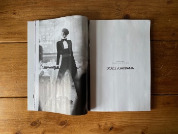
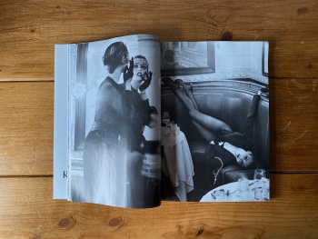
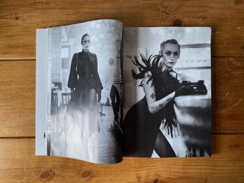
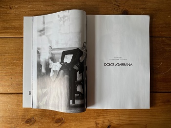
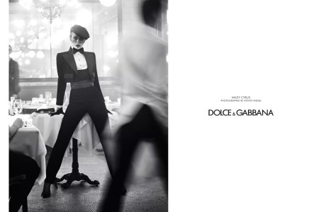
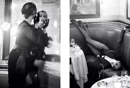
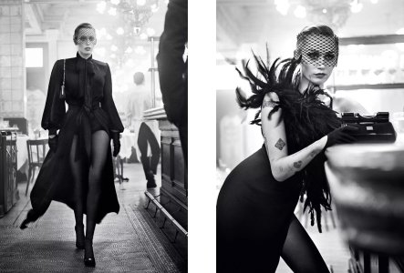
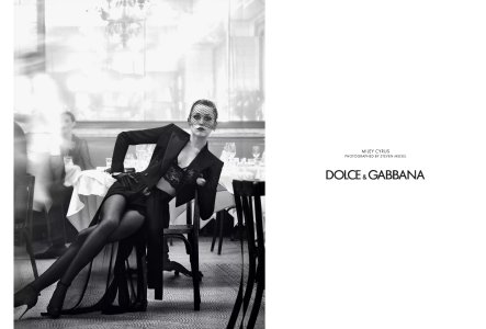
Dolce & Gabbana F/W 2024.25 : Miley Cyrus by Steven Meisel

I was disappointed when I read that she had this season's campaign, not that I have anything against her, but last season's images were so strong and cinematic that I thought they'd be hard to beat with a celebrity fronting the campaign. :heart:

Here we finally see something of an effort from Meisel, and the power that the cinematic ambience creates is undeniable. Then again, this is the standard that I always expect from Fabien, Karl and Meisel together (and Mary Howard). I really appreciate what some of the new gen are producing in terms of imagery but this standard of polish is something that appears unattainable to them as it stands.
 
The shot with the espresso demitasse is wonderful.
 
It’s nice, but Meisel these days at best, is just pure callbacks to his superior past. As @Ninocka98 mentioned, Miley looks good but the team does seem to be aiming for a tribute to 90s Nadja.

The only memorable effort he’s done currently is the shoot he produced for his collab with…Zara. It’s all straightforward lookbook imagery of course. However, it’s also the only current work of his that doesn’t rely on pure nostalgia. Maybe many enjoy nostalgia— and I don’t blame them since this fashion era is just so dire. I loath it when it’s what once Greats fall back on— and made lesser by hiring incompetent retouching/post-porduction, because that signifies they’ve truly got nothing left to say. Such a sh!t fashion era we’re living in now LMFAO
 
Last edited:
The ones at the table are my favorites so far :heart:
I hate those kind of tattoos in general (small, random, like a stamp kind) so the more she's covered the better 😅
 
Similar Vibe to the Madonna LV SS2009 but so glamorous and evocative!
 
I can’t believe I’m saying this but I actually find this super dated.
In reality, I find the current Meisel/Dolce & Gabbana thing terribly dated. It looks like something from 10 years ago…
Miley isn’t the face of modernity either and she doesn’t carry that kind of exaggerated feminity with an effortless charisma.

It’s very « Yaaas! Yes queen! Go serve! » but not modern HF.
 
Manifesting that someone will share digital scans of this advertisement, specifically from the September edition of Vogue US (since there like 6-8 pages worth of this ad)!
 
Her expressions are not good, luckily the production is good by current standards which made everything seem better than it is... I'm not going to take into account the offense of some members comparing this to something from Nadja (moderators should be in charge of punishing them)!
 
I hate the retouching. There is some really strange blurring in these pictures, it's as if they shot whole frame in focus and then applied blur and fake bokeh in post.
 
i love the direction. it's giving good old VI times and franca/meisel storytelling magic. also, i love the fact that her mouth is closed, something i thought we would never experience anymore.
 
He really excels in these types of environments: the bar/pub/restaurant thing, i can think of a dozen of his better pictures in this setting... no doubt this was a day in the park for them.
Nothing to skip a heartbeat over, but it shows you what a good team does. Miley looks like a vamp revamped, although femme fatale is a tired cliche in 2024. what's funny is that it looks like more effort is put into this and at the same time with much more ease and enthusiasm than younger teams.

3 last shots do it for me.
 
Her face looks so hollow. It’s a blessing her mouth isn’t constantly open but she has this strange pinched look in her mouth as she’s trying to keep it naturally closed looking. She’s just so tense in the face.

If this were an editorial, with some colour shots, I’d appreciate it far more. As a campaign (and for D&G) it just doesn’t do it as well as it should. Too nostalgic for its own good it comes off super corny. Frankly didn’t care for the styling at the show so it’s a shame they stuck with it here. Something more undone and “after-sex” would have been a delight.
 
Miley looks like a vamp revamped, although femme fatale is a tired cliche in 2024. what's funny is that it looks like more effort is put into this and at the same time with much more ease and enthusiasm than younger teams.
We're living in a world where "modernity" in fashion is represented by wearing sweatpants, with all the effort that entails.

Anything more than the bare minimum now seems impressive, although there's always the sense of it not quite hitting the same mark that it used to.
 

Users who are viewing this thread

New Posts

Forum Statistics

Threads
212,496
Messages
15,187,233
Members
86,385
Latest member
muglaasli
Back
Top
monitoring_string = "058526dd2635cb6818386bfd373b82a4"
<-- Admiral -->