You are using an out of date browser. It may not display this or other websites correctly.
You should upgrade or use an alternative browser.
You should upgrade or use an alternative browser.
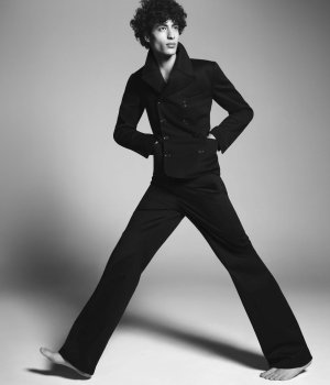
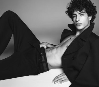
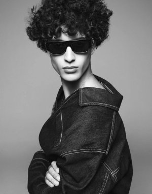
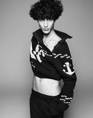
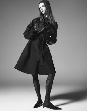
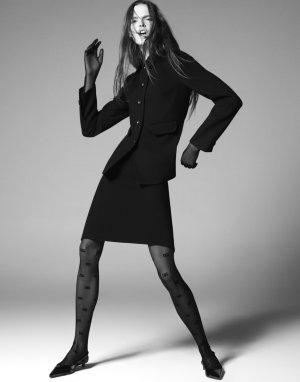
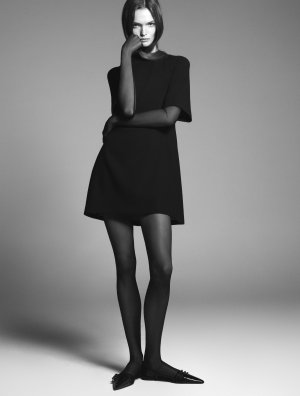
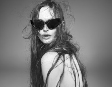
Dolce & Gabbana Pre-Spring 2024 : Lulu Tenney, Yoesry Detre, Xu Meen & Habib Masovic by Steven Meisel
- Thread starter vogue28
- Start date
Toni Ahlgren
Well-Known Member
- Joined
- Aug 29, 2020
- Messages
- 1,674
- Reaction score
- 5,063
An utter surprise yet so wonderful!
D
Deleted member 1957
Guest
Love it, reminds me of something one might have seen in a 2000s Vogue ed.
Bertrando3
Well-Known Member
- Joined
- Mar 22, 2010
- Messages
- 5,653
- Reaction score
- 2,451
WOWWWW stunning !!!
Lulu really is one of the very few of the new generation of models with an x factor. She seems to understand that, as a model, you need to give “something.” Maybe it’s her close work with Galliano recently - maybe he’s given her some perspective and insight as to what a model can and should do. It’s really not just looking pretty…it’s so much more. Of course, she is exceptionally beautiful.
The color photos are fun, although I don’t care for the clothes and floral headpieces. Lulu still brings it. But the black and white photos are GORGEOUS.
The color photos are fun, although I don’t care for the clothes and floral headpieces. Lulu still brings it. But the black and white photos are GORGEOUS.
Last edited:
WinstonH20
Well-Known Member
- Joined
- Aug 5, 2021
- Messages
- 263
- Reaction score
- 1,205
- Joined
- Jul 14, 2017
- Messages
- 14,891
- Reaction score
- 22,237
couturefan
Well-Known Member
- Joined
- Oct 2, 2022
- Messages
- 565
- Reaction score
- 1,087
This campaign is amazing!! Lulu really nailed it.
Cocteau Stone
Well-Known Member
- Joined
- Feb 12, 2022
- Messages
- 2,045
- Reaction score
- 5,184
Kind of odd to see Yoestry not wearing shoes in the full body shot when Lulu is styled to the nines from pretty much head to toe.
Vision Ruan
Active Member
- Joined
- Feb 19, 2019
- Messages
- 54
- Reaction score
- 31
The menswear ad looks boring. Meisel could have done better than that.
Even the full body shot, which meisel is usually good at, looks very stiff. Maybe a little color will help.
Even the full body shot, which meisel is usually good at, looks very stiff. Maybe a little color will help.
D
Deleted member 141523
Guest
a single girl campaign, while men's has multi cast. Love this concept.
Similar Threads
- Replies
- 12
- Views
- 2K
- Replies
- 61
- Views
- 16K
Users who are viewing this thread
Total: 1 (members: 0, guests: 1)

