This is a good campaign and I like it, but I am not blown away; although in fairness my expectations were quite high and I have not seen the photos in print and the past two seasons the images that were selected to run in magazines looked much better in print. What I like least is the background / scenery and the lighting / colorization technique. I also don't like the incongruity of in some of the images and wonder if the pictures that we are seeing are true snapshots, or if the models, or pairs of models, were photographed separately and then composites were made. I like certain images within a photo, but I am less enamoured with the composite / photo.
Just for fun, my rework of the photos (same order as post
#182:")
An assumption, unless otherwise noted I am assuming that the image is supposed to cover two pages in a magazine.
1. For
this picture, I'd put Izabel on one page (after photoshopping her chest) and Isabeli and Alessandra on the other; love ya Maryna, but buh-bye.
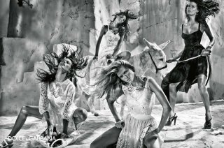
2.
Buh-bye to the two on the right, Alessandra and Izabel (?) and change the setting to a village street, church, parlor, and put more space between Maryna and Isabeli(?) as if Maryna is staring at her from a few feet away. To keep it a double page you can add in the headless models from
this image or a variant in the background. Some have complained about models in the Gucci campaign being in the background, but I actually think that it is a good idea, you get to see the clothes and it lessens the probability that the image becomes "too much."
3.
This image would be a standout without the model in the middle, buh-bye Isabeli(?), I also wonder if it would look even better with a brilliant blue sky? For more product placement, a bench or stool can be added with a handbag or shoes sitting on it.
4. I think that
this picture would have been much better in another setting, like a parlor, a porch or veranda or a village street. Isabeli alone would also work as single page ad.
5.
What I said about the second image.
6.
This image would be brilliant if it was just Isabeli and Izabel, however I do love the dresses on the other models perhaps they should be pushed off to the other side / in the background. I think the setting here is fine, but a parlor or a church may have been better, hmmm still thinking about that.
7.
Fantastico! Bellissima!
8.
This picture is growing on me, at first Maryna's [strike]dumb[/strike] innocent expression bugged me, but it is now drawing me in. I know that it is subtle, but I like how they are holding hands and the rosary. I did not notice the problem with Alessandra's lips until someone made a comment about it. At first I thought duos and singles would be better like Izabel and Maryna, Izabel and Ale or Ale alone, but again the trio is growing on me.

 ... but this is HOTTTT!!!!!
 not sure if they release something