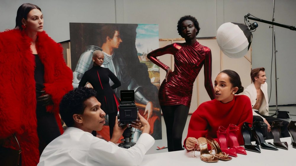
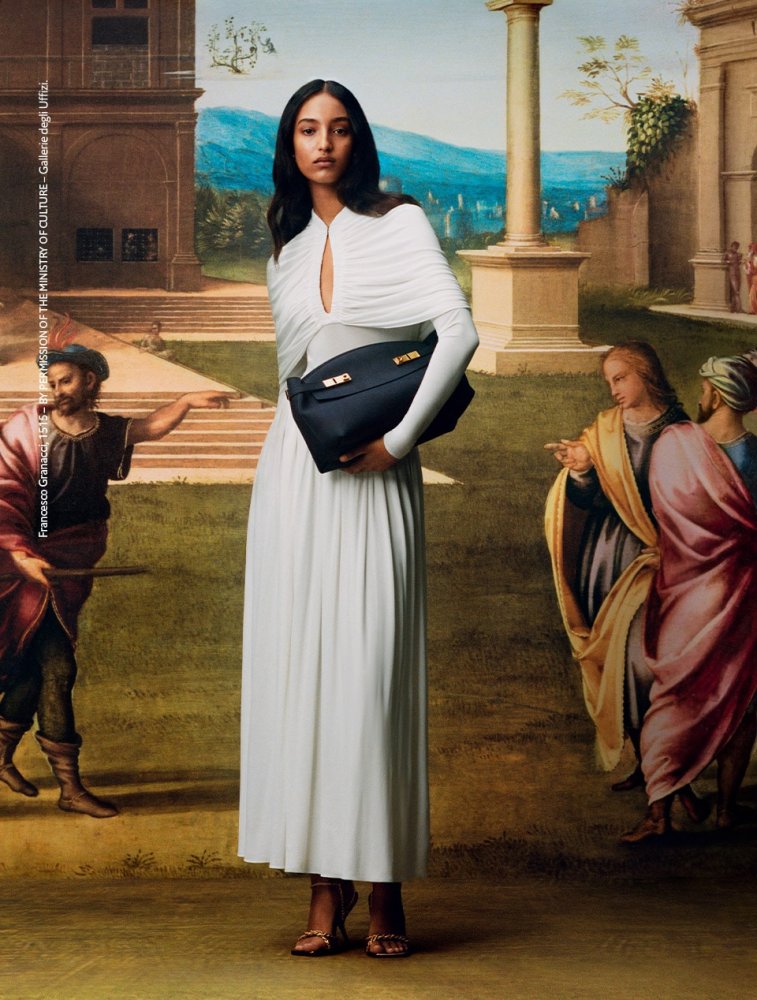
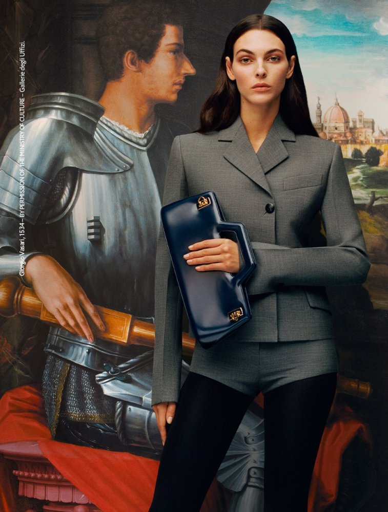
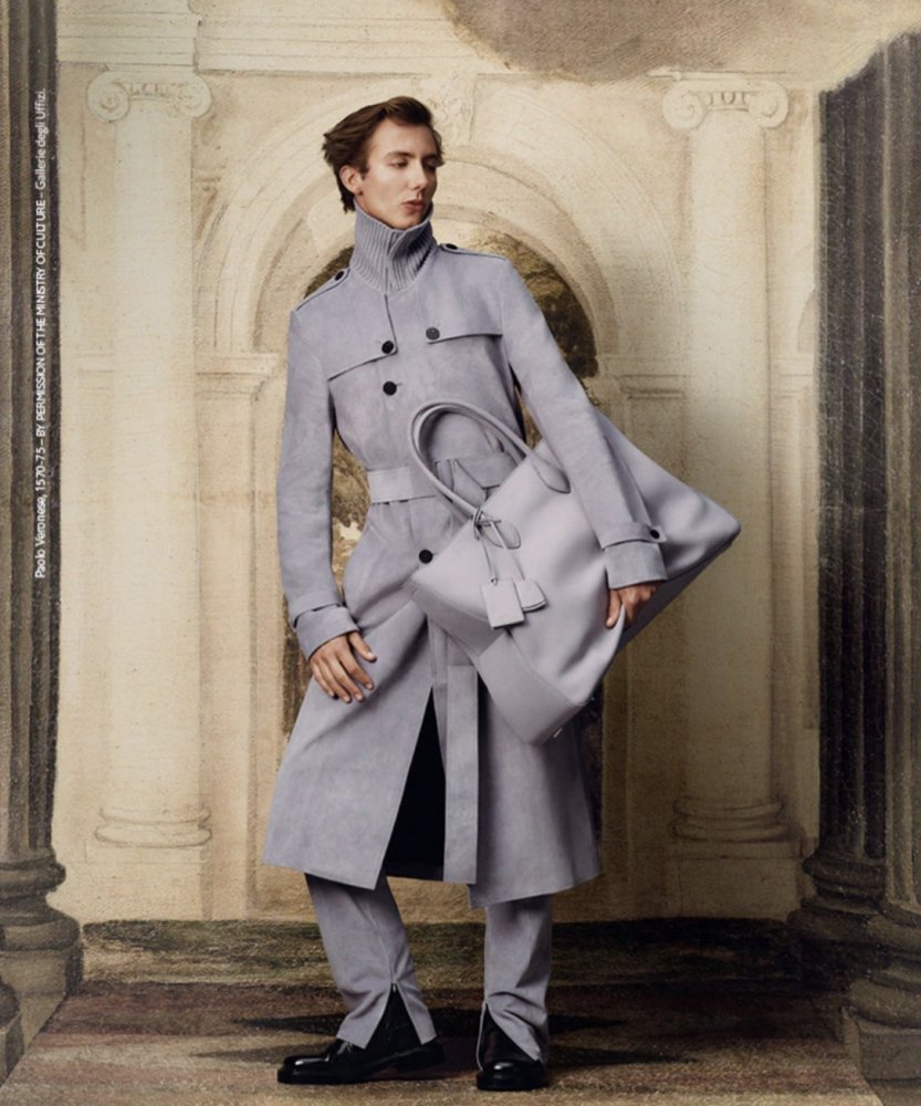
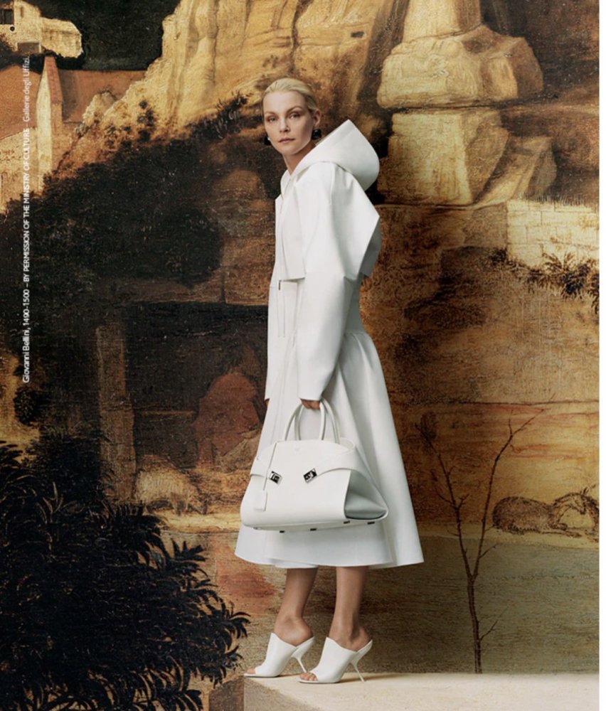
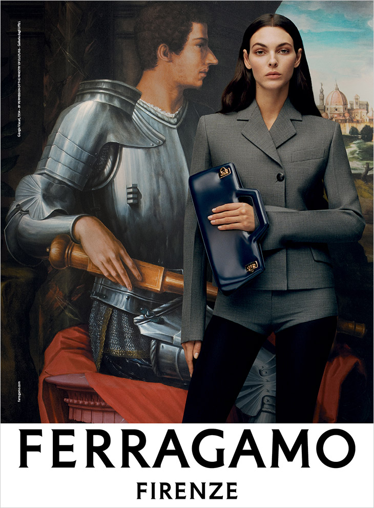
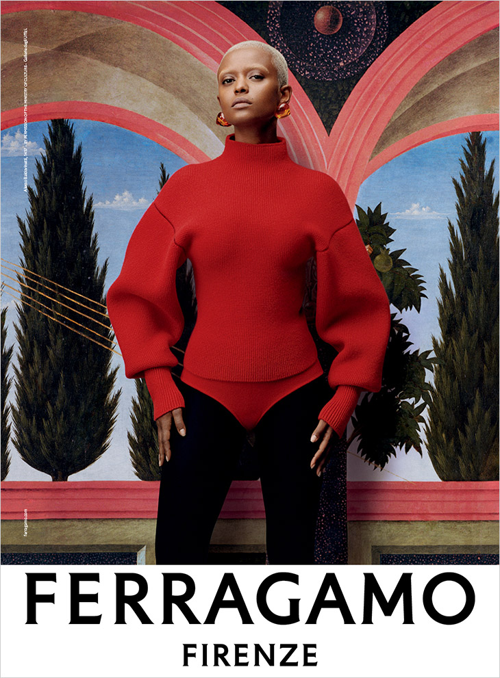
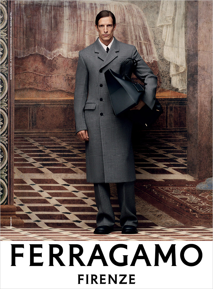
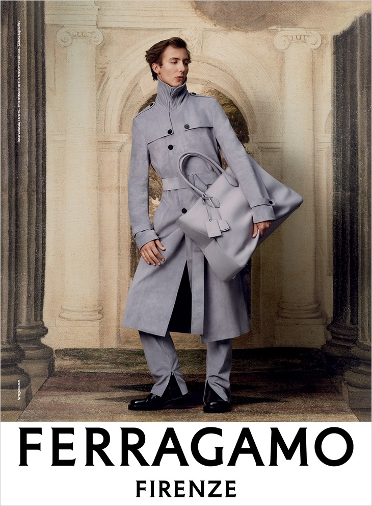
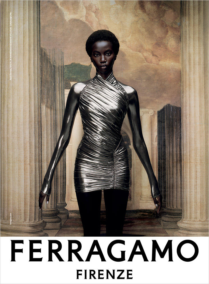
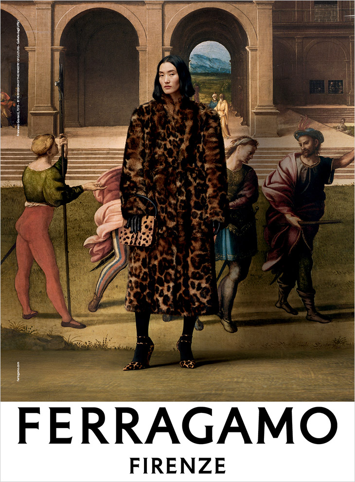
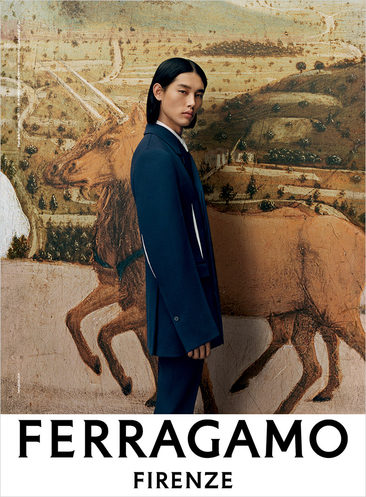
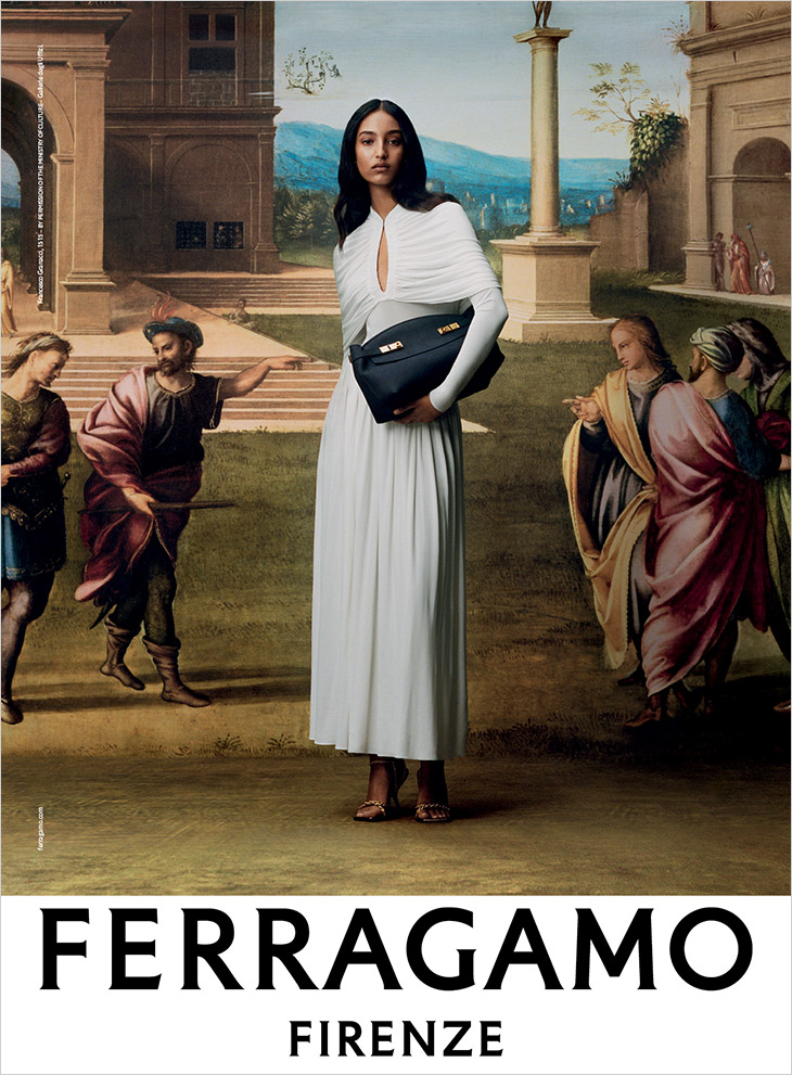
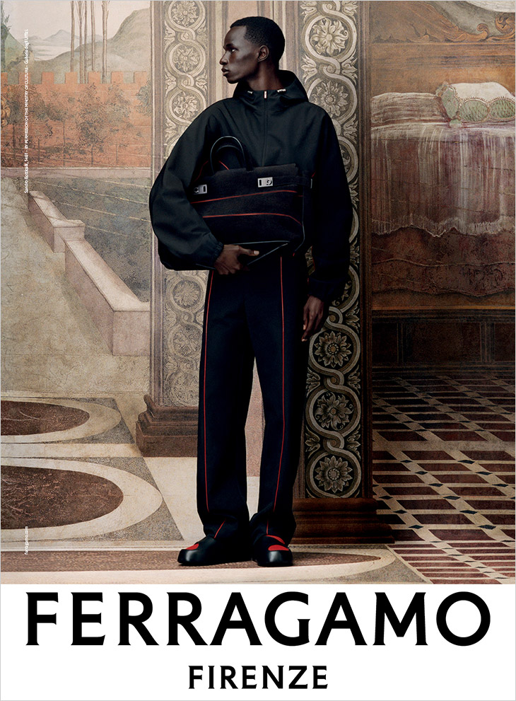
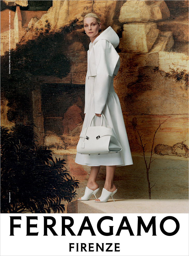
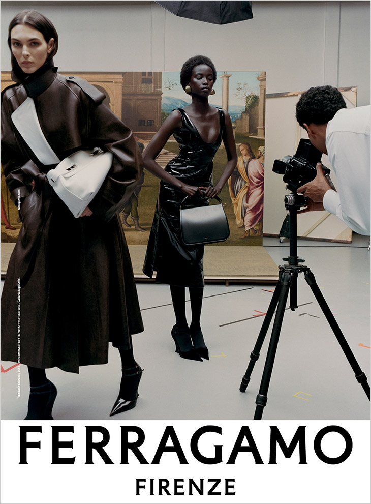
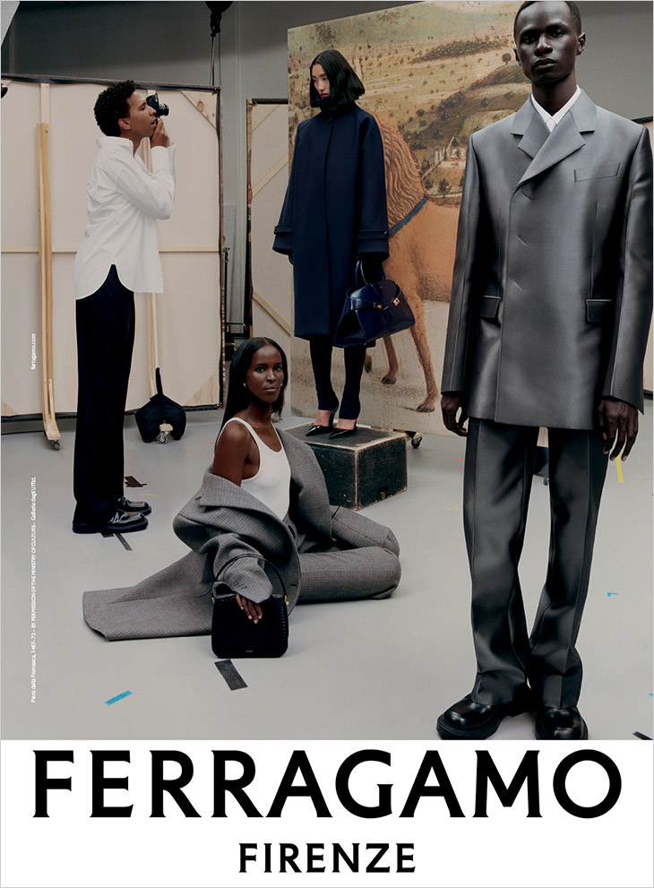
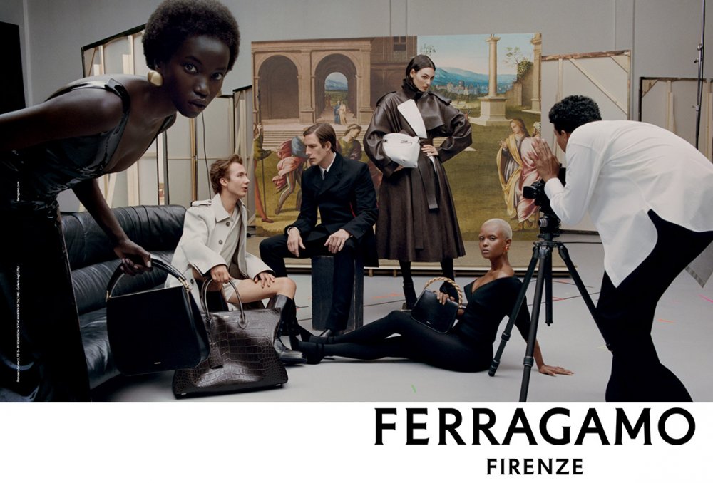
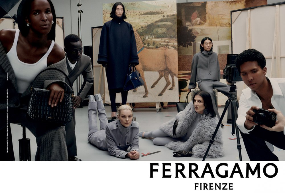
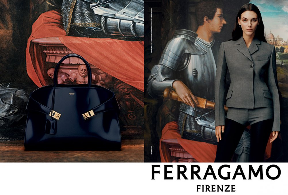
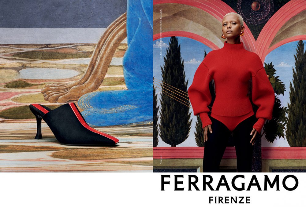
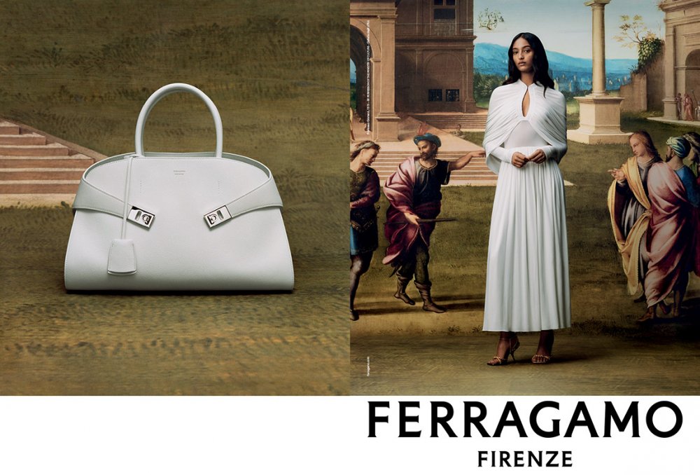
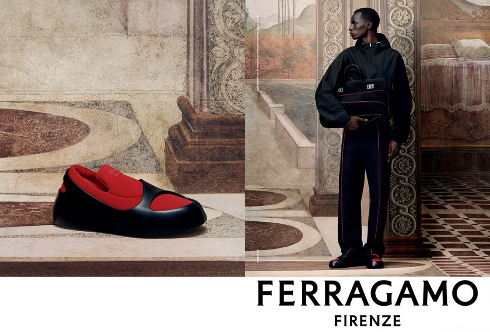
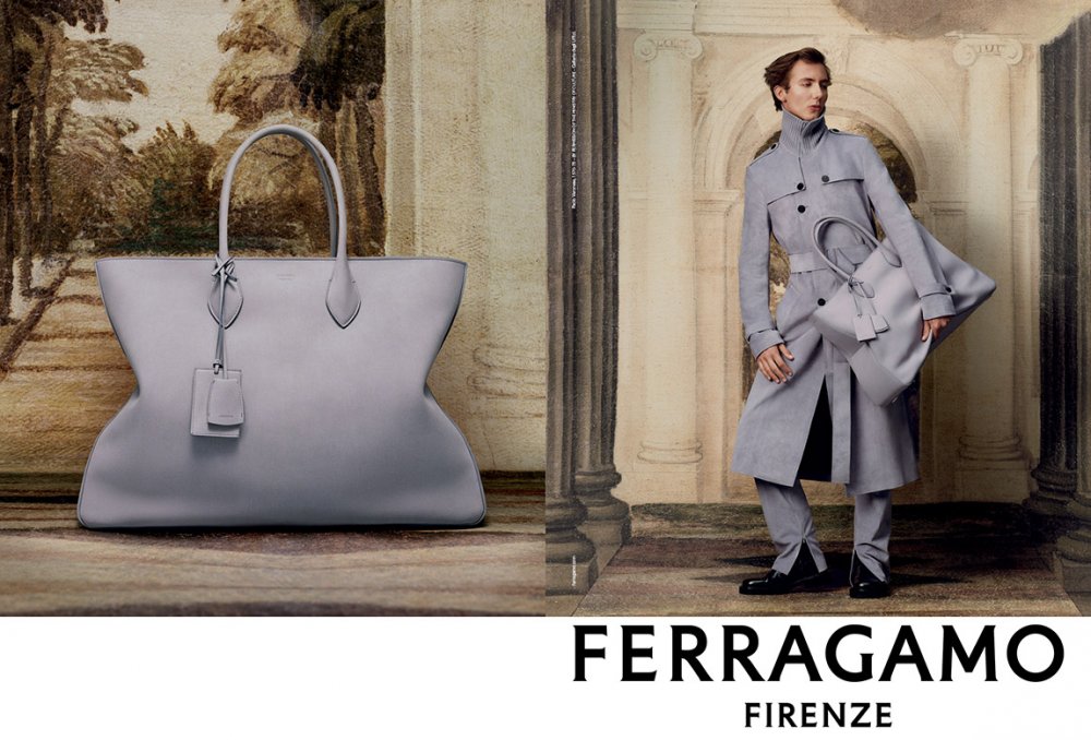
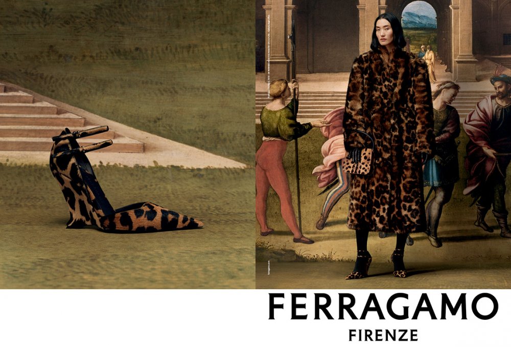
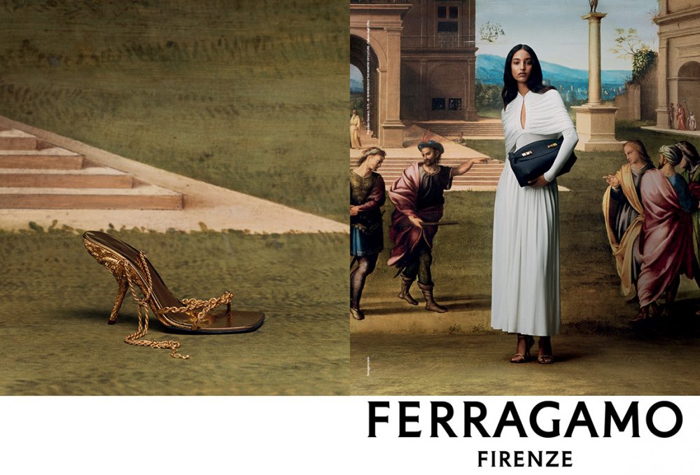
Ferragamo F/W 2023.24 by Tyler Mitchell

The concept might have been all Berge but it's the photographer who executes the idea (unless Berge was on set, giving orders to everyone and constantly asking to have a look behind the camera which is highly possible lol) .
You know he was…ahahaha
Bossing people around and throwing tantrums.
And that was probably the reason why he choose young photographers after years of Helmut Newton.

‘He is probably my least favorite person in fashion ever but he had an impeccable taste.
 
^^^ Boss away if such fashion supremacy as the Sorrenti one was the result. Concepts are dime-a-dozen, frankly (…and even then, these lessers nowadays can’t even come up with a decent one. This Ferragamo one is very… 1st-year/1st-semester "Intro to Photoshop" class assignment...).

It’s the execution that defines the creative talent and experienced, technical skills of fashion vision that will be remembered. That Mario’s (and even if Berge had contributed on-set as a bossy CD/AD, it will still be Mario’s photography that defines the excellence of the campaign imagery) is still being held as the standard nearly 25 years later is a deserving testament to genuine talents involved. Again, the likes of Tyler/Rafael/Elizaveta and their roster of student post-production team— and as seemingly passionate and excited as they are for fashion, almost always come off as a bunch of fashion students’ weekly class assignments ripping off the Greats. No one will be studying any of their messy imagery 5 years from now, let alone 25-- when hopefully people will finally come to there senses and employ creatives for their talent and experience, rather than for affirmative action. “Graphic design is my passion” comes to mind for these types.
It’s fun to joke but yeah, even if the idea was Pierre Bergé (in another attempt to create a lineage between YSL and artists), the master interpretation was Sorrenti…Back when his work was still interesting.

But campaigns nowadays can’t really that impact because everything that count is that instant visual appeal.

There’s no intent almost. It has to be modern and work on social media.
Even something as obvious as shocking people is not a very politically correct intention.

So this looks arty but doesn’t really say anything, like a lot of campaigns anyway. Maybe this is more beautiful on your IG feed.

‘I take this over Fendi..
 
I don’t mind this.

It feels warmer than the glacial catwalk presentation and attempts to ground the band in its hometown. Most interesting, I feel, is the dialogue between the updated logo and the images, both riffing off cleaned-up classism in a way. It feels like a play on an exhibition poster for the Uffizi — witty but I don’t think that the was the intent here. I wonder how much they had to pay for the rights to those paintings?

At least they’re trying to say something more than “just buy this bag and go home” but maybe they should, judging by the recent revenue reports!

(I don’t dislike Prada for this very reason neither.)
 
Last edited:
these last four images are incredible. love it.
Vittoria’s expression could be a little but better but I’ll take it (biased I know!)

Stam looks amazing, Mona too and so does Leon.
 
The designs are always fab and he has a hit with that Eva pump!
 
^^^ The group shots are very Hugo Comte ripping off Steven Meisel 90s Vogue Italia… (Except Tyler’s inserted himself into every group shot…. Likely insisted by the brand to show how down with the children the label is by having Beyonce's photographer.)

The simpler, more straightforward presentation of a single model standing in front of paintings— complete with their shadow, work much better than the cut-and-paste insertion of model into the painting. It’s still has that unpleasant, juvenile student assignment stench. But as you've already mentioned, this is for the children on social: Bright, saturated colors and gimmicky concepts. And just so you don’t miss what brand this is, the layout makes sure you know : It’s F E R R A G A M O… So loud.
 
these last four images are incredible. love it.
Vittoria’s expression could be a little but better but I’ll take it (biased I know!)

Stam looks amazing, Mona too and so does Leon.
I believe it’s Paul Hameline and not Leon.
 
Iván, Malick and Jessica are amazing here.

we-love.gif
 

Users who are viewing this thread

New Posts

Forum Statistics

Threads
212,461
Messages
15,185,451
Members
86,314
Latest member
BeneathTHEsurFACE
Back
Top
monitoring_string = "058526dd2635cb6818386bfd373b82a4"
<-- Admiral -->