Ferragamo F/W 2024.25 by Juergen Teller

Don't let Raquel ever work with Juergen again. My god, makes me question what I have been seeing in her all these years... She's never looked worse. Lina looks sickly in most of her shots. Truly one horrible campaign that convinces you not to go anywhere near Ferragamo, unless you want to appear washed out and ill.
 
Lotta and Teller is a match made in hell

They tried to do something casual but it's just awkward.

Sad cause I quite like Davis' designs.
 
No. It’s not good.

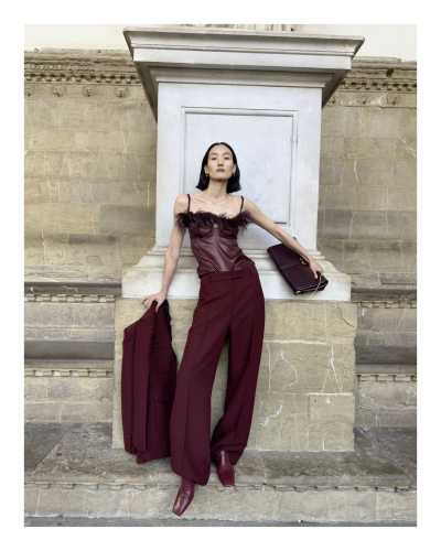
Raquel is a legend, but I’m beginning to wonder if there’s a clause in her contracts now that she refuses any heat styling on her hair…nothing against curls…but I prefer her with a blowout.

That shot of her in the burgundy outfit with those monstrous shoes is horrible.

The entire industry, top to bottom, every brand is a clueless mess.
 
Best ad of the season, I love all the womanly models
but its just old celine clothes mixing with new bv and bits of Raf's CK
The clothes are fine, shoes are bad and bags are still awful
For an accessories house, maybe they need to sell tons of those ballet bow flats to support this vanity project
 
I always wonder if Juergen has a 'thing' with Raquel. He did a shoot with her in 2008 with his flaccid penis inches away from her face while he pressed her head down. Both of them are naked in that picture
 

weibo.com
a YSL (vaccarello juregne) ad campaign with old Bottega via old Celine clothes ...next season they will do a miu miu ferragamo version is up next ....wait and you will see lol
 
Raquel’s been giving us that face for a while now and it’s the opposite of what we want. it looks bad.

thank God, Lina is saving it! the whole mood of the campaign is not the aesthetic I was thinking of considering the collection and it does fall flat to me.
 
Last edited by a moderator:
I always find the choice of Juergen repetitive. It's always a brand or a creative director that's trying to prove something.
What he does now with Loewe only works for me. The rest I don't feel like he puts in that much effort.
 
I love the whole campaign! Juergen always works when there's an expensive location not on some trashy street with couches. This still feels expensive. Only thing I dislike is the yellowish tint in their skin.
 
the logo placement and the white
passe-partout do really extol this ad campaign.
 
Raquel’s been giving us that face for a while now and it’s the opposite of what we want. it looks bad.

thank God, Lina is saving it! the whole mood of the campaign is not the aesthetic I was thinking of considering the collection and it does fall flat to me.
I feel awfully bad by saying it but the first thing that came to mind when I saw that expression was Lucy Letby.
 
I liked this collection, I'm generally fine with Juergen and Lotta's work but this is just a mismatch on multiple fronts.
 

Users who are viewing this thread

New Posts

Forum Statistics

Threads
211,795
Messages
15,164,226
Members
85,690
Latest member
156sprinter
Back
Top
monitoring_string = "058526dd2635cb6818386bfd373b82a4"
<-- Admiral -->