You are using an out of date browser. It may not display this or other websites correctly.
You should upgrade or use an alternative browser.
You should upgrade or use an alternative browser.
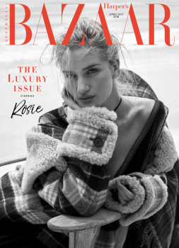
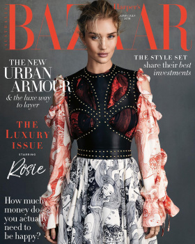
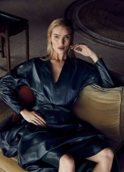
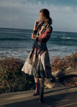
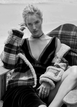
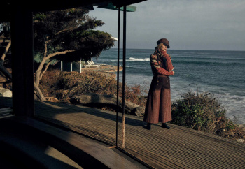
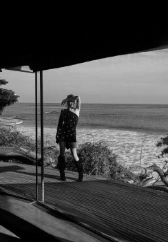
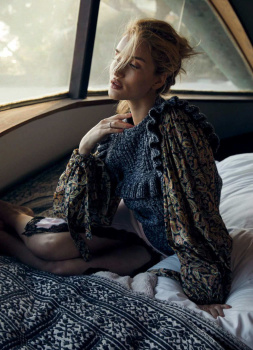
Harper’s Bazaar Australia June/July 2018 : Rosie Huntington-Whiteley
- Thread starter vogue28
- Start date
badgalcrush
Well-Known Member
- Joined
- Mar 2, 2017
- Messages
- 728
- Reaction score
- 378
Is it just me or the past few years , when Rosie scores a cover there is 88% of chance to be a Bazaar cover...
Lets see the edit
Lets see the edit
happycanadian
Well-Known Member
- Joined
- Mar 2, 2005
- Messages
- 8,207
- Reaction score
- 270
Seriously, Rosie is basically THE Bazaar model.
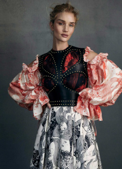
She looks incredibly beautiful in the face in this shot. But I dislike the styling. I get that it's fall/winter in Australia, so the darker palette makes sense ... but I must say I'm very bored of this grey background that's become ubiquitous in the past couple years.
She looks incredibly beautiful in the face in this shot. But I dislike the styling. I get that it's fall/winter in Australia, so the darker palette makes sense ... but I must say I'm very bored of this grey background that's become ubiquitous in the past couple years.
D
Deleted member 141523
Guest
She's a HB girl! That is a new record  Stunning pic by the way.
 Stunning pic by the way.
I prefer the black and white cover (even though that bit of hair is really annoying me!) over the coloured shot, her pose in that one just looks awkward and makes the dress look uncomfortable. I actually saw the second cover first and thought it was a reprint - for some reason it reminded me of her Vogue Germany cover in August 2016, although now I've looked properly they aren't as similar as I thought..
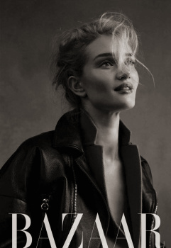
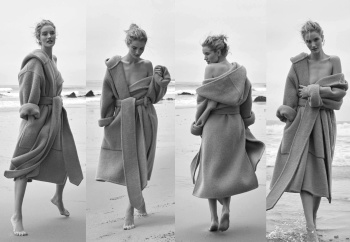
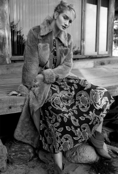
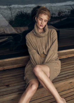
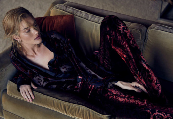
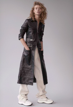
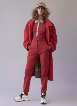
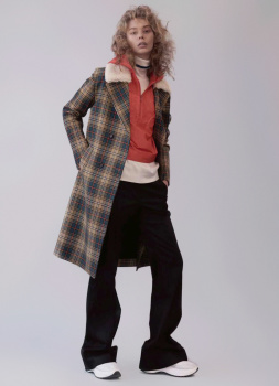
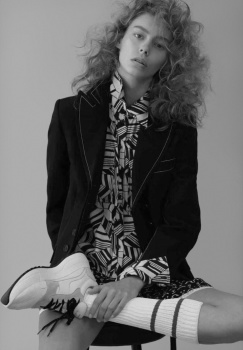
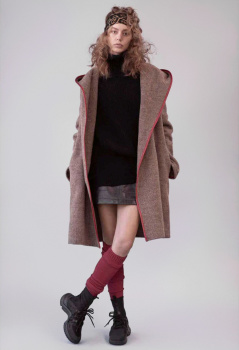
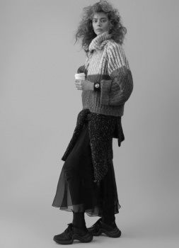
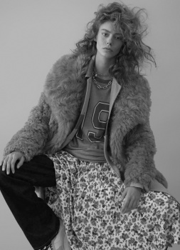
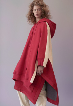
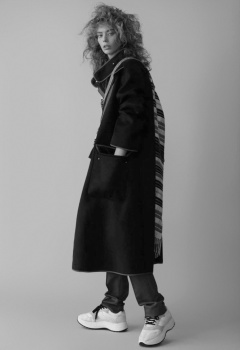
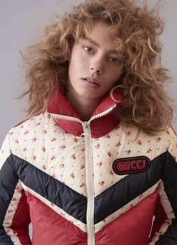
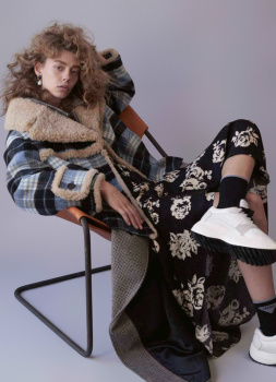
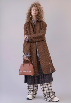
Actually presently surprised by the editorial, it's something different from Rosie and a lot better than her March UK Bazaar edit. She looks beautiful too.
Surprised to see Ondria Hardin again, I had forgotten all about her!
Actually presently surprised by the editorial, it's something different from Rosie and a lot better than her March UK Bazaar edit. She looks beautiful too.
Surprised to see Ondria Hardin again, I had forgotten all about her!
- Joined
- Jan 9, 2008
- Messages
- 35,323
- Reaction score
- 20,336
Absolutely love the subscribers cover, by far the best thing to come from the whole shoot, so serene and beautiful. The black and white image teamed with the burnt orange masthead is... perfect! It's a real shame the newsstand cover feels so stiff and robotic. This definitely isn't Rosie's most strongest Harper's Bazaar shoot she's done, I must admit.
Similar Threads
- Replies
- 21
- Views
- 5K
- Replies
- 37
- Views
- 12K
- Replies
- 6
- Views
- 2K
D
- Replies
- 8
- Views
- 3K
- Replies
- 134
- Views
- 32K
Users who are viewing this thread
Total: 2 (members: 0, guests: 2)
New Posts
-
D la Repubblica ‘DStyle’ Autumn/Winter 2024 : Raquel Zimmermann by Mark Kean (9 Viewers)
- Latest: jeje10
-
-
Louis Vuitton Cruise 2025 : Mona Tougaard, Larissa Moraes & Cara Schadel by Jamie Hawkesworth (7 Viewers)
- Latest: chrisand489
-
-


