-
The Red Carpet Highlights of... The 78th Annual Cannes Film Festival 2025!
-
MODERATOR'S NOTE: Please can all of theFashionSpot's forum members remind themselves of the Forum Rules. Thank you.
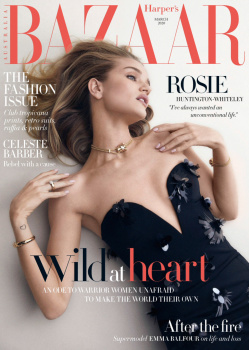
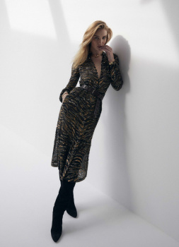
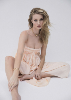
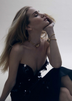
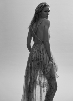
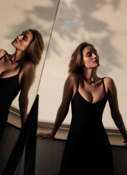
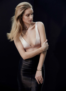
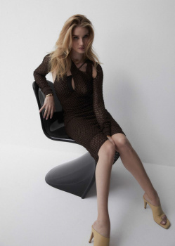
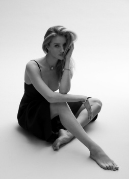
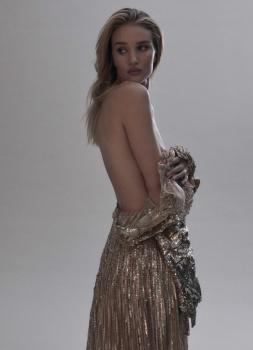
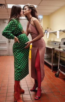
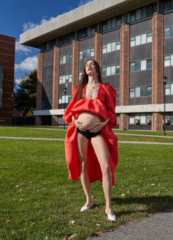
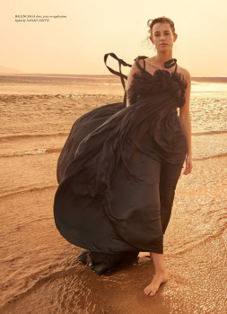
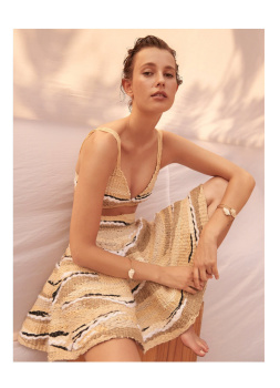
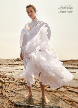
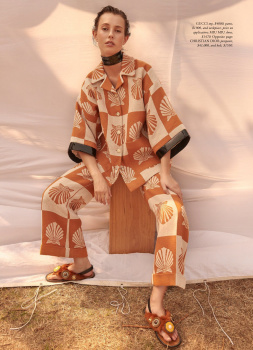
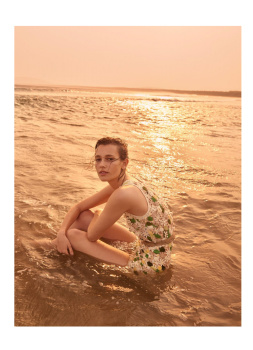
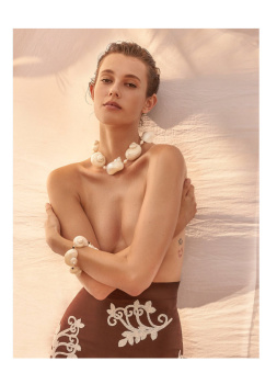
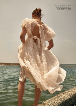
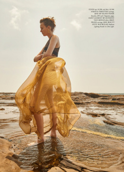
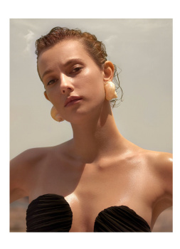
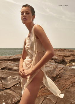
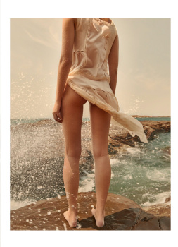
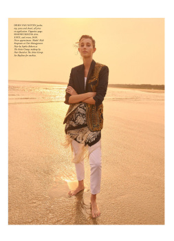
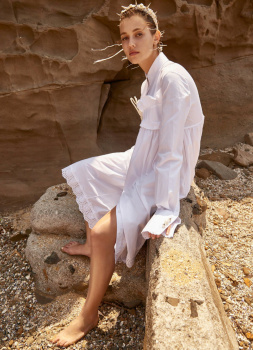
Harper’s Bazaar Australia March 2020 : Rosie Huntington-Whiteley by Darren Mcdonald
- Thread starter vogue28
- Start date