You are using an out of date browser. It may not display this or other websites correctly.
You should upgrade or use an alternative browser.
You should upgrade or use an alternative browser.
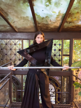
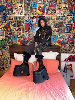
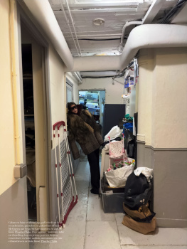
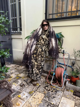
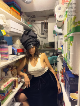
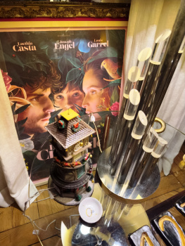
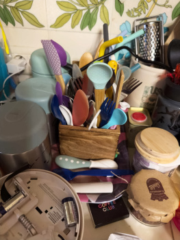
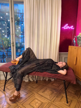
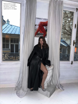
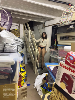
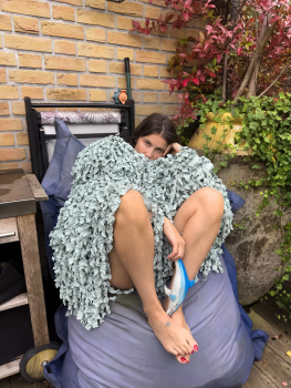
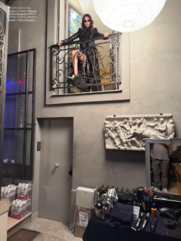
Harper’s Bazaar France December 2024/January 2025 : Laetitia Casta by Juergen Teller
- Thread starter vogue28
- Start date
Deleted member 116957
New/Inactive Member
- Joined
- Apr 4, 2009
- Messages
- 13,772
- Reaction score
- 15,808
Both of her covers for Harper's Bazaar France has been dreadful. She looked like a golem on her last one and now this pose.. my god... HELP!
tigerrouge
Well-Known Member
- Joined
- Feb 25, 2005
- Messages
- 18,885
- Reaction score
- 9,715
This would probably be nicer on their companion edition, Harper's Bazaar Interieurs.
Avonlea
Well-Known Member
- Joined
- Feb 10, 2020
- Messages
- 3,247
- Reaction score
- 13,171
Are the people responsible for this magazine brain dead? Why would anyone look at this dreadful image and think it's the perfect option for a cover? I just don't understand how a team of supposed professionals comes up with sh*t like this.
The Model Gene
Member
- Joined
- Apr 27, 2022
- Messages
- 20
- Reaction score
- 17
I never want to see another cover by Juergen Teller again. Please make it stop.
Zorka
Well-Known Member
- Joined
- Jan 29, 2014
- Messages
- 18,657
- Reaction score
- 20,946
When it comes to Little Edie Beale/Grey Gardens-inspired fashion editorials, the first thing that comes to mind - which is, to say the least, excellently done! - is Rianne van Rompaey by Tim El Kaïm for d la Repubblica.
This futile attempt of Juergen Teller is just another in a series of his epochal failures when it comes to fashion photography. Although, it's not his fault. It is the fault of the fashion editors who persistently push it, despite the fact that we know that it is simply impossible to squeeze water out of a stone!
This futile attempt of Juergen Teller is just another in a series of his epochal failures when it comes to fashion photography. Although, it's not his fault. It is the fault of the fashion editors who persistently push it, despite the fact that we know that it is simply impossible to squeeze water out of a stone!
phungnam96
Well-Known Member
- Joined
- Jul 7, 2011
- Messages
- 1,237
- Reaction score
- 923
I am still baffled that why 10 years ago I was such a fan of Teller’s work…
fauxfashion
Well-Known Member
- Joined
- Oct 11, 2023
- Messages
- 991
- Reaction score
- 3,723
GivenchyAddict
Well-Known Member
- Joined
- Feb 5, 2012
- Messages
- 2,538
- Reaction score
- 7,021
Their worst issue for me and Élodie David is really really overrated.
The Mark Kean x Robbie Spencer’s editorial is barely about volume but anyway.
The Mark Kean x Robbie Spencer’s editorial is barely about volume but anyway.
Deleted member 116957
New/Inactive Member
- Joined
- Apr 4, 2009
- Messages
- 13,772
- Reaction score
- 15,808
It's kind of wild that Vogue France is better than Bazaar France this month, but... jeeze... this is bad.
Starry
Well-Known Member
- Joined
- Nov 22, 2007
- Messages
- 3,535
- Reaction score
- 384
I am debating if I should renew my subscription for this magazine next year. They had some highlights in 2024 but not that exciting overall. The current low standard of fashion magazines makes it look "acceptable" for me though...
Frenchkiki
Member
- Joined
- Jul 16, 2008
- Messages
- 460
- Reaction score
- 22
Tell me how is it possible to take and publish such ugly pictures with this beautiful woman ? This beyond my understanding ! 


jeremydante
Well-Known Member
- Joined
- Jul 15, 2009
- Messages
- 3,595
- Reaction score
- 1,236
Not the garden and garden furniture taking more of the spotlight than Laetitia!
Juergen needs to retire. Like, you did your time sweetie; you can go rest now.
Juergen needs to retire. Like, you did your time sweetie; you can go rest now.
Similar Threads
- Replies
- 7
- Views
- 4K
- Replies
- 9
- Views
- 6K
- Replies
- 5
- Views
- 2K
Users who are viewing this thread
Total: 1 (members: 0, guests: 1)


