You are using an out of date browser. It may not display this or other websites correctly.
You should upgrade or use an alternative browser.
You should upgrade or use an alternative browser.
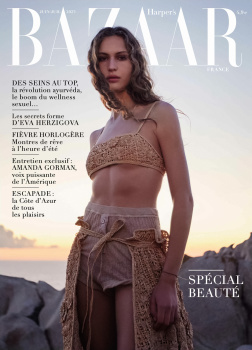
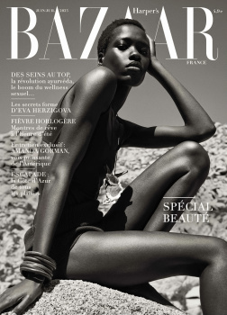
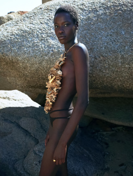
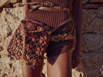
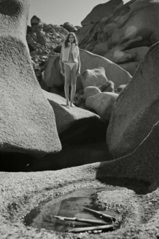
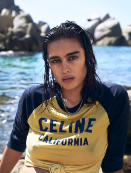
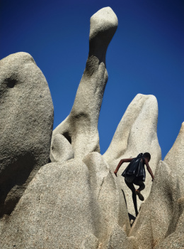
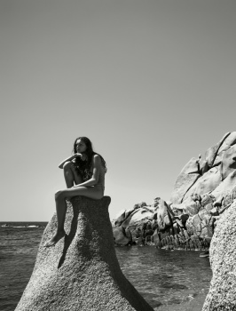
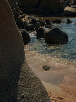
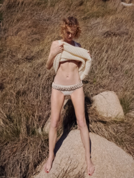
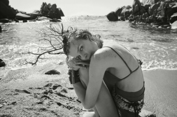
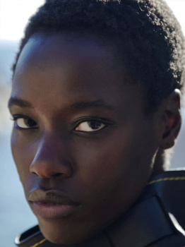
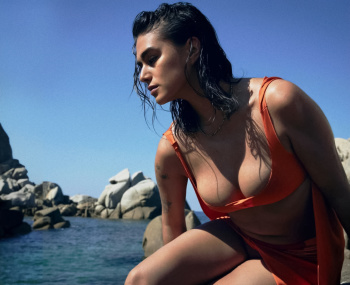
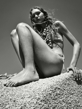
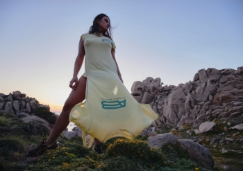
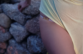
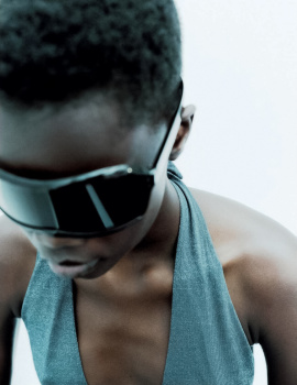
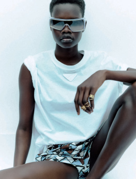
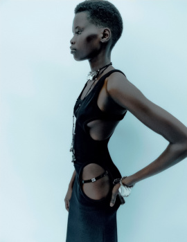
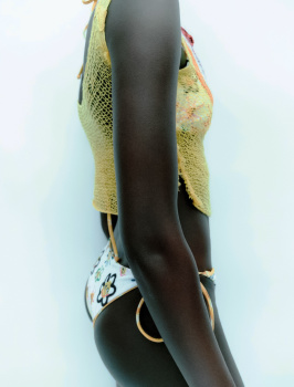
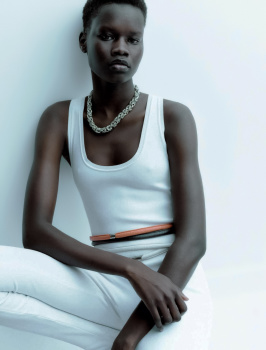
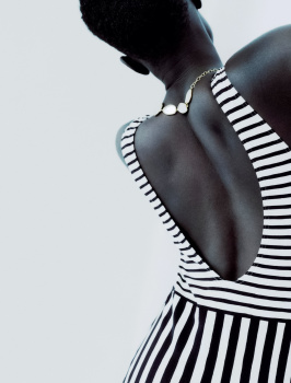
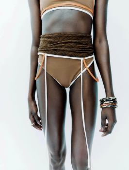
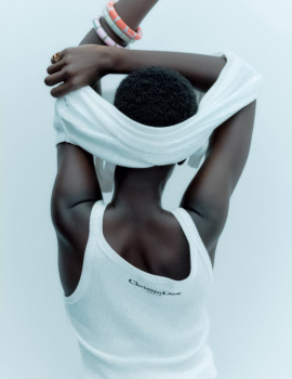
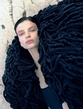
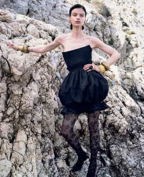
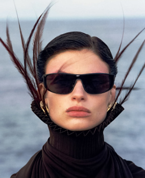
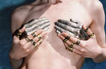
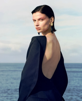
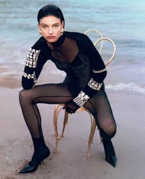
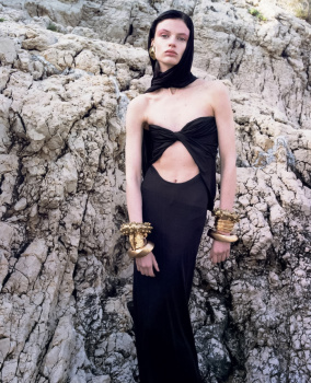
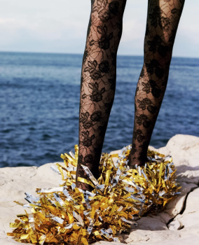
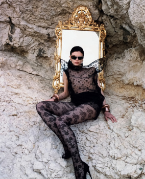
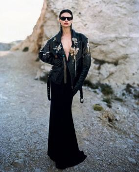
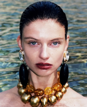
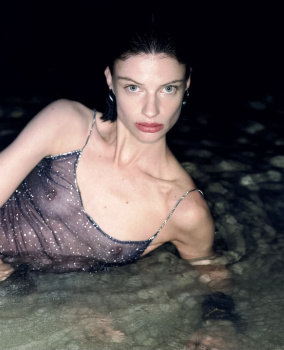
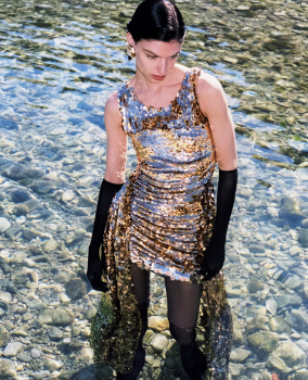
Harper’s Bazaar France June/July 2023 by Mario Sorrenti
- Thread starter vogue28
- Start date
DK92
Well-Known Member
- Joined
- Dec 17, 2018
- Messages
- 2,426
- Reaction score
- 4,611
When I read Mario's name I had high expectations, because I think he is one of the most underrated photographers for the incredible work he has... But the covers were not up to what I was expecting. I hope the editorials are good!
Phuel
Well-Known Member
- Joined
- Feb 18, 2010
- Messages
- 6,243
- Reaction score
- 11,222
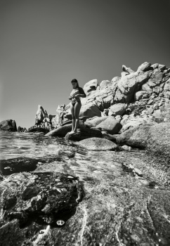
Awar’s is the only cover that matters. France Bazaar has been on a winning streak since their inaugural issue. The B&W with the sienna undertones really brings out an understated, melancholic mood to a summer issue. Wished that brand of high-end sensuality was also brought to Jill’s— instead of the summer sale in-house billboard direction.
Lola701
Well-Known Member
- Joined
- Oct 27, 2014
- Messages
- 13,813
- Reaction score
- 36,785
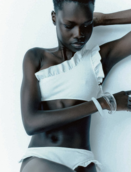
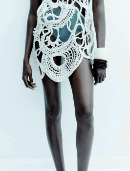
The first cover is fabulous but I feel a lack of confidence or vision in those various multi covers issues after issues.
Because the POV isn’t fresh, I feel like they feels the need to cater to everybody. I don’t think it makes the title desirable…
Because the POV isn’t fresh, I feel like they feels the need to cater to everybody. I don’t think it makes the title desirable…
D
Deleted member 141523
Guest
Sharing the feeling. The first one is enough, stands out.
Alien Sex Friend
Well-Known Member
- Joined
- Oct 26, 2005
- Messages
- 8,596
- Reaction score
- 1,454
flipped it through, its so insanely boring despite sorrenti presense. I can`t even name any cover i like out of 4. they`re so basic and lazy.
super long main ed
jonathan frantini with Beauise Ferwerda
and another boring paparazzi kind of editorial by Virginie benarroch with some young photographer
super long main ed
jonathan frantini with Beauise Ferwerda
and another boring paparazzi kind of editorial by Virginie benarroch with some young photographer
Bertrando3
Well-Known Member
- Joined
- Mar 22, 2010
- Messages
- 5,631
- Reaction score
- 2,394
AND TO THINK that I was soooooo excited yearssss ago when I heard French Bazaar would be created but I haven't liked a single cover.
It all looks fan made and cheap ones at that.
NEXT !
It all looks fan made and cheap ones at that.
NEXT !
MulletProof
Well-Known Member
- Joined
- Apr 18, 2004
- Messages
- 28,869
- Reaction score
- 7,904
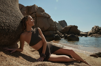
They really didn't need the other three, not only they're awful (the styling of the second oneAwar’s is the only cover that matters. France Bazaar has been on a winning streak since their inaugural issue. The B&W with the sienna undertones really brings out an understated, melancholic mood to a summer issue.
 , Eva's April 2020/DIY shot), it just takes attention away from that majestic shot. Awar's cover is soo Gisele in that Missoni Spring 2002 campaign in my eyes.. all about skin in full glory and that commanding presence like you own the sun and not like you just spent 10 months with tragic weather and are being basically an annoying sun tourist lol.. but the b&w does make it less exuberant than that Missoni campaign and more romantic.. the more soothing effect you'd get from Koto Bolofo's work.
Vogue FR and IT defecting to Wintour really left a void and a unique opportunity for other magazines to rise to the occasion and respond to the needs and wishes of many fashion enthusiasts, if only they also appropriated the confidence of Vogue and fully trusted their own decision on one single, powerful image and stop with the multiple covers that reek of desperation, they would really do themselves and the people who still believe in fashion imagery, a huge favor.
GivenchyHomme
Well-Known Member
- Joined
- Sep 3, 2009
- Messages
- 5,473
- Reaction score
- 5,352
Is this magazine oversized? The text in the cover looks very small.
Xone
Well-Known Member
- Joined
- Sep 1, 2004
- Messages
- 5,421
- Reaction score
- 5,034
I love Awar's cover...amazing shot.
contents:
Harper’s Bazaar France on Instagram: "N•4 Out tomorrow. #cover #summer #bazaar #bazaarfrance"
contents:
Harper’s Bazaar France on Instagram: "N•4 Out tomorrow. #cover #summer #bazaar #bazaarfrance"
Lola701
Well-Known Member
- Joined
- Oct 27, 2014
- Messages
- 13,813
- Reaction score
- 36,785
For me the problem is that French aesthetic is really stuck. Bazaar FR is very generic tbh. It’s generic but with great names and budget…They really didn't need the other three, not only they're awful (the styling of the second one, Eva's April 2020/DIY shot), it just takes attention away from that majestic shot. Awar's cover is soo Gisele in that Missoni Spring 2002 campaign in my eyes.. all about skin in full glory and that commanding presence like you own the sun and not like you just spent 10 months with tragic weather and are being basically an annoying sun tourist lol.. but the b&w does make it less exuberant than that Missoni campaign and more romantic.. the more soothing effect you'd get from Koto Bolofo's work.
Vogue FR and IT defecting to Wintour really left a void and a unique opportunity for other magazines to rise to the occasion and respond to the needs and wishes of many fashion enthusiasts, if only they also appropriated the confidence of Vogue and fully trusted their own decision on one single, powerful image and stop with the multiple covers that reek of desperation, they would really do themselves and the people who still believe in fashion imagery, a huge favor.
I’ve never expected something great regarding the talents involved.
Taking risks for me is about mixing talents. All I see is the same people doing basically the same thing with another title.
I have to admit that I’m much more excited about reading old issues of magazines than opening a new one. Covers are one thing. Content is another…
What’s the purpose, what’s the message beyond « we have to please advertisers »?
For me this new Bazaar is pure firecrackers.
Bernie Flood
Well-Known Member
- Joined
- Nov 18, 2021
- Messages
- 802
- Reaction score
- 475
Can someone pls tell French Bazaar to just emulate the Vogue Paris under JJBuck and Carine’s aesthetic?!
Thanks!
Thanks!
GivenchyAddict
Well-Known Member
- Joined
- Feb 5, 2012
- Messages
- 2,541
- Reaction score
- 7,048
^You can't emulate anything when someone as bland as Frand Durand is involved in it...
Very cliquish, only people with the same aesthetic, no one to challenge each other. It is a nice magazine. It definitely does not intimidate the other publications though.
Very cliquish, only people with the same aesthetic, no one to challenge each other. It is a nice magazine. It definitely does not intimidate the other publications though.
Zorka
Well-Known Member
- Joined
- Jan 29, 2014
- Messages
- 18,728
- Reaction score
- 21,249
Similar Threads
- Replies
- 49
- Views
- 8K
- Replies
- 34
- Views
- 12K
- Replies
- 16
- Views
- 3K
- Replies
- 23
- Views
- 5K
Users who are viewing this thread
Total: 1 (members: 0, guests: 1)
New Posts
-
Harper’s Bazaar Italia November 2025 : Kai Schreibber by Inez van Lamsweerde & Vinoodh Matadin (10 Viewers)
- Latest: ellearchivist
-
-
-
-

