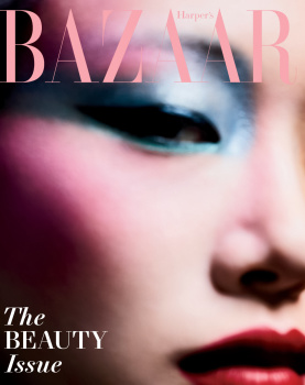
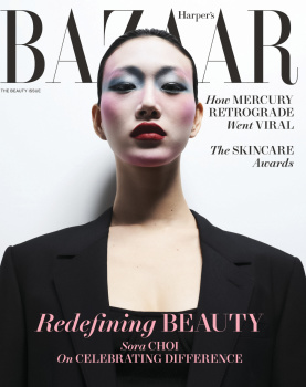
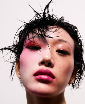
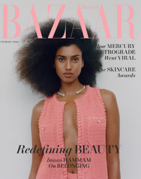
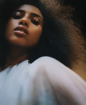
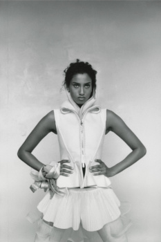
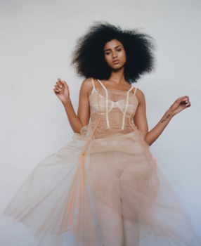
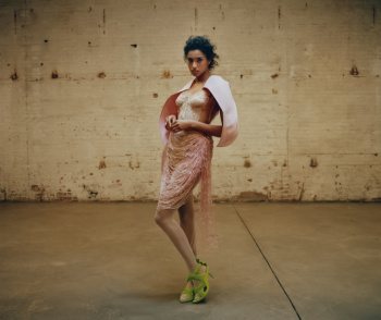
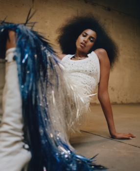
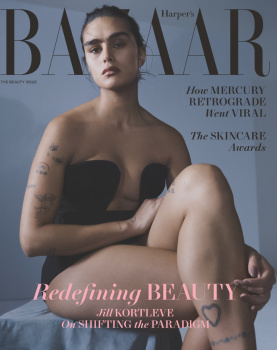
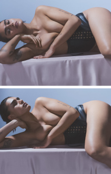
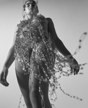
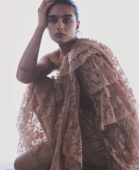
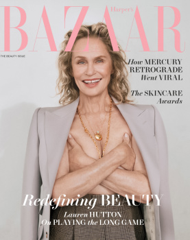
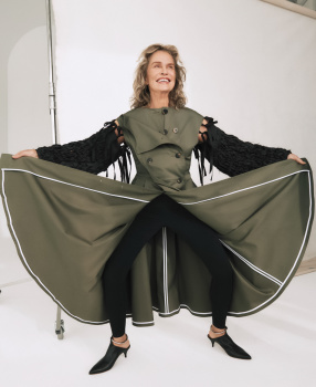
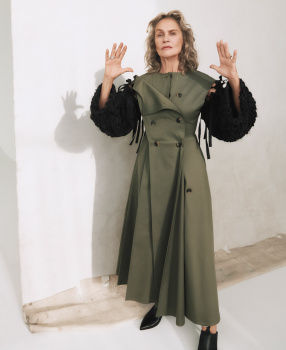
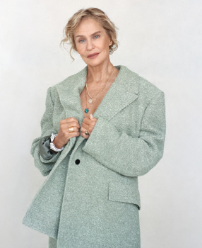
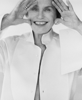
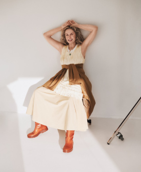
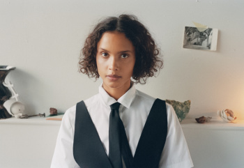
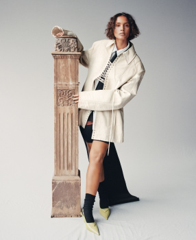
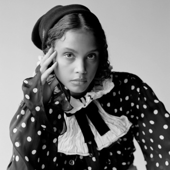
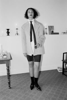
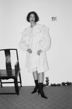
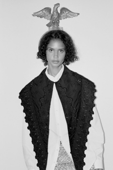
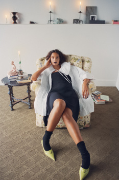
Flicking through this online, sometimes you can get an idea of what the import newsstand cover will be from what the library displays, but the cover shown is Sora's close-up shot, which looks more like a subscribers cover than a newsstand one. 166 pages. The amount of ads seems healthy enough.
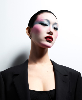
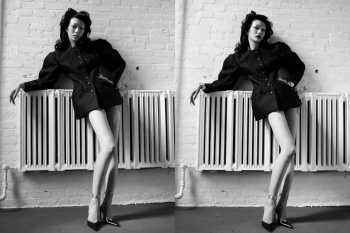
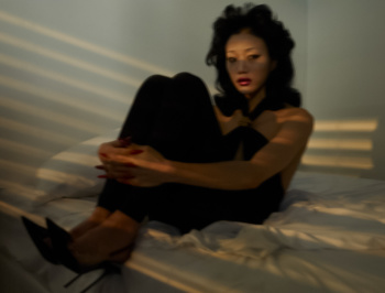
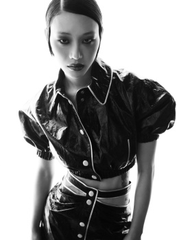
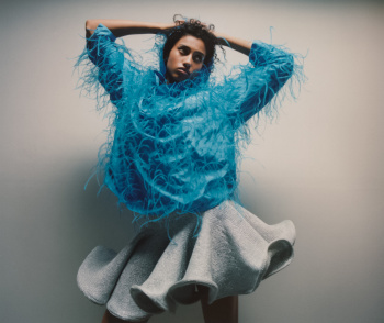
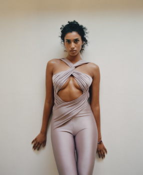
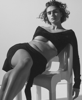
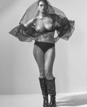
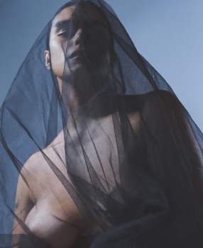
Anyhow, all the covers seem to be included in a series, following on from the front page, then they're also shown all together on an intro page. They're not that good that I need to see them several times. The editor's letter opens with : "I wish we could have made 2,000 covers to represent our beauty issue".
A message to magazine editors everywhere: JUST MAKE ONE GOOD COVER. I'd say 'don't waste time making multiple half-hearted ones' but there's never the impression that much time goes into them. If effort is being made, that isn't being conveyed by the end result.
Harper's Bazaar seems to have a regular feature where two names talk with each other, this month it's Marilyn Minter and Michèle Lamy.
There's an advertorial section for Bazaar's Skincare Awards, and the few pages of the Beauty section seem to be very dull for what is... the Beauty issue?
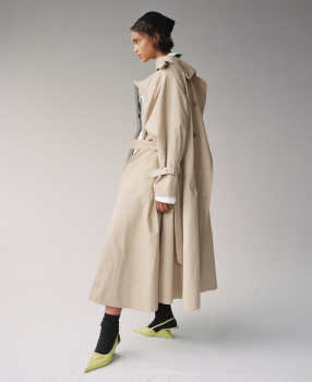
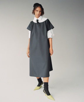
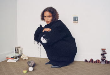
The four cover stories, put together, is the sort of content that could finally make me buy my first issue of this Bazaar, but on balance, the issue is more a dirge than a source of inspiration. There's another editorial, the 10-pg High Contrast, but it's a dull dressed-down shoot of oversized clothes. The back page archive shot is Amber Valletta by Craig McDean from Dec 1998.


