I really like the first one. It feels like a reference to Bazaar under Nancy White in the 1960s. A smart way to play with the layout. This must look like a dream next to the Vanity Fair Italia ANTM-disaster on the newsstand.
The cover editorial, 'Sway', feels like the first editorial by McDean in ages that is even close to good. By his current standards it's probably amazing!
Very nicely edited, clean story. Although I'm always here for Maty, I've got to give Mila her flowers, she steals the show here. Particularly in the first black and white shot. Overall, this is what I feel HB Italia should really look like. Thank you for posting Zorka.
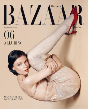
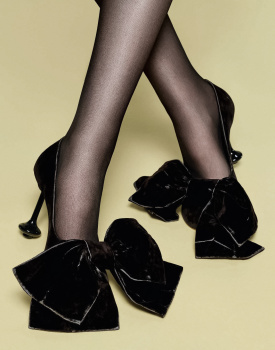
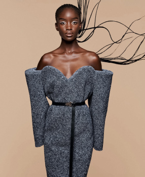
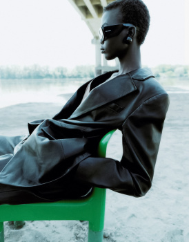
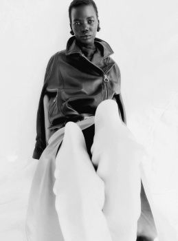
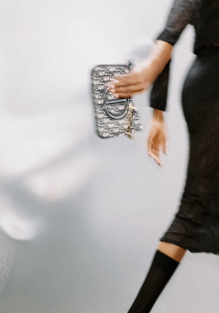
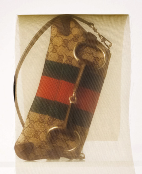
Mila Van Eeten's cover is fabulous. I usually loathe rotated cover imagery (i.e. the August cover of Vogue France) but this is a prime of example of how rotated imagery can work perfectly, with an artistic and stylized effect. The cover itself is so simple, yet so effective and the whole minimalism works wonders. A firm 10/10 from me!
This site uses cookies to help personalise content, tailor your experience and to keep you logged in if you register.
By continuing to use this site, you are consenting to our use of cookies.