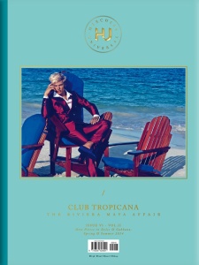
Got my copy today. DO NOT BUY IT!
You've already seen everything here (except on smaller editorial). They shortened the mag with 50 (!!!) pages compared to last seasons, but not the advertisements of course. The price is the same: 10£ which makes it the most expensive men's biannual on the market. Even that it has the best paper quality (btw.: still stinks like a press full of machines), it just does not worth 10£/15€...