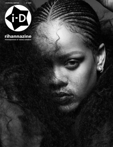
That's the new logo? Hate it. Looks very cheap, like a 'Only $5' type sticker. And I doubt their audience will respond to it because ID may be 'down with the kidzzz' but they flog expensive tat.
As for the image, it's very WSJ. Nothing technically wrong with that, but it doesn't stop me dead in my tracks and it's not timeless enough for a magazine that sits on the newsstand for a considerable amount of time. I think ID should be under more pressure to have arresting covers than say Vogue or Elle.


 Jonathan Anderson - Designer, Creative Director of JW Anderson & Christian Dior (4 Viewers)