Jonathan Saunders fall/winter 05/06 London

stilista

Member
Joined
Dec 30, 2004
Messages
769
Reaction score
0
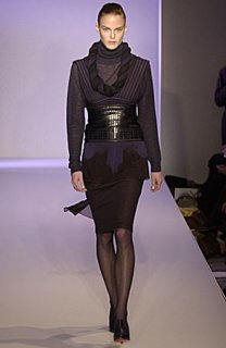
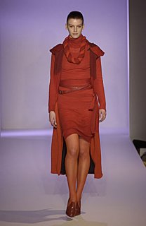
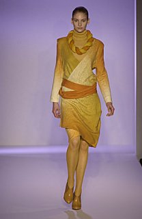
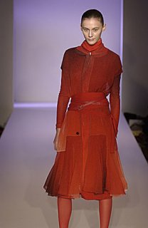
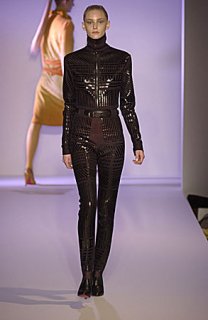
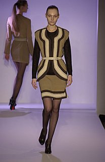
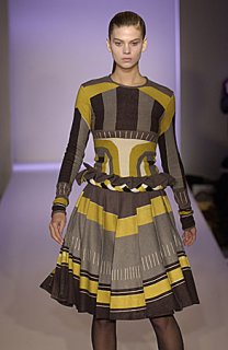
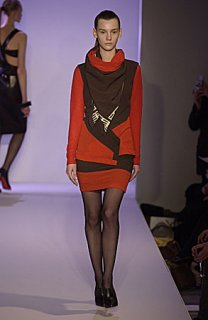
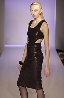
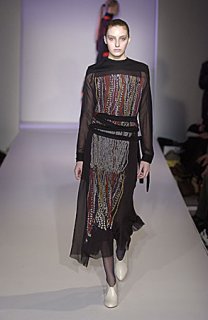
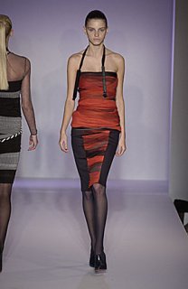
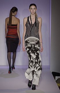
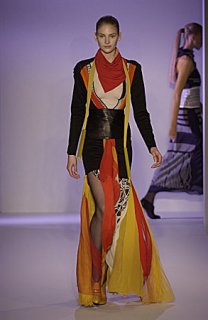
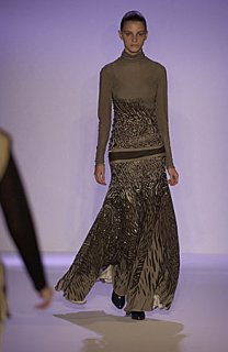
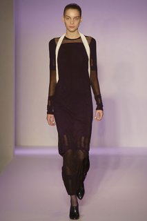
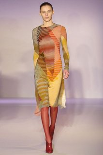
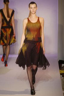
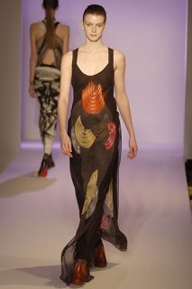
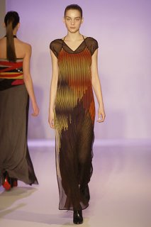
Scottish designer, Jonathan Saunders showed last night...don't like this much, his last collection had so much more instant impact, but the fabrics are nice and colours are good.

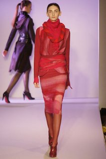
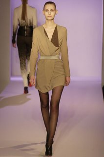
The Power-Dressing styling is really not for me.
 

Attachments

  • SAUN_AW05_001.jpg
    SAUN_AW05_001.jpg
    21.4 KB · Views: 1
  • SAUN_AW05_009.jpg
    SAUN_AW05_009.jpg
    20.8 KB · Views: 1
  • SAUN_AW05_022.jpg
    SAUN_AW05_022.jpg
    21.8 KB · Views: 3
  • SAUN_AW05_033.jpg
    SAUN_AW05_033.jpg
    22.3 KB · Views: 1
  • SAUN_AW05_036.jpg
    SAUN_AW05_036.jpg
    24.8 KB · Views: 1
more...

all pics from Catwalking.com
 

Attachments

  • SAUN_AW05_076.jpg
    SAUN_AW05_076.jpg
    25.8 KB · Views: 1
  • SAUN_AW05_090.jpg
    SAUN_AW05_090.jpg
    31.8 KB · Views: 2
  • SAUN_AW05_069.jpg
    SAUN_AW05_069.jpg
    23.9 KB · Views: 2
  • SAUN_AW05_057.jpg
    SAUN_AW05_057.jpg
    22 KB · Views: 0
  • SAUN_AW05_048.jpg
    SAUN_AW05_048.jpg
    29 KB · Views: 1
more...
 

Attachments

  • SAUN_AW05_164.jpg
    SAUN_AW05_164.jpg
    24.9 KB · Views: 0
  • SAUN_AW05_228.jpg
    SAUN_AW05_228.jpg
    23.3 KB · Views: 0
  • SAUN_AW05_244.jpg
    SAUN_AW05_244.jpg
    28.8 KB · Views: 1
  • SAUN_AW05_297.jpg
    SAUN_AW05_297.jpg
    28.8 KB · Views: 0
  • SAUN_AW05_093.jpg
    SAUN_AW05_093.jpg
    26 KB · Views: 1
I like all the red looks, except for that last red dress...the rest is indeed a bit too hard and I think the prints are a bit too 'there'...don't like them....
 
I think a couple of the looks are gorgeous...but you're right - some of it does feel like "Power-Dressing"
 
A bit disappointing...it looks like he toned things way down this season. I miss a lot of the weirder prints. Still, his eye for colour is impeccable and there's a lot I do like here.

Here's a few more pics from vogue.co.uk....love the stripey dresses!
 

Attachments

  • 00030f.jpg
    00030f.jpg
    28.6 KB · Views: 1
  • 00090f.jpg
    00090f.jpg
    22.2 KB · Views: 1
  • 00170f.jpg
    00170f.jpg
    17.1 KB · Views: 1
  • 00250f.jpg
    00250f.jpg
    23.8 KB · Views: 1
  • 00260f.jpg
    00260f.jpg
    29.9 KB · Views: 1
  • 00330f.jpg
    00330f.jpg
    26.8 KB · Views: 2
  • 00340f.jpg
    00340f.jpg
    27.5 KB · Views: 1
You're right, its not all that interesting and draws too much from the power dressing 80's thing. What happended to those brilliant prints and combination of colours he did a few years ago that got him regognised? My favourite was that dress that was on the cover of British Vogue.
 
This is really interesting imo...

00310f.jpg


This feels like a very modern kimono to me...I like the subtle gradations in color...the similar red look is even better.

00040f.jpg


from www.vogue.fr
 
Last edited by a moderator:
First half is a bit 80's....then the second group seems more disco-y?? The prints are lovely but the consistency is just odd.
 
A little to agressive/disco/80's as said befor, I think it could be his best though.
 
i don't really love the colours he used this season...

not my favourite of his collections...it just doesn't SNAP!...

thx for the pics stilista...
 
i like few of the looks droogist posted, mainly the short beige/brown dress..
and i agree, probably his less impressive collection to date, he seems eager to mainstream his work, and it just doesnt work too well ...

thanks for the topic and the visuals :flower:
 
hmmm i'm not too excited by this collection either...what attracted me in the first place was his brilliant use of prints/patterns and colour...there wasn't a lot of that in this collection...the reds and yellows are kinda drab and the patterns aren't that flattering or complementry to the form as they were the previous seasons...am i the only one thinking "star trek" when i saw the first few outfits posted?...i can see that he's pushing his designs into a new direction which he had started to last season which i guess is good...hopefully his designs will evolve into something better next season...
 
luxmode said:
This is really interesting imo...

...feels like a very modern kimono to me...
i agree, it's funny actually that the mentioned power dressing goes along with eastern influences.
 
You can see he is still experimenting with being a dressmaker as opposed to just making prints or collaborating with other people. When (or if) ever he gets the two in sync, I think he'll be quite dangerous--he's pushing print and use of colour in a direction rarely seen, quite promising.
 
it makes me think of star trek: the next generation. all a bit too 80's for me. that said, a couple of the print combinations are appealing to me in a way...
 
Last edited by a moderator:
I liked what Luxmode chose to post and some of what droogist posted as well. Something about the colors in combination with those geometric shapes made of lines rubbed me the wrong way, reminded me of this term my friend and I coined--"nuevajo." Yeah, very 80's. I think I would have liked it better without those shoes, too. They were ugly.
 
Makes me feel nasty. It looks like sleezy 80s wear. I don't like it at all
 

Users who are viewing this thread

New Posts

Forum Statistics

Threads
213,876
Messages
15,241,376
Members
87,817
Latest member
pretty woman
Back
Top