You are using an out of date browser. It may not display this or other websites correctly.
You should upgrade or use an alternative browser.
You should upgrade or use an alternative browser.
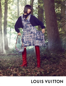
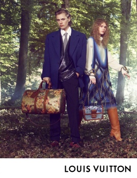
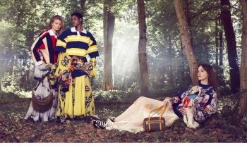
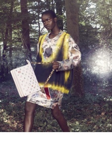
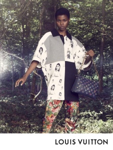
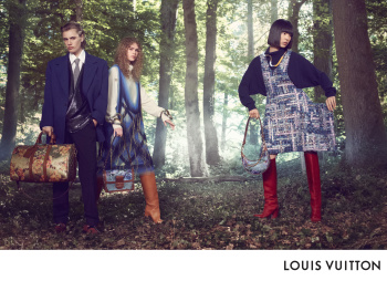
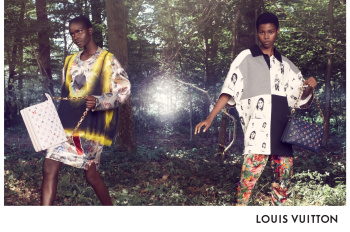
Louis Vuitton F/W 2022.23 by David Sims
- Thread starter TunHakii
- Start date
- Joined
- Jul 14, 2017
- Messages
- 14,863
- Reaction score
- 22,078
I was expecting a more brutal, more urban setting… There was a sense of practicality in that collection…. So what’s going on with the forest given that it’s the same exact styling..
Exactly my thoughts, the forest setting makes absolutely no sense with the collection. A very big miss for me.
Overindulgence
Well-Known Member
- Joined
- Oct 5, 2020
- Messages
- 381
- Reaction score
- 833
The images seem to be referencing Monet's "Luncheon On The Grass", so I can understand the heavy styling against the nature setting. And frankly, I just can't hate the results when David Sims collaborates with Ghesquiere!
Vitamine W
Well-Known Member
- Joined
- Oct 15, 2010
- Messages
- 2,957
- Reaction score
- 965
It's always so interesting that a lot of combined talent can lead to diminishing returns.
Frederic01
Well-Known Member
- Joined
- Jun 7, 2021
- Messages
- 1,909
- Reaction score
- 4,706
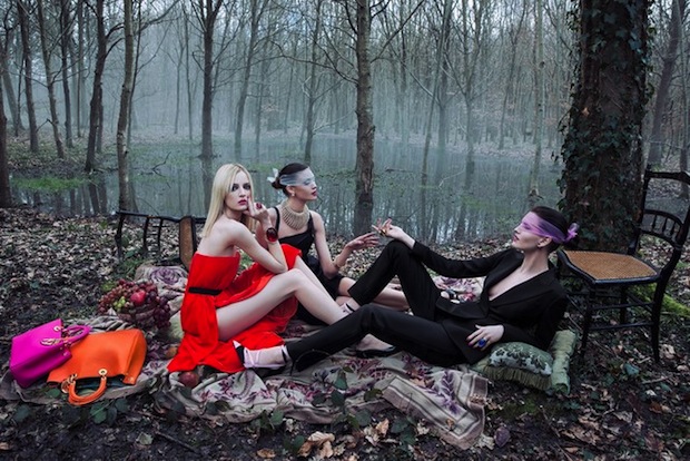
The whole “high fashion in the forest” thing is very Balenciaga Spring Summer 2011 by Steven Meisel. Somehow that was done to much better effect than this?
Phuel
Well-Known Member
- Joined
- Feb 18, 2010
- Messages
- 6,209
- Reaction score
- 11,060
Sims shot this amateur slop…?!?!?
Maybe it’s deliberate, but the models look like they were shot in-studio, then cut and pasted onto the forest background without accurate tonal correction. The tones between the subjects and the background are very different… Or the very uneven color-grading enhancement on some part of the fashions— like the highly-saturated colors of the boots, just look like a poor cut-and-paste job.
Awful fashions aside, this campaign is very amateur-budget for such a huge brand. The days of masterful referencing and interpretations are long gone, sadly:

YSL/Mario Sorrenti
Maybe it’s deliberate, but the models look like they were shot in-studio, then cut and pasted onto the forest background without accurate tonal correction. The tones between the subjects and the background are very different… Or the very uneven color-grading enhancement on some part of the fashions— like the highly-saturated colors of the boots, just look like a poor cut-and-paste job.
Awful fashions aside, this campaign is very amateur-budget for such a huge brand. The days of masterful referencing and interpretations are long gone, sadly:

YSL/Mario Sorrenti
VogueGirl8910
Well-Known Member
- Joined
- Apr 14, 2008
- Messages
- 48,035
- Reaction score
- 8,772
The background is too Disney's style.
GivenchyHomme
Well-Known Member
- Joined
- Sep 3, 2009
- Messages
- 5,467
- Reaction score
- 5,321
D
Deleted member 1957
Guest
This looks too generic like something you would find under some random photographer's page showing how to capture good images with backlight.
Bombshell1
Well-Known Member
- Joined
- Jun 5, 2021
- Messages
- 484
- Reaction score
- 271
Amazing to see again Ida for LV. She is such a star! 

Kite
Well-Known Member
- Joined
- Jul 12, 2010
- Messages
- 2,282
- Reaction score
- 1,785
Why shoot the most unnatural and overstocked clothes in Nature?
Surely this would be more suitable located in a School corridor where they've all had their uniforms bought to 'Grow into'
Or a Skate park in provincial West Midlands.....
Surely this would be more suitable located in a School corridor where they've all had their uniforms bought to 'Grow into'
Or a Skate park in provincial West Midlands.....
THD96
Well-Known Member
- Joined
- Nov 3, 2020
- Messages
- 1,667
- Reaction score
- 4,604
Another uninspired campaign for a great collection. I will never understand why Nicolas & MAS never utilized their show location for the campaign, the background of musée d'Orsay suddenly fit with the clothes better than this weirdly oversaturated forest.
I think they need a new photographer now, David Sims just doesn't work anymore. Why not Viviane Sassen, she is doing an amazing job for the travel campaign.
Can't remember the last time womenswear has a good campaign. So much potential wasted.
I think they need a new photographer now, David Sims just doesn't work anymore. Why not Viviane Sassen, she is doing an amazing job for the travel campaign.
Can't remember the last time womenswear has a good campaign. So much potential wasted.
Similar Threads
- Replies
- 23
- Views
- 9K
- Replies
- 34
- Views
- 7K
- Replies
- 30
- Views
- 9K
- Replies
- 3
- Views
- 2K
Users who are viewing this thread
Total: 1 (members: 0, guests: 1)

