-
Share with us... Your Best & Worst Collections of Haute Couture F/W 2025.26
-
Xenforo is upgrading us to version 2.3.7 on Thursday Aug 14, 2025 at 01:00 AM BST. This upgrade includes several security fixes among other improvements. Expect a temporary downtime during this process. More info here
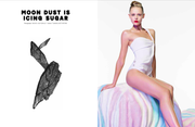
Pop S/S 2012 : Joan Smalls by Daniel Sannwald
- Thread starter vogue28
- Start date


 . The prefer the second one, for now at least.
 .. and great model choice, Joan's gorgeous.