There are many ways to deal with the MJ images, here are my 3 cents...
1. The most immediate is that it is to some degree an affectation of 'blackface' which was born and bred here in the US and involved white theatrical performers (most famously Al Jolson) donning black grease paint or shoe polish to emulate black skin and exaggerate the mouth. Blackface facial expressions were usually buffoonish and cartoonish in order to play up degrading views of blacks at the time. Paired with racist jokes and skits, the effects were devestating. What's interesting is that Sasnal's expression is fairly aggressive and mistrustful, his body language defensive, slightly wounded.
2. The ads are obviously of some kind of process, his face becoming more and more clean. It thus becomes some kind of performance art. Sasnal also uses black in his art work to paint voids, gaps, spaces. He's just released his first book covering his work entitled Night Day Night, it could be some kind of play on that as well.
3. It could be an opinion on the lack of black faces in fashion advertising. Taking into account that blackface is authentically an American tradition, one could say that the affectation of it isn't out of sync with MJ's S/S 05 work. As a defense to critics who said his work the season before was too European, he developed a wholly American collection chock full of apple pie symbology: marching bands, boy scouts, homecoming, prom dates. This could just be the darker side of that approach (no pun intended).
It also may be important to think about these ads as more of a collaboration between the artist and the photographer. It's almost as if Juergen Teller has been documenting the life of the clothes once they've left the stores. In past ads, its sometimes been tricky to see the connection between the image and the brand.
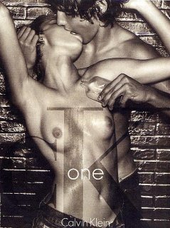


 They airbrushed her nipples out, thank God. When I was scrolling down, I saw the girl's face and thought she was really pretty, then I saw the rest, ew.
")

 i think this ad is kinda offensive and ignorant.