The old logo reinterpretation/font without Yves is really so good. Brings about the right blend of nostalgia, but also a sense of newness with the revision/abbreviation.
Although, to my eyes, that S can look slightly unbalanced now that it's acting as the opening letter.
A little too much empty space in the top half, making it look like someone standing awkwardly to the side, while the rest of the letters are a tight bunch who fit together like old friends.
Gray Sorrenti has to be the worst of all the Sorrenti mafiosos… And all they can do is thank that their daddy slept with Kate Moss in the 90s. Hahahahha
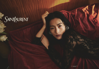
The ad campaign looks absolutely beautiful is print. The photograph of Bella Hadid laying on the bed with fur by her side is my favorite from the series.
That’s Anthony’s effect: It’s only solid on the quick first impression. Upon a second pass, and he’s utterly exposed as the mid that he is. Thus why he must be thanking the high heavens that he’s working in an era that only relies on first impressions and don’t care for a second look. Him and Jacquemus both.
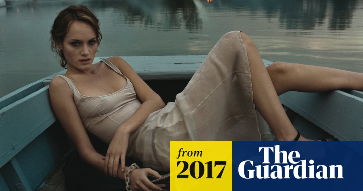
(Although the shot of the guy peeking through the blinds is admittedly solid enough, it’s instantly reminiscent of Amber peeking through the keyhole of the supreme Prada campaign of A/W 1997 by Glen Luchford. God, Prada’s past glories really were that glorious. That jewelled-trimmed dress and top looks as fresh in 1997 as it does in 2024— and will likely in 2074. The stars aligned so gorgeously during that era of fashion, where designers, photographers, models, CDs/ADs, stylists-- probably even assistants, all came together to conjure such titanic iconography. Magical.)
I remember a UK broadsheet running a massive double-page-spread version of Amber's "boat" shot, and putting that image up on my wall, knowing it would have a finite lifespan because the newspaper would eventually degrade...
‘The owner of Prada was standing on the riverbank shouting at everyone. When he asked me if I’d got the shot I said, “No!” and stormed off in a huff’
www.theguardian.com
"To get the shot, we had to aim for this one moment when there was a perfect balance between the strength of that artificial light and the strength of the dying sun. Two months later, I discovered Photoshop, with which I could have done the whole thing in just two minutes."
But those two minutes leave no space for heart and soul.
^^^ The boat shot is the stuff of pure fashion highs amongst so many Prada fashion highs, and passed in legend. Prada x Glen were unstoppable, untoppable, just unrelenting in their creative stampede— just one gorgeous campaign after another. The men’s is equally supreme— maybe that’s where Gray was “inspired” by for her color-palette.
This site uses cookies to help personalise content, tailor your experience and to keep you logged in if you register.
By continuing to use this site, you are consenting to our use of cookies.